
Colour trends interior design 2028 are moving toward warmer neutrals, nature-inspired greens, earthy pigments, and expressive shades that give modern homes more personality. From soft mushroom and creamy white to olive green, chocolate brown, and complex blues, the emerging direction is all about creating spaces that feel comfortable, individual, and visually balanced.
Choosing the right interior colours involves more than following the latest trends. The best colour schemes work with your natural light, existing furniture, room size, and preferred decorating style. Whether you are planning a complete renovation or simply refreshing a living room with new accessories, understanding the colour directions for 2028 can help you make more confident design decisions.
This guide explores the most promising interior colour trends for 2028, explains how to combine them successfully, and shares practical ideas for creating a home that feels contemporary without becoming outdated too quickly.
In This Article
Colour Trends Interior Design 2028: The Key Shades to Watch
The most interesting colour trends interior design 2028 are not limited to one fashionable shade. Instead, they reflect several complementary directions, including comforting earth tones, botanical greens, atmospheric blues, and carefully chosen accent colours.
These palettes offer flexibility for different interiors, from minimalist apartments and contemporary family homes to traditional properties that need a fresh update.
Warm Earth Tones Bring Depth and Comfort
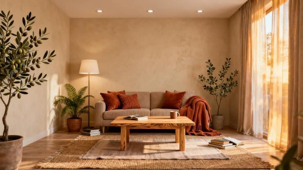
Earthy colours remain an appealing direction for interiors because they create warmth without requiring excessive decoration. Shades inspired by clay, sunbaked soil, natural wood, and autumn landscapes can make a room feel welcoming and grounded.
Look for colours such as:
- Terracotta: A warm reddish-brown shade that works beautifully with cream, timber, and natural stone.
- Caramel: A soft golden brown that adds richness to upholstery, wooden furniture, and decorative accessories.
- Muted ochre: A subdued yellow with earthy undertones that introduces warmth without appearing overly bright.
- Clay pink: A dusty, earthy pink that brings softness to bedrooms and living areas.
- Cinnamon brown: A deeper reddish-brown suitable for accent chairs, cushions, and statement furniture.
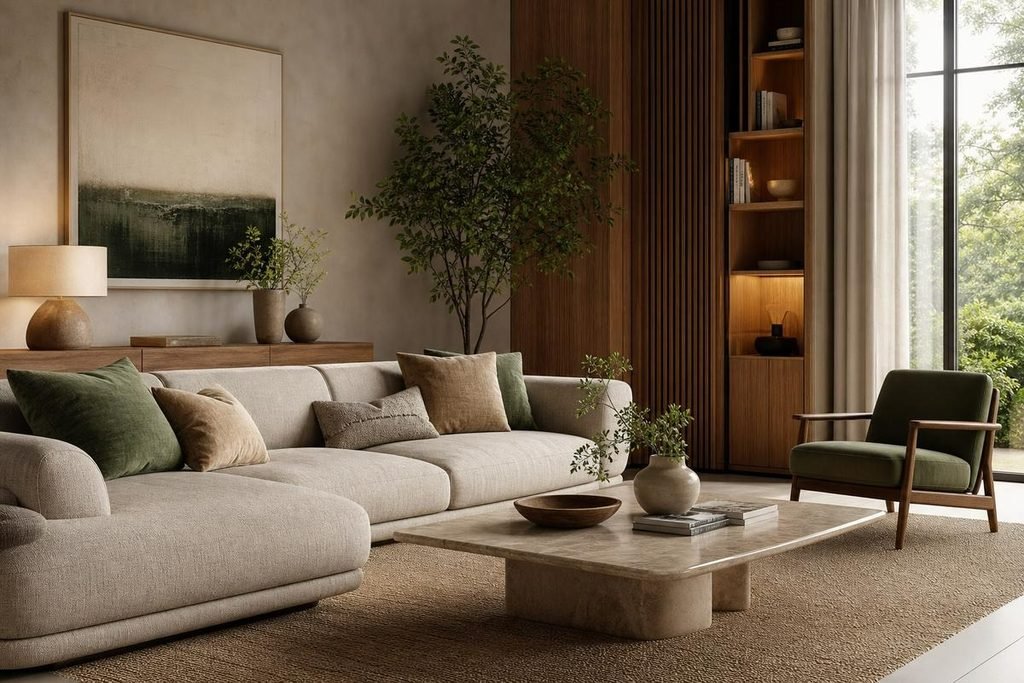
These shades are particularly effective when combined with tactile materials. Imagine a cream sofa, a terracotta ceramic lamp, a caramel leather armchair, and a natural oak coffee table. The colours feel connected because they share warm undertones, while the different textures prevent the room from looking flat.
Styling tip: Choose one dominant earth tone and introduce the remaining shades through smaller elements. Terracotta walls can make a strong statement, so balance them with pale curtains, natural flooring, and understated furniture.
Nature-Inspired Greens Continue to Influence Modern Interiors
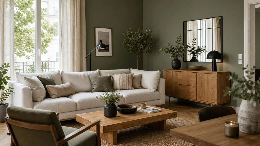
Green is a versatile choice for homeowners who want colour without overwhelming a space. Its wide range of undertones allows it to feel fresh and airy, earthy and relaxed, or dark and sophisticated.
Several green shades are worth considering for 2028-inspired interiors:
- Sage green: A soft, grey-green shade suited to bedrooms, kitchens, and calm living spaces.
- Olive green: A warmer, slightly yellow-green colour that pairs naturally with wood, beige, and brass.
- Moss green: A deeper, organic shade that introduces richness without the intensity of some jewel tones.
- Forest green: A dramatic option for cabinetry, feature walls, bookshelves, and upholstered furniture.
The key is to select a green that complements the room’s fixed finishes. A muted sage may work particularly well with pale oak and cream, while a deeper olive can look striking beside walnut furniture and warm stone surfaces.
Green also offers an easy way to connect interior decoration with natural materials. Linen curtains, woven baskets, wooden furniture, and indoor plants can reinforce the palette without introducing competing colours.
For a simple starting point, try sage green, warm white, and natural oak. This combination suits contemporary, Scandinavian-inspired, and relaxed traditional interiors. Those who prefer a stronger look can replace sage with forest green and introduce brass or dark brown accents.
Complex Blues Add Calm Without Feeling Cold
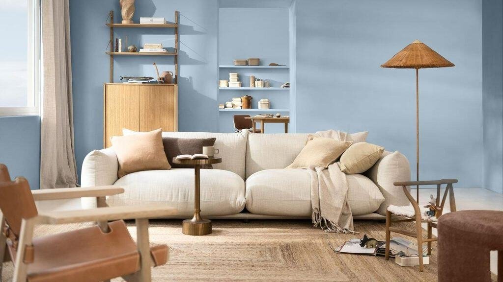
Blue remains a useful choice for interiors, but softer and more complex variations can be easier to incorporate than highly saturated primary blue. Dusty, smoky, and blue-green shades provide colour while maintaining a composed atmosphere.
Consider these options:
- Dusty blue: A softened blue with grey undertones, ideal for bedrooms and living rooms.
- Slate blue: A more grounded shade that suits contemporary furniture and restrained colour palettes.
- Blue-green: A versatile blend that can shift between blue and green depending on the light.
- Muted navy: A deeper colour that works well for cabinetry, doors, accent walls, and upholstered furniture.
The secret to using blue successfully is to consider its temperature. A cool blue can appear even colder in a north-facing room or under cool artificial lighting. Pairing it with warm timber, creamy textiles, and beige upholstery helps create a more balanced result.
For example, dusty blue walls can look elegant with a natural oak bed, ivory bedding, and caramel bedside accessories. In a living room, a navy accent chair can add depth to a palette of warm white, taupe, and walnut.
Best approach: Use lighter blues when you want a gentle, open appearance. Reserve deeper blues for areas where you want stronger contrast or a more intimate atmosphere.
Expressive Accent Colours Give Neutral Rooms More Personality
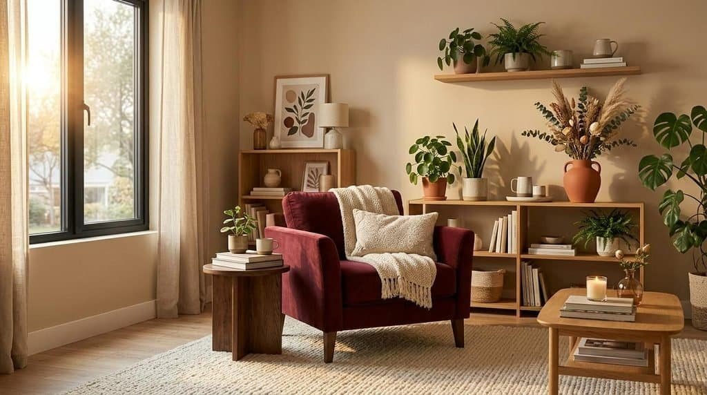
Neutral interiors provide flexibility, but a room dominated by beige, white, and grey can sometimes lack character. Expressive accent colours offer a practical way to introduce individuality without redesigning the entire space.
Burgundy, muted plum, warm yellow, and dusty rose are useful colours to explore in small doses.
Burgundy adds richness to a neutral living room through an accent chair, velvet cushion, or piece of artwork. Muted plum offers a softer, more unusual alternative to conventional purple. Warm yellow introduces an optimistic note, particularly when used in lampshades, ceramics, or patterned textiles.
These colours do not need to cover large surfaces to make an impression. A carefully selected accent can draw attention to a favourite piece of furniture or create a visual connection between otherwise separate areas of a room.
When choosing an accent colour, repeat it at least twice. For example, burgundy cushions can be echoed in artwork or a decorative vase. This repetition makes the scheme feel intentional rather than accidental.
Remember that these shades represent design directions to explore for 2028, rather than a definitive or officially confirmed list of the year’s leading colours. The most successful choice is one that suits your home and remains enjoyable after the initial excitement of a new trend has passed.
Beyond Beige: The New Neutrals Making Rooms Feel Warmer
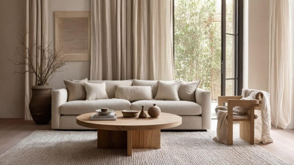
Neutral colours are evolving beyond the stark whites and cool greys that have dominated many modern interiors. For colour trends interior design 2028, warmer neutrals offer a particularly adaptable starting point for rooms that need to feel welcoming, sophisticated, and easy to update.
These shades are not necessarily more colourful in an obvious way. Their appeal comes from subtle undertones that create depth and work naturally with different materials.
The Warm Neutral Shades Worth Considering
| Neutral colour | Overall appearance | Where it works best |
| Creamy white | Soft, bright, and welcoming | Living rooms, kitchens, ceilings, and bedrooms |
| Mushroom | A balanced mix of beige and grey | Living rooms, cabinetry, and hallways |
| Warm taupe | A refined brown-grey neutral | Bedrooms, upholstery, and feature walls |
| Sandy beige | Light, earthy, and relaxed | Open-plan spaces, living rooms, and bathrooms |
| Oatmeal | Soft and understated | Curtains, sofas, bedding, and rugs |
| Greige | A combination of grey and beige | Modern interiors and transitional spaces |
Each shade creates a slightly different atmosphere. Creamy white helps a room feel bright without the starkness of a brilliant white. Mushroom adds understated depth, while warm taupe can make a large room feel more cohesive.
Sandy beige and oatmeal are particularly useful when you want to introduce colour through materials rather than painted surfaces. Linen, wool, jute, and natural wood can add enough variation to prevent a neutral room from looking one-dimensional.
Why Undertones Matter More Than You Think
Two paint colours may appear almost identical on a small sample card but look very different when applied to an entire wall. The reason often comes down to undertones and lighting.
A beige with pink undertones can feel warm and soft, while one with green or grey undertones may appear more subdued. Creamy whites can lean yellow, while some warm greiges have subtle violet or green notes.
Before choosing a paint colour, consider the following:
- Natural light: Rooms with limited daylight may benefit from warmer neutrals that prevent the space from feeling too cold.
- Flooring: Existing wood, stone, and tile colours influence how wall paint appears.
- Artificial lighting: Warm bulbs can emphasise yellow and beige undertones, while cooler bulbs may make the same paint appear more grey.
- Furniture: Upholstery, curtains, and large wooden pieces should complement the chosen wall colour.
Always test at least two or three samples on the actual wall. Observe them at different times of day and alongside your existing furniture before making a final decision.
How to Create a Neutral Palette Without Making It Boring
The most effective neutral rooms use variation rather than relying on a single shade throughout the space.
Try combining three related colours, such as creamy white walls, mushroom upholstery, and warm taupe curtains. Add oak furniture, a textured wool rug, and a stone coffee table to introduce further contrast.
Texture is particularly important when working with a restrained palette. Smooth painted walls, nubby upholstery, woven fabrics, and natural wood each reflect light differently, making the room feel richer without adding more colours.
A useful approach is to combine:
- One light neutral for the largest surfaces.
- One medium neutral for furniture or textiles.
- One darker shade for definition.
- Natural materials to add texture and visual interest.
For a small apartment, creamy white walls and pale oak furniture can establish an airy foundation, while mushroom cushions and a darker taupe rug create depth. In a larger living room, deeper warm taupe walls may feel more intimate, particularly when balanced with lighter furniture.
The takeaway: Warm neutrals are not simply a safe alternative to bold colours. They can form a complete design scheme in their own right, offering a flexible backdrop for both modern minimalism and more layered, characterful interiors.
Nature-Inspired Colour Palettes That Bring the Outdoors Inside
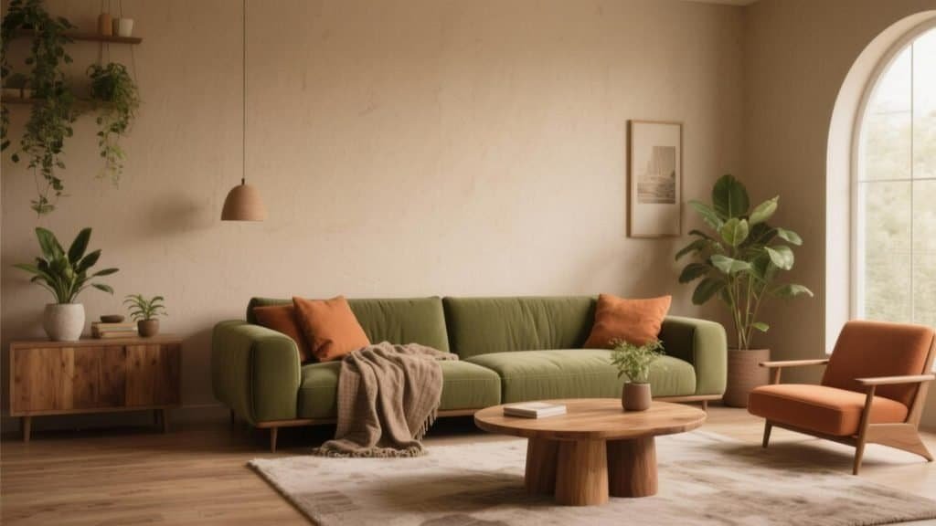
Nature-inspired colour palettes are a strong direction to explore when planning a 2028 interior refresh. Drawing inspiration from forests, gardens, clay, sand, and natural stone creates a connection between the colours in a room and the materials used to furnish it.
These schemes work especially well because their colours often share compatible undertones. Green complements wood, terracotta sits naturally beside sandy beige, and earthy browns provide a grounding contrast to softer shades.
Rather than choosing colours individually, think about the landscape you want to recreate and build a palette around that idea.
Olive Green and Cream for a Relaxed Living Room
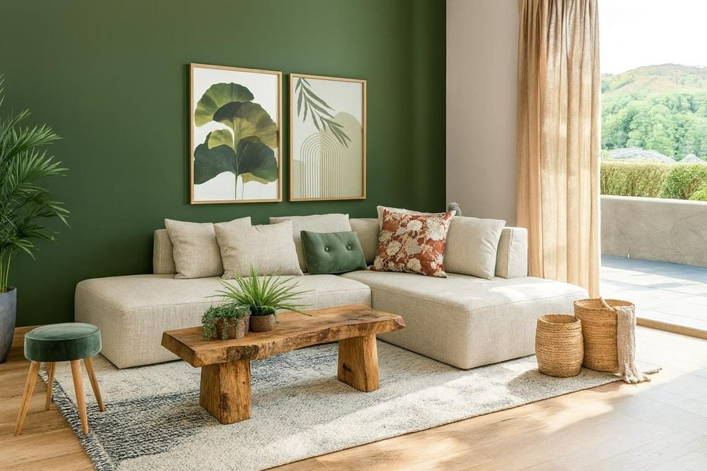
Olive green and cream create a comfortable combination that feels grounded without becoming too dark. The green provides character, while cream keeps the room visually light.
Use olive green on a feature wall, built-in shelving, or an upholstered armchair. Introduce cream through the sofa, curtains, or rug, then add oak furniture and a few black or bronze details for definition.
This palette suits contemporary, rustic, Mediterranean-inspired, and transitional interiors.
For a subtle version, keep the walls creamy white and use olive green in cushions, ceramics, and artwork. If you want a stronger look, apply olive to the walls and use cream for larger furniture and window treatments.
Sage Green and Warm Wood for Calm, Modern Spaces
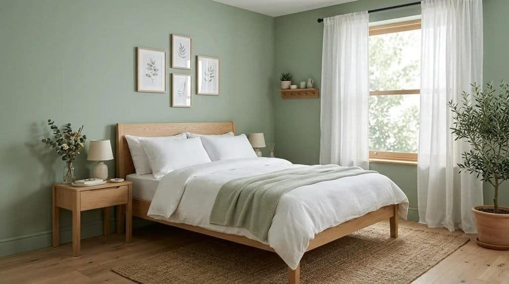
Sage green works particularly well with natural wood because both elements have an understated, organic quality. The combination feels gentle enough for bedrooms but can also suit kitchens, dining rooms, and home offices.
A sage-painted wall behind a natural oak bed creates a soft focal point. Cream bedding, textured curtains, and a wool rug add comfort without introducing too many competing colours.
In kitchens, sage cabinets paired with timber shelves and pale stone worktops create a similar effect. The result feels more distinctive than an all-white kitchen while remaining adaptable to future decorating changes.
Practical tip: Choose a muted sage rather than a highly saturated green if you want the wood grain and other natural materials to remain prominent.
Terracotta and Sand for Warm, Sunlit Interiors
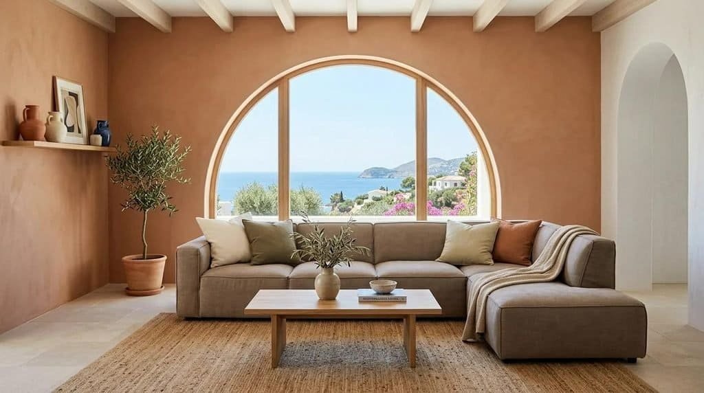
Terracotta and sand evoke sun-warmed landscapes and natural building materials. This combination can bring warmth to rooms that otherwise feel plain, especially when paired with soft lighting and tactile fabrics.
Use sandy beige as the dominant shade and introduce terracotta through a feature wall, patterned rug, decorative tiles, or ceramics. Natural stone, linen, and pale timber help soften the contrast.
This palette works well in dining areas, living rooms, sunrooms, and spaces with Mediterranean or modern rustic influences.
If your room receives strong sunlight, terracotta can appear more vivid during the day. Testing the paint before committing is particularly important when using warm, earthy shades across large surfaces.
Moss Green and Chocolate Brown for a Richer Look
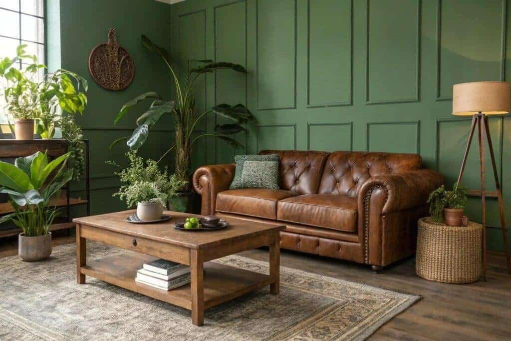
Moss green and chocolate brown offer a deeper interpretation of nature-inspired decorating. Instead of creating a bright, airy interior, this pairing produces a more enveloping atmosphere with plenty of visual character.
Moss green works well on walls, cabinetry, or upholstered furniture, while chocolate brown adds weight through leather seating, walnut furniture, or darker accessories. Cream textiles can provide contrast and prevent the overall palette from feeling too heavy.
This combination is particularly effective in reading corners, studies, dining rooms, and living rooms where a more intimate mood is desirable.
To make the scheme work in a smaller room, avoid covering every surface in dark colours. Introduce lighter curtains, a pale rug, and reflective accents to maintain visual balance.
How to Combine Natural Colours With Materials
Colour and material choices should support each other. Even a beautiful palette can feel disconnected when the finishes do not work together.
Use this simple guide when planning your scheme:
| Colour palette | Materials to consider | Best finishing touch |
| Olive and cream | Oak, linen, limestone | Bronze or black accents |
| Sage and warm wood | Pale timber, wool, cotton | Handmade ceramics |
| Terracotta and sand | Travertine, jute, textured plaster | Woven accessories |
| Moss green and chocolate brown | Walnut, leather, velvet | Cream textiles |
| Forest green and warm white | Dark timber, stone, brushed metal | Warm ambient lighting |
The aim is not to use every material listed. Choose two or three that complement your preferred palette and repeat them throughout the room for a cohesive appearance.
Start with one combination that feels natural to you. Test it with paint samples, fabric swatches, or a small arrangement of accessories before committing to a larger change. A well-chosen palette can transform the atmosphere of a room without requiring new furniture or a complete renovation.
Bold or Muted? Choosing the Right Colour Mood for Every Room
One of the most important colour trends interior design 2028 brings into focus is the balance between understated shades and more expressive colours. Some interiors benefit from soft, muted palettes that create a peaceful atmosphere, while others come alive with deeper tones and confident contrasts.
The right choice depends on more than personal taste. Natural light, room proportions, furniture, and the way you use a space all influence how a colour scheme feels once it is in place.
Muted Colours for Calm, Comfortable Interiors
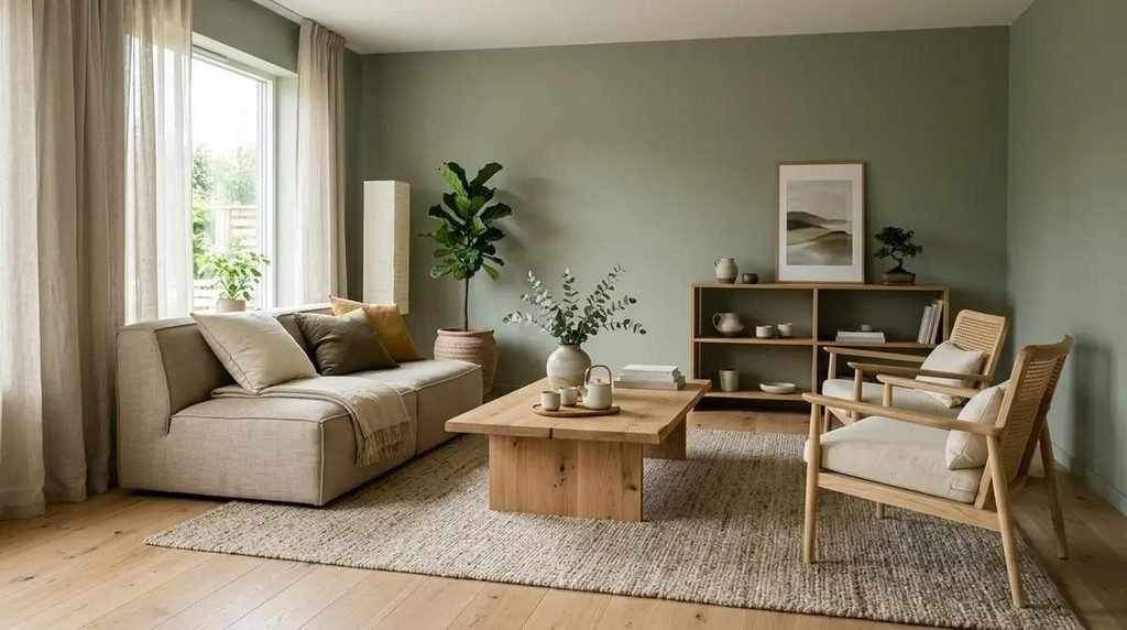
Muted colours have a softened appearance because they contain grey, brown, or other subdued undertones. Sage green, dusty blue, mushroom, muted rose, and soft clay are good examples.
These shades are particularly useful when you want a room to feel relaxed without relying entirely on white or beige. They provide enough colour to establish a distinctive style while remaining easy to coordinate with furniture and accessories.
Consider using muted colours in:
- Bedrooms: Dusty blue, sage, and muted mauve can create a restful visual atmosphere.
- Living rooms: Mushroom, clay, and soft olive work well with natural materials and comfortable upholstery.
- Home offices: Soft blue-green and warm grey-beige provide colour without creating excessive visual contrast.
- Small apartments: A consistent palette of muted shades can help connected spaces feel cohesive.
Muted colours also make it easier to introduce patterns. A sage-green room, for example, can accommodate striped cushions, botanical artwork, and textured rugs without feeling visually crowded.
The secret is to combine different depths of colour. Pale sage walls, medium-toned wood, and darker green accessories create more interest than using nearly identical shades throughout the room.
Saturated Colours for Interiors With More Character
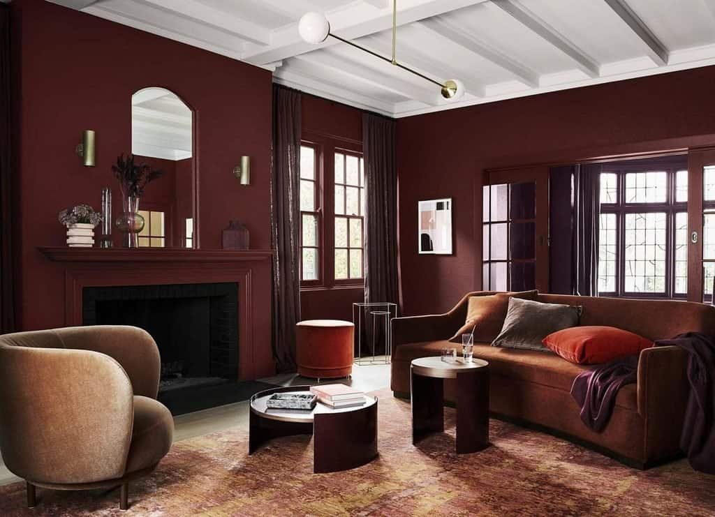
Saturated colours create stronger visual impact. Deep burgundy, forest green, navy, aubergine, and rich chocolate brown can make a room feel distinctive and carefully considered.
These colours are especially effective when you want to highlight an architectural feature, create a focal point, or give a familiar room a more individual character.
A deep burgundy wall behind a dining table can establish an intimate setting. Forest-green cabinetry can make a kitchen feel more substantial, while a navy armchair can introduce contrast into a neutral living room.
However, saturated colours need thoughtful placement. Using several intense shades across large surfaces can make a room feel busy, particularly when the furniture, flooring, and decorative accessories also compete for attention.
Try these approaches:
- Paint one wall in a deep shade while keeping the remaining walls lighter.
- Use rich colours on cabinetry, interior doors, or built-in shelving.
- Introduce saturated colours through velvet upholstery, rugs, or artwork.
- Balance darker colours with warm whites, natural timber, and lighter textiles.
A useful rule: The more visually intense the colour, the more carefully you should consider its surroundings. A single dramatic shade can be more effective than several competing statement colours.
How Natural Light Changes the Way Colours Look
The same paint colour can appear completely different depending on the direction of the windows, the amount of daylight, and the type of artificial lighting.
Rooms with abundant natural light can often accommodate stronger colours because daylight helps reveal their undertones. Spaces with limited sunlight may benefit from warmer shades that prevent the room from feeling overly cool.
Here is a practical starting point for choosing colours according to your room’s conditions.
| Room condition | Colours worth testing | Design approach |
| Bright, sunny room | Sage, dusty blue, warm white | Balance daylight with softer tones |
| Limited natural light | Cream, warm taupe, muted terracotta | Introduce warmth and layered lighting |
| Small room | Pale mushroom, soft sage, creamy white | Maintain visual continuity |
| Large open-plan room | Olive, caramel, warm greige | Define separate zones with colour |
| Room with dark timber | Cream, muted blue, warm beige | Balance darker finishes with lighter shades |
These are guidelines rather than strict rules. A small room can look beautiful in dark green, and a bright room can accommodate a deep brown palette. The important consideration is the atmosphere you want to create.
Before painting, place large colour samples on different walls and observe them in morning, afternoon, and evening light. Check them beside your flooring, furniture, and curtains. This simple step can prevent expensive mistakes.
Choosing Colours According to the Room’s Purpose
Colour can help communicate how a space should feel and function.
In a bedroom, you might prefer a quieter combination of sage, creamy white, and natural oak. A dining room could benefit from richer terracotta or burgundy, while a creative workspace might suit dusty blue with a warm yellow accent.
Think about the room’s primary purpose before selecting a palette:
- For relaxation: Choose soft greens, muted blues, and warm neutrals.
- For social spaces: Consider earthy colours, warm browns, and carefully selected accent shades.
- For concentration: Try restrained blue-green, mushroom, or soft olive.
- For visual drama: Explore navy, burgundy, forest green, or chocolate brown.
The goal is not to follow rigid rules about which colours belong in which rooms. Instead, use colour intentionally to support the way you live.
Room-by-Room Inspiration: How to Use Interior Design Colour Trends in 2028
The easiest way to apply interior design colour trends in 2028 is to consider each room separately while maintaining a consistent overall palette. You do not need to paint every room the same colour. A shared undertone, repeated accent shade, or common material can connect different spaces naturally.
Living Rooms: Layered Neutrals and Confident Accents
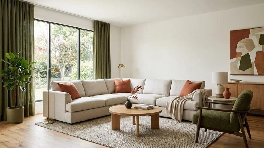
Living rooms are ideal places to experiment with colour because they usually contain several elements that can be updated independently. Walls, sofas, rugs, curtains, artwork, and accessories all provide opportunities to introduce a new palette.
For 2028-inspired living rooms, consider starting with warm white, oatmeal, or mushroom as the foundation. Add olive green, dusty blue, terracotta, or burgundy to create depth.
Three living room colour schemes to try:
- Relaxed and natural: Cream walls, sage-green cushions, oak furniture, and a beige rug.
- Warm and contemporary: Mushroom walls, caramel upholstery, terracotta accessories, and walnut details.
- Rich and sophisticated: Warm white walls, a forest-green accent chair, chocolate-brown furniture, and brass lighting.
The first scheme works particularly well for homes that receive plenty of daylight and feature natural materials. The second is suited to interiors that need additional warmth, while the third creates a stronger contrast without requiring dark paint throughout the room.
If you have a large neutral sofa that you do not want to replace, use it as the foundation for the new colour scheme. Cushions, throws, and artwork can introduce a completely different mood at a fraction of the cost of buying new furniture.
For open-plan homes, repeat one or two colours across the living and dining areas. An olive-green accent in the living room, for example, could be echoed in dining chairs or kitchen accessories to create a subtle connection between the spaces.
Kitchens: Colourful Cabinetry and Softer Contrasts
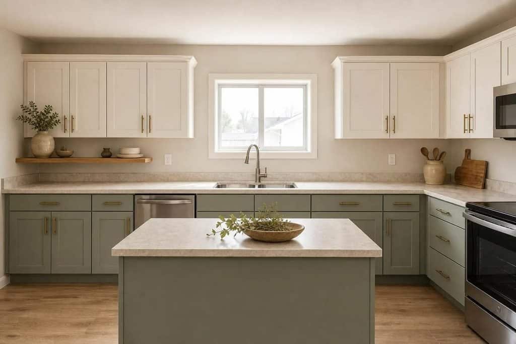
Kitchen colour trends are moving beyond the assumption that cabinets must be white to remain timeless. Muted greens, warm creams, earthy browns, and sophisticated blues offer ways to introduce personality while keeping the kitchen practical and visually balanced.
Cabinetry is often the most influential colour element in a kitchen because it occupies a substantial amount of visible space. Choosing the right shade can transform the room without changing its layout.
Olive-green cabinetry pairs beautifully with oak shelves, cream walls, and warm stone worktops. It creates a natural appearance that works in contemporary, transitional, and rustic kitchens.
Warm cream cabinets offer a softer alternative to bright white. They complement timber, beige stone, and brushed metal finishes while helping the kitchen feel light.
Deep blue cabinets create a more defined, tailored appearance. They work particularly well when balanced with pale worktops, warm wood, and adequate task lighting.
Earthy brown cabinets can make a kitchen feel rich and grounded. Consider medium brown or walnut finishes if you want warmth without relying on a heavily saturated paint colour.
How to Combine Kitchen Colours Successfully
A practical kitchen palette usually includes three main elements: cabinetry, worktops or backsplash, and flooring or other fixed finishes.
Use the following combinations as starting points:
| Cabinet colour | Worktop and backsplash | Complementary finishes |
| Olive green | Cream or warm white stone | Natural oak and brass |
| Warm cream | Beige or softly veined stone | Walnut and bronze |
| Dusty blue | Pale quartz or limestone-look surfaces | Oak and brushed nickel |
| Chocolate brown | Cream stone or warm beige tile | Brass and lighter timber |
| Sage green | Warm white or sandy surfaces | Natural wood and understated metal |
Before committing to a cabinet colour, examine it beside the actual worktop and flooring samples. Colours can shift noticeably when viewed together, especially under artificial kitchen lighting.
If replacing cabinets is outside your budget, painting suitable existing doors, changing handles, adding colourful bar stools, or introducing accessories can deliver a similar visual refresh.
Bedrooms: Restful Colours With More Personality
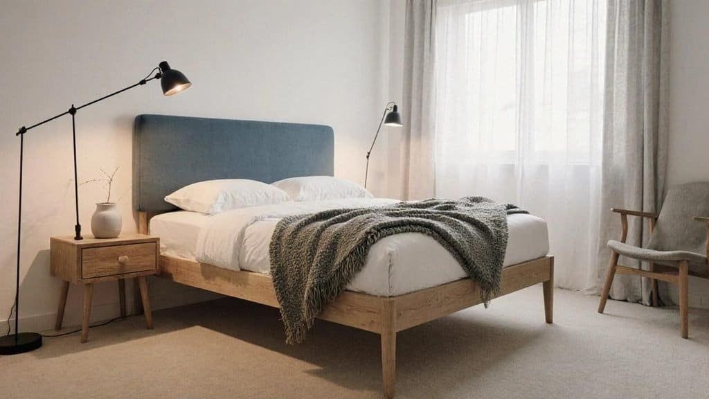
bedrooms-yourway-eastyorkshire.co.uk
Bedrooms benefit from colour schemes that feel comfortable and cohesive. Rather than choosing a shade simply because it is fashionable, consider whether you will enjoy seeing it every morning and evening.
Dusty blue, sage green, warm taupe, and muted mauve are useful starting points for a bedroom inspired by the colour directions of 2028.
Dusty blue pairs well with cream bedding and natural timber. Sage creates a gentle connection with nature, while warm taupe offers a more understated look that can accommodate changing bedding and accessories.
Muted mauve introduces a subtle decorative quality without the intensity of bright purple. It can work particularly well with oatmeal textiles, walnut furniture, and soft white walls.
Four Ways to Introduce Bedroom Colour
- Paint the wall behind the bed: Create a focal point with sage, dusty blue, or a warm earthy shade.
- Change the bedding: Use a combination of two or three complementary colours rather than a matching set in one shade.
- Introduce an upholstered headboard: A coloured headboard can add depth without requiring a feature wall.
- Layer curtains and rugs: Use textiles to repeat the main colour and create a more complete scheme.
For a small bedroom, consider keeping the larger surfaces light and introducing stronger shades through the headboard, bedding, and artwork. Larger bedrooms can accommodate deeper wall colours, particularly when there is sufficient natural light and a clear contrast between walls and furnishings.
Avoid introducing too many unrelated accent colours. A bedroom with sage walls, dusty blue bedding, terracotta cushions, and burgundy curtains may feel disconnected unless the shades are carefully balanced. A restrained palette usually creates a more restful result.
Bathrooms: Spa-Inspired Shades Beyond White
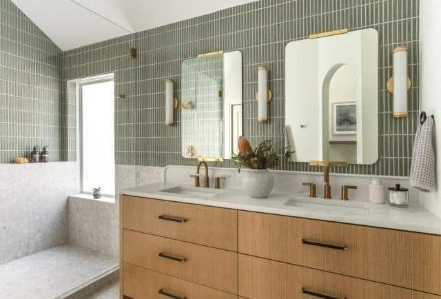
Bathrooms offer excellent opportunities to experiment with colour through tiles, painted walls, vanities, and accessories. Although white remains a practical choice, warmer and more nature-inspired shades can make a bathroom feel distinctive without sacrificing a clean appearance.
Mineral green is a useful option for wall tiles or vanity cabinetry. Combined with pale stone, natural timber, and simple fixtures, it creates a relaxed, organic look.
Warm limestone tones work well for bathrooms where you want a soft, understated palette. Beige tiles, creamy walls, and textured towels can create visual warmth without requiring strong colours.
Deep blue adds contrast and can be particularly effective on a vanity unit or within a shower feature area. Balance it with lighter surfaces to prevent the room from feeling enclosed.
Terracotta-inspired shades introduce warmth and character, especially when used in patterned tiles or small decorative details.
What to Consider Before Choosing Bathroom Colours
Bathroom lighting and surface finishes have a major influence on the final appearance. Glossy tiles reflect more light than matte surfaces, while textured materials can make colours appear deeper or more subdued.
Moisture resistance is equally important. Choose products specifically designed for bathrooms and follow the manufacturer’s recommendations for ventilation, surface preparation, and maintenance.
A simple bathroom palette could combine sandy beige tiles, a sage-green vanity, and warm white walls. Another option is a cream bathroom with a deep-blue vanity and brushed-metal fixtures.
For smaller bathrooms, repeating one light colour across several surfaces can help the space feel more continuous. A darker accent can still work, but consider placing it on a vanity, a limited tile area, or accessories rather than using it on every surface.
The best bathroom colour scheme should complement the fixed finishes, provide enough contrast for visual definition, and remain practical to maintain.
Unexpected Colour Combinations That Could Define Interiors in 2028
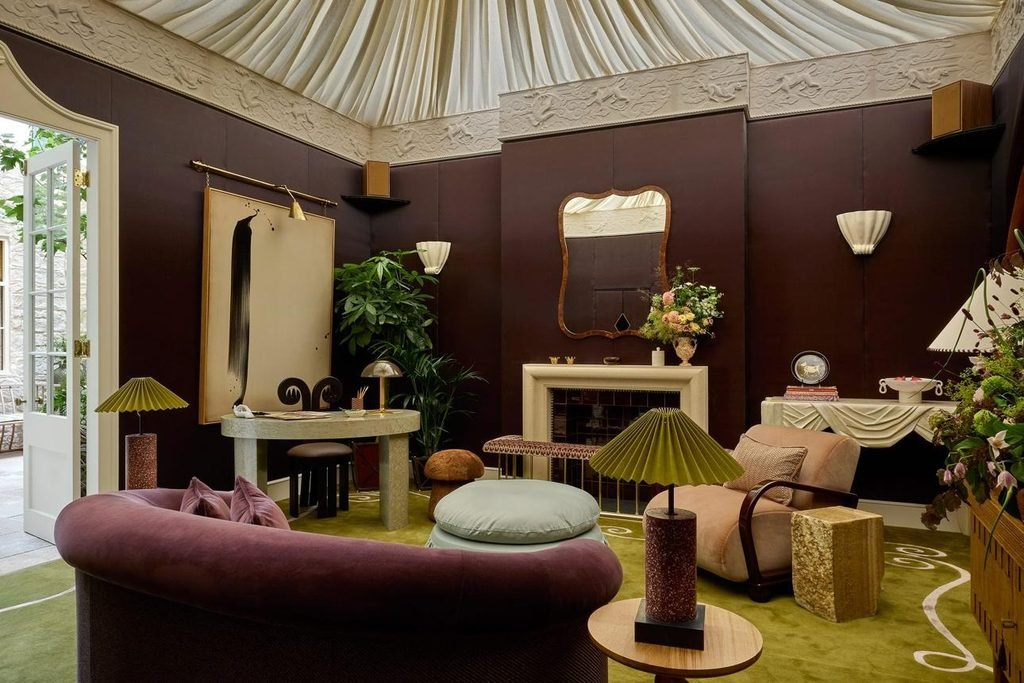
Some of the most memorable interiors come from colour combinations that initially seem unusual. Pairing colours from different families can create depth, contrast, and a more individual look than relying on a familiar neutral palette.
The key is to find a visual connection between the shades. Similar undertones, repeated materials, or a clear difference in colour intensity can help an unexpected pairing feel deliberate.
These combinations are worth exploring when planning an interior refresh for 2028.
Burgundy and Dusty Pink: Rich Colour With a Softer Edge
Burgundy is a deep, expressive shade, while dusty pink is softer and more subdued. Together, they create a layered palette that feels decorative without necessarily appearing overly formal.
Use burgundy as the dominant accent through an upholstered chair, artwork, or selected wall. Introduce dusty pink in cushions, curtains, or a smaller piece of furniture.
Cream, warm taupe, and walnut can help connect the two colours. The wood provides grounding, while lighter neutrals keep the palette from becoming too heavy.
This combination works particularly well in bedrooms, reading corners, and living rooms that need a little more character.
Best tip: If you are uncertain about using burgundy, begin with one substantial accent piece and repeat dusty pink in two smaller accessories.
Olive Green and Butter Yellow: Natural With a Sunny Accent
Olive green and butter yellow share a warm, slightly earthy quality. The result is a colour combination that feels lively without relying on intense primary colours.
Olive works well on cabinetry, accent walls, and upholstery. Butter yellow can be introduced through a lampshade, ceramic vase, artwork, or occasional chair.
In a kitchen, olive cabinets paired with creamy walls and small yellow accessories can create a welcoming atmosphere. In a living room, an olive-green sofa with butter-yellow cushions offers a similar effect without a major renovation.
Warm white and pale timber are useful supporting finishes because they allow both colours to stand out without competing.
Chocolate Brown and Powder Blue: Warmth Meets Freshness
Chocolate brown provides depth, while powder blue introduces a cooler, lighter contrast. This pairing can make a neutral room feel more considered and contemporary.
A chocolate-brown sofa against a powder-blue wall creates a clear focal point. Alternatively, keep the walls creamy white and combine walnut furniture with blue cushions, artwork, or a rug.
The contrast works because the two colours serve different purposes. Brown anchors the room, while blue prevents the palette from becoming visually heavy.
This combination is particularly effective in living rooms, studies, and bedrooms where you want a balance between warmth and freshness.
Terracotta and Muted Lavender: An Unexpected Earthy Pairing
Terracotta and lavender may seem like unlikely partners, but muted versions of these colours can create an interesting balance. Terracotta introduces warmth, while lavender adds a cooler, slightly romantic quality.
The trick is to avoid choosing shades that are too bright or highly saturated. A dusty lavender with grey undertones is generally easier to coordinate with earthy terracotta than a vivid purple.
Consider terracotta cushions against a muted lavender wall, or use a terracotta feature wall with lavender artwork and understated cream upholstery.
Natural wood, linen, and sandy beige help bridge the two shades, creating a more cohesive appearance.
This combination suits creative interiors, bedrooms, and living spaces where you want something less conventional than green and beige.
Navy and Warm Caramel: A Timeless Combination With Modern Appeal
Navy and caramel offer a useful balance between cool depth and warm richness. Navy creates a strong visual anchor, while caramel introduces a softer, inviting contrast.
A navy accent chair with caramel leather details can give a neutral living room more definition. In a study, navy cabinetry combined with caramel seating and walnut furniture can create a polished appearance.
For a lighter interpretation, use warm white walls, a caramel sofa, and navy cushions or artwork.
The combination also works with a range of finishes, including brass, dark wood, cream textiles, and pale stone.
How to Balance Unexpected Colour Combinations
The easiest way to make an unusual palette work is to establish a clear hierarchy. One colour should lead, another should support it, and a third should provide contrast or visual relief.
A useful starting point is the 60–30–10 approach:
- 60% dominant colour: The main shade across walls, large furniture, or other substantial surfaces.
- 30% supporting colour: A complementary shade used for upholstery, curtains, cabinetry, or rugs.
- 10% accent colour: A stronger or contrasting shade introduced through artwork, cushions, lighting, and accessories.
These proportions are flexible rather than strict rules. A room with predominantly neutral walls may use a darker colour for a large sofa, while a bold feature wall might require fewer additional accents.
For example, a living room using chocolate brown and powder blue could feature warm white walls as the dominant background, a brown sofa as the supporting element, and powder-blue accessories for contrast. The colours remain noticeable without overwhelming the space.
Before committing to a new palette, test the combination with real materials. Put paint samples beside fabric swatches, flooring samples, and furniture finishes. If the colours still look appealing under different lighting conditions, you have a stronger foundation for the rest of the room.
The most successful colour combinations are not necessarily the boldest. They are the ones that feel balanced, suit the architecture, and reflect the way you want your home to look and feel.
Paint, Furniture, or Accessories? Where to Introduce the Colours of 2028
You do not need to renovate your entire home to embrace colour trends interior design 2028. Sometimes, changing a few accessories or repainting a single wall can make a room feel noticeably different. The best approach depends on your budget, how long you plan to keep the colour scheme, and whether you want a subtle refresh or a more dramatic transformation.
Before buying paint or furniture, identify which elements of your room already work well. Existing flooring, sofas, wooden furniture, and countertops can provide a useful starting point for building a new palette.
Paint: The Most Direct Way to Transform a Room
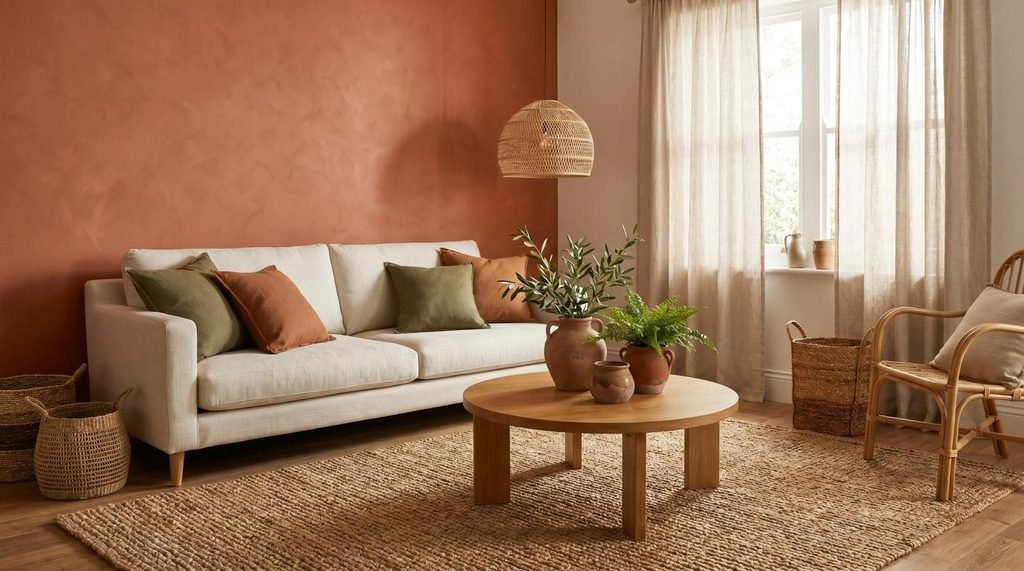
Paint is one of the most effective ways to introduce a new colour because it changes the visual backdrop of a room. A carefully chosen wall colour can make existing furniture look more coordinated without requiring expensive replacements.
For a 2028-inspired update, consider these options:
- Warm neutrals: Repaint cool grey walls in creamy white, mushroom, or warm taupe to create a softer atmosphere.
- Nature-inspired greens: Use sage or olive on a feature wall, kitchen cabinetry, or built-in shelving.
- Earthy shades: Introduce terracotta or clay to create a warmer focal point in a living room or dining area.
- Deeper colours: Try forest green, navy, or chocolate brown where you want greater depth and contrast.
A feature wall can be a useful starting point if you are uncertain about using a strong colour. However, painting every wall the same shade can sometimes produce a more cohesive result, particularly when the colour is muted and the room has plenty of natural light.
The decision should depend on the space rather than an assumption that one painted wall is always best.
Practical tip: Test paint samples directly on your walls and view them beside your furniture. Choose a finish suited to the surface and the room’s needs, and prepare the wall properly before painting. These steps will usually have a greater impact on the finished result than selecting a fashionable colour alone.
Furniture: Make a Statement Without Repainting
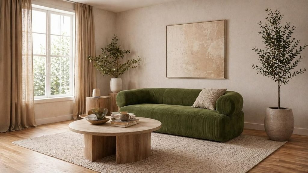
Furniture provides another way to introduce colour, especially when you want to preserve existing wall finishes. A coloured sofa, accent chair, dining table, or upholstered headboard can become the centrepiece of a room.
Olive-green sofas work beautifully with cream walls and natural wood. Dusty-blue armchairs can introduce a cooler contrast to warm neutral interiors, while caramel leather seating adds richness to minimalist spaces.
Before purchasing a coloured furniture piece, consider how easily it will work with future decorating changes.
Ask yourself:
- Does the colour complement the existing flooring and wall finishes?
- Can it work with at least two or three other colours?
- Will it suit the room if you change the curtains, cushions, or rug?
- Does the material suit your household’s daily needs?
- Is the colour appealing enough to live with beyond the current trend cycle?
Large furniture purchases deserve more consideration than small decorative updates. If you love a bold shade but are unsure about its long-term appeal, try introducing it through an accent chair or upholstered footstool before committing to a large sofa.
Furniture can also be refreshed rather than replaced. Reupholstering an older chair, painting suitable wooden furniture, or replacing removable cushion covers may give you the look you want at a lower cost.
Accessories: The Easiest Way to Experiment With New Colours
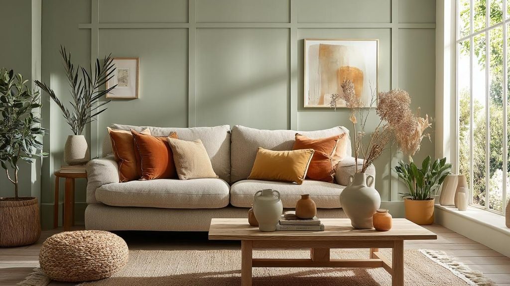
Accessories are ideal for testing new colour combinations without making permanent changes. They allow you to experiment with the shades of 2028 while keeping your existing furniture and wall colours.
Useful items include:
- Cushion covers and throws
- Curtains and decorative rugs
- Table lamps and coloured lampshades
- Ceramic vases and decorative bowls
- Artwork, framed prints, and picture frames
- Bedding, towels, and table linens
A neutral living room can take on a completely different character with olive-green cushions, a terracotta vase, and a warm yellow lampshade. These additions introduce colour while allowing the main furniture pieces to remain unchanged.
Accessories are particularly useful for renters who cannot repaint walls or replace fixed finishes. They also make seasonal changes easier because smaller items can be stored and reused.
To avoid a scattered appearance, repeat accent colours across the room. If you introduce dusty blue through cushions, echo it in artwork or a small decorative object. Repetition helps the colour scheme feel intentional.
Budget-Friendly Ways to Refresh Your Colour Palette
The cost of a colour update varies considerably depending on room size, material choices, preparation, and whether you hire professionals. Rather than assuming a new palette requires a major investment, start with the changes that offer the most visual impact.
| Budget level | What to update | Possible result |
| Low | Cushion covers, ceramics, artwork, and lampshades | A fresh accent palette without permanent changes |
| Moderate | Curtains, rugs, selected furniture, or a DIY paint project | A more noticeable transformation |
| Higher | Professional painting, cabinet refinishing, or new upholstered furniture | A more substantial and coordinated update |
| Renovation-level | New cabinetry, worktops, flooring, and major finishes | A comprehensive redesign |
These are relative spending categories, not fixed price estimates. Actual costs depend on your location, materials, room dimensions, and labour requirements.
For the best value, prioritise items that affect the largest visible areas. Repainting a wall or changing curtains may make a bigger difference than buying several small decorative accessories.
A sensible strategy is to establish the palette first, then purchase only the pieces that help complete it. This reduces the risk of buying attractive items that do not work together.
How to Choose a 2028 Interior Colour Palette That Still Feels Timeless
Trends can provide useful inspiration, but your home should not feel outdated as soon as the next colour forecast appears. The most successful interior colour trends for 2028 are those you can adapt to your own preferences, existing finishes, and long-term decorating plans.
Rather than copying a complete room from a photograph, identify the specific colours and materials that appeal to you. Then consider how they would work in your actual space.
Start With the Elements You Cannot Easily Change
Flooring, countertops, tiles, fireplaces, and large pieces of furniture often determine which colours will work best in a room. Choosing wall paint before considering these elements can lead to combinations that feel slightly mismatched.
Begin by identifying the undertones in your fixed finishes.
A honey-toned wooden floor may work beautifully with warm white, olive green, or terracotta. Cool grey flooring may be easier to coordinate with dusty blue, soft greige, or selected neutral shades that share its cooler character.
If your kitchen already has cream stone worktops, choosing cabinetry in a compatible warm neutral can create a cohesive look. Introducing a contrasting green or blue is also possible, provided the colours work with the existing finishes.
The practical rule: Work from the elements that are hardest to replace toward the details that are easiest to update.
A useful order is:
- Flooring, tiles, and other permanent finishes
- Large furniture and cabinetry
- Wall colours
- Curtains, rugs, and upholstery
- Decorative accessories and accent colours
This approach makes it easier to build a coordinated palette without replacing items that are still in good condition.
Choose a Foundation, a Supporting Colour, and an Accent
A room can contain several colours without feeling chaotic, provided each one has a clear purpose.
Start with a foundation colour that works across the largest surfaces. Warm white, sandy beige, mushroom, or soft greige can provide a versatile background.
Next, choose a supporting shade that gives the room more character. Olive green, dusty blue, caramel, or terracotta can work well, depending on the mood you want to create.
Finally, select an accent colour to add contrast. Burgundy, muted plum, butter yellow, or a deeper shade of green can provide the finishing touch.
For example, a contemporary living room could use:
- Foundation: Creamy white walls
- Supporting colour: Olive-green upholstery
- Accent: Terracotta cushions and ceramics
- Materials: Oak, linen, and natural stone
The result feels connected because the main colours are repeated through different elements rather than introduced randomly.
You can also reverse the hierarchy. A room with deep green walls might use cream furniture as the main contrast, with caramel accessories providing warmth.
The proportions do not need to follow a rigid formula. Focus on whether the dominant colour, supporting shades, and accents feel balanced when viewed together.
Test Colours Before Making a Final Decision
Paint samples, fabric swatches, and material samples are valuable tools because colour changes according to its surroundings.
A dusty blue may appear soft and grey in one room but more vivid in another. Cream can look warm beside cool white finishes and more neutral beside natural timber.
Follow these steps before committing to a palette:
- Collect samples: Choose a few paint colours and fabric or material swatches that fit your intended palette.
- Place them together: View the samples beside your flooring, furniture, and fixed finishes.
- Check different lighting conditions: Observe the colours in daylight and under your normal evening lighting.
- Test large enough areas: Small paint cards may not reveal how a colour will look across an entire wall.
- Live with the samples: Give yourself time to see the combination in everyday conditions before purchasing materials.
Avoid choosing paint based solely on photographs or digital colour previews. Screens can display shades differently, and professionally styled interiors may use lighting that differs considerably from your home.
Avoid Building Your Entire Home Around One Trend
A fashionable colour can be a useful starting point, but using it everywhere may make your home feel repetitive.
Instead, create continuity through related undertones, recurring materials, and a small number of repeated accent colours. The living room might feature olive-green upholstery, while the kitchen uses a softer sage shade. A bedroom could introduce warm taupe and creamy white, with natural timber connecting it to the rest of the home.
This approach allows every room to have its own identity while maintaining a consistent overall style.
It is also worth considering how your preferences might change. If you enjoy experimenting, keep larger permanent surfaces relatively adaptable and use accessories for more adventurous colours. If you know you love deep green or burgundy, incorporating these shades into larger design elements can be a rewarding choice.
Timeless design does not mean avoiding colour. It means choosing colours that work with your home and your lifestyle rather than relying entirely on what is fashionable at a particular moment.
Frequently Asked Questions About Colour Trends Interior Design 2028
What are the biggest colour trends in interior design for 2028?
Promising directions to explore include warm neutrals, earthy terracotta, olive and sage greens, complex blues, chocolate brown, and expressive accents such as burgundy and muted plum. These are design directions rather than a definitive ranking of officially confirmed colours.
What is the best neutral colour for a modern home in 2028?
Creamy white, mushroom, warm taupe, sandy beige, and soft greige are versatile choices. The best option depends on your natural light, flooring, furniture, and preferred atmosphere. Test samples in your home before committing.
Are green walls still a good choice for 2028 interiors?
Yes. Sage, olive, moss, and forest green can all work well in contemporary interiors. Choose lighter, muted greens for a softer appearance or deeper shades when you want a stronger focal point.
Which interior colours make a small room look bigger?
Creamy white, pale beige, soft greige, and muted pastels can help a room feel bright and open, particularly when paired with good lighting and visual continuity. Dark colours can also work in small rooms when used intentionally, so room size alone should not determine your palette.
What colours go well together in modern interior design?
Warm white and olive green, terracotta and sand, dusty blue and caramel, sage and oak, and burgundy with dusty pink are useful combinations. Repeating colours through furniture, textiles, and accessories helps create a cohesive appearance.
How can I update my home with 2028 colour trends on a budget?
Start with cushion covers, throws, artwork, lampshades, ceramics, or a small DIY painting project. Reusing existing furniture and coordinating it with a new accent palette can make a room feel refreshed without requiring a complete renovation.
Are warm or cool colours better for interior design in 2028?
Neither is universally better. Warm colours can create an inviting atmosphere, while cooler shades such as dusty blue can provide a calm, balanced appearance. Consider your room’s lighting, existing finishes, and the mood you want to achieve.
How do I choose an interior paint colour that will not look outdated quickly?
Choose a colour that complements permanent finishes and furniture you intend to keep. Warm neutrals, muted greens, and softened blues can provide flexible foundations, while trend-led shades can be introduced through accessories that are easy to change.
How should I test interior paint colours before buying them?
Apply sample paint to the actual wall or a suitable large sample board. View it at different times of day and beside your flooring, furniture, and curtains. Check the colour under your usual artificial lighting before making a final decision.
Bring the Colour Trends of 2028 Into Your Home
Colour trends interior design 2028 offer plenty of opportunities to create interiors that feel warm, distinctive, and personal. From the understated appeal of mushroom and creamy white to the richness of olive green, terracotta, chocolate brown, and burgundy, there are options for almost every decorating style.
The most effective approach is to start with your existing space, identify the atmosphere you want to create, and select a palette that supports it. You might refresh a living room with earthy accessories, introduce sage-green cabinetry into a kitchen, or use dusty blue and warm neutrals to create a more restful bedroom.
You do not need to embrace every trend to create a modern home. Choose one colour combination that genuinely appeals to you, test it in your space, and build the rest of the room around it. Small, thoughtful changes can make a home feel more current while preserving the character and comfort that make it yours.
