
Kitchen colour schemes 2027 are moving towards warmer neutrals, nature-inspired greens, earthy browns, soft blues, and expressive colour combinations that make kitchens feel more personal. Whether you are planning a complete renovation or simply refreshing your cabinets and walls, the right palette can transform your kitchen into a welcoming, stylish, and functional space.
The most exciting kitchen colour ideas for 2027 are not just about choosing a fashionable paint shade. They focus on how colours work together with natural wood, stone countertops, backsplashes, lighting, and hardware. A carefully planned combination can make a small kitchen feel brighter, give a large kitchen more character, or bring warmth to a minimalist interior.
From elegant cream and sage green combinations to dramatic chocolate brown cabinets and colourful kitchen islands, there are plenty of ways to update your space without sacrificing timeless appeal. This guide explores the kitchen colour trends worth considering, explains how to combine popular shades, and offers practical ideas for different layouts, budgets, and interior styles.
In This Article
Kitchen Colour Schemes 2027: The Biggest Palette Trends to Know
Kitchen design is becoming more expressive, with colour playing a bigger role in creating atmosphere and defining the character of a room. Rather than relying exclusively on bright white cabinets and cool grey surfaces, many contemporary palettes explore warmer undertones, natural materials, and carefully balanced contrasts.
The appeal of these kitchen colour schemes lies in their flexibility. You can introduce a new shade through a painted island, commit to colourful cabinetry, or build an entire design around complementary tones.
Warm Neutrals Are Replacing Stark White
White kitchens remain popular for their clean appearance, but warmer neutrals offer a softer alternative. Cream, ivory, oatmeal, mushroom, and warm greige can make a kitchen feel comfortable without losing its fresh, uncluttered look.
These shades work particularly well with natural materials. Cream cabinets paired with oak flooring and a pale stone countertop create a relaxed atmosphere, while mushroom-coloured cabinetry with bronze handles gives the room a more sophisticated finish.
Warm neutrals are also useful in open-plan homes because they transition naturally into living and dining areas. Instead of making the kitchen look like a separate zone, they help create a consistent colour story throughout the space.
Try this combination: Warm ivory cabinets, a beige quartz countertop, pale oak shelving, and brushed brass hardware. The result feels light and inviting without appearing overly plain.
Nature-Inspired Greens Bring a Relaxed Atmosphere
Green continues to offer plenty of possibilities for kitchens, ranging from delicate sage to deeper olive and moss shades. These colours connect the interior with the natural world while providing more character than traditional neutral cabinetry.
Sage green is especially versatile because its muted appearance works with both contemporary and classic kitchens. Olive green feels richer and more grounded, making it an excellent option for lower cabinets or a kitchen island.
Pairing green with natural wood helps prevent the scheme from feeling cold. Cream walls and lightly textured stone can soften darker shades, while aged brass hardware adds warmth.
Green also works well in kitchens with plants, wooden dining furniture, and natural woven accessories. The key is to choose a shade that complements the room’s existing finishes rather than competing with them.
Earthy Colours Add Depth and Personality
Terracotta, clay, cinnamon, rust, and warm brown are useful choices for homeowners who want a kitchen with more visual depth. These earthy shades create a grounded atmosphere and work beautifully with natural textures.
You do not need to cover every cabinet in a strong colour to enjoy this look. A terracotta backsplash, clay-coloured feature wall, or muted rust island can introduce warmth without overwhelming the space.
Earthy colours are particularly effective alongside oak, walnut, stone, and handmade ceramic tiles. Their slightly varied textures make the overall design feel more layered and less dependent on decoration.
For a contemporary interpretation, combine clay-coloured accents with creamy cabinets and simple black or bronze details. For a rustic kitchen, use terracotta with exposed timber and softly textured walls.
Rich Browns Create a More Sophisticated Kitchen
Chocolate brown, espresso, and walnut-inspired tones are appealing alternatives to black or charcoal cabinetry. They provide depth while retaining a warmer appearance, especially when paired with lighter countertops and walls.
Dark brown cabinets can look striking in a large kitchen with generous natural light. In smaller rooms, using the colour on lower cabinets or an island can create a similar effect without making the entire space feel enclosed.
Natural wood grain is another way to explore this direction. Walnut cabinetry, for example, introduces both colour and texture, reducing the need for additional decorative elements.
A balanced combination might include chocolate brown lower cabinets, creamy upper cabinets, a pale stone backsplash, and warm metallic hardware.
Soft Blues Bring Freshness Without Feeling Cold
Dusty blue, muted denim, and blue-green shades provide a calmer alternative to more saturated navy. They work especially well when you want a kitchen to feel fresh, distinctive, and timeless rather than strongly tied to one decorating trend.
Soft blue cabinets pair naturally with warm white walls, pale timber, and light stone. A deeper blue island can create a focal point, while blue-green cabinetry offers a subtle connection to the nature-inspired palettes popular in contemporary interiors.
Pay attention to undertones when choosing blue paint. A blue with a strong grey base may appear cool beside creamy countertops, while a slightly greener blue can feel more harmonious with warm wood.
A useful design principle for 2027: Let one colour establish the mood, use a complementary neutral to create balance, and introduce texture through materials rather than adding too many competing shades.
The Colours Set to Define Kitchens in 2027
Choosing a colour becomes easier when you understand the atmosphere each shade creates and the materials that make it look its best. The following kitchen colour ideas offer a starting point for building a coordinated palette, whether you prefer a light and airy room or a more dramatic design.
Warm Cream and Buttery Yellow
11
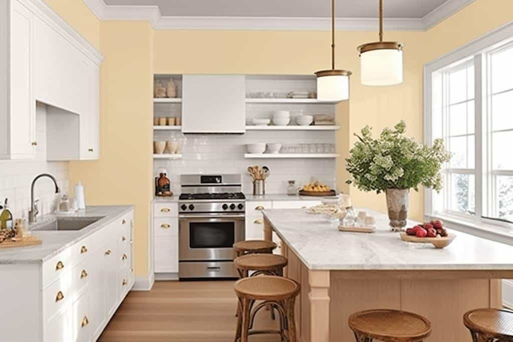
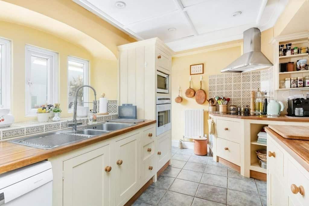
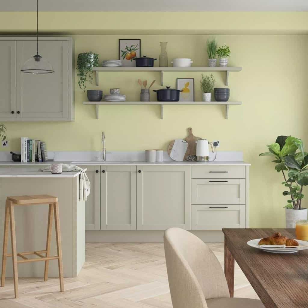
Cream and buttery yellow bring softness and warmth to kitchen interiors. Cream is an adaptable base colour, while buttery yellow introduces a gentle hint of brightness without the intensity of a vivid primary yellow.
This combination is particularly useful in kitchens that need a welcoming atmosphere. It can make traditional cabinetry feel fresh and give contemporary spaces a more relaxed, lived-in quality.
Best ways to use this palette:
- Choose warm cream for cabinets to establish a light, versatile foundation.
- Add buttery yellow to a breakfast nook, pantry door, backsplash, or accent wall.
- Introduce pale oak or ash wood to create natural contrast.
- Finish with brushed brass or champagne-toned hardware for a coordinated appearance.
For a restrained look, keep yellow to a few carefully chosen details. If you want a more expressive kitchen, consider muted yellow cabinetry with creamy stone countertops and natural wood shelving.
Avoid pairing buttery yellow with too many competing warm colours. Cream, timber, and one subtle accent are often enough to create a cohesive result.
Sage Green, Olive, and Moss
12
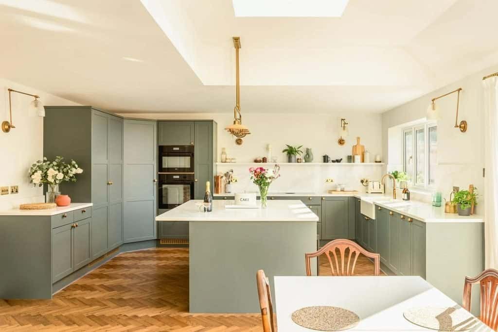
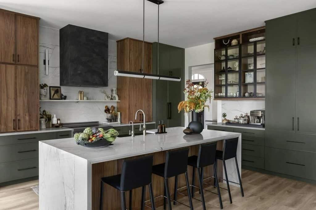
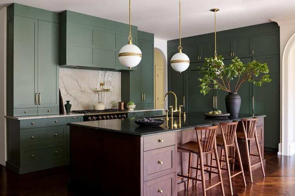
Green is one of the most flexible colours to explore when designing a kitchen for 2027. The main decision is choosing the right depth and undertone for your space.
Sage green suits bright, understated kitchens. Its muted character works well with off-white walls, pale stone, and light wood.
Olive green has more depth and a slightly earthier quality. It is an excellent choice for lower cabinetry, kitchen islands, or full cabinet schemes when balanced with lighter surfaces.
Moss green creates a richer, more enveloping atmosphere. It can work beautifully in larger kitchens with timber details, warm lighting, and natural stone.
Consider these combinations:
| Green shade | Colours to pair it with | Overall effect |
| Sage green | Cream, pale oak, warm white | Airy and relaxed |
| Olive green | Walnut, beige stone, brass | Earthy and sophisticated |
| Moss green | Chocolate brown, ivory, bronze | Rich and atmospheric |
| Grey-green | Soft white, light timber, brushed nickel | Contemporary and understated |
Green cabinetry can also provide a practical foundation for future updates. You can change the wall colour, lighting, or accessories without necessarily repainting every cabinet.
Before choosing a shade, view a large paint sample next to your countertop and flooring. Green can shift noticeably between daylight and artificial lighting, and a colour that looks soft in a showroom may appear much darker at home.
Earthy Terracotta and Clay
16
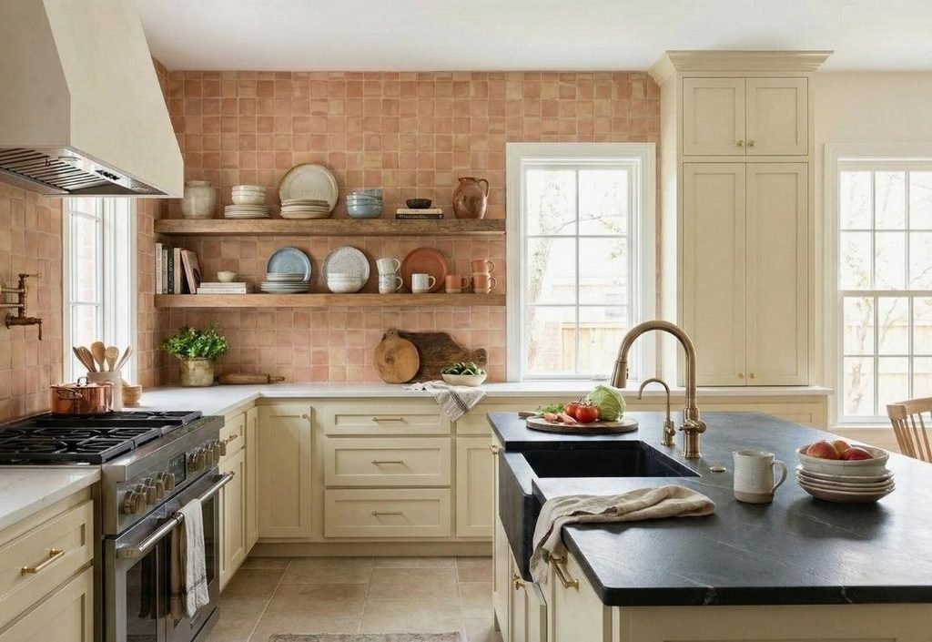
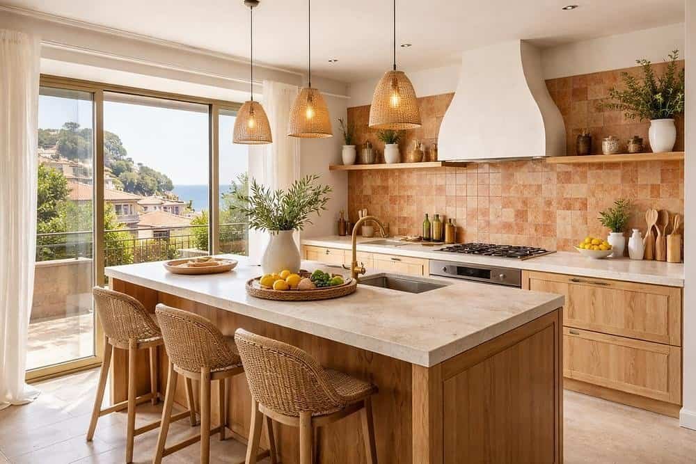
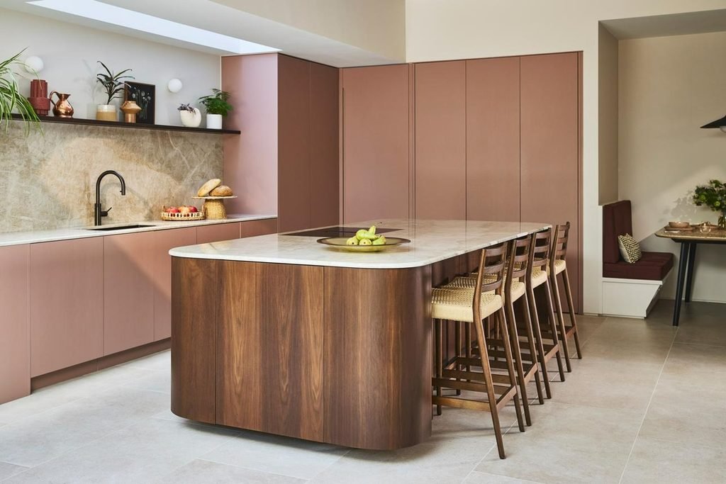
Terracotta and clay introduce warmth through muted red, orange, pink, and brown undertones. These colours are especially appealing if you want a kitchen to feel distinctive without relying on glossy finishes or dramatic contrasts.
The most versatile versions are often softened rather than intensely orange. Dusty terracotta, faded brick, and clay pink can sit comfortably beside cream, beige, and natural wood.
There are several ways to introduce these shades:
- Backsplashes: Use terracotta or clay-coloured tiles behind the hob or along the main preparation area.
- Kitchen islands: Paint the island a muted earthy shade while keeping the surrounding cabinets neutral.
- Walls: Choose a softened clay tone to bring warmth to a dining corner or breakfast area.
- Accessories: Introduce ceramic bowls, planters, and textiles before committing to permanent changes.
Terracotta is particularly effective with natural materials because it echoes the colours found in clay, brick, and stone. A palette of terracotta, warm ivory, oak, and aged brass feels cohesive without needing many decorative accents.
If your kitchen already has reddish timber flooring, test the colours together before committing. Too many similar red-orange undertones can make the space feel visually heavy. Creamy surfaces or muted green accents can help restore balance.
Deep Chocolate Brown and Rich Wood Tones
12
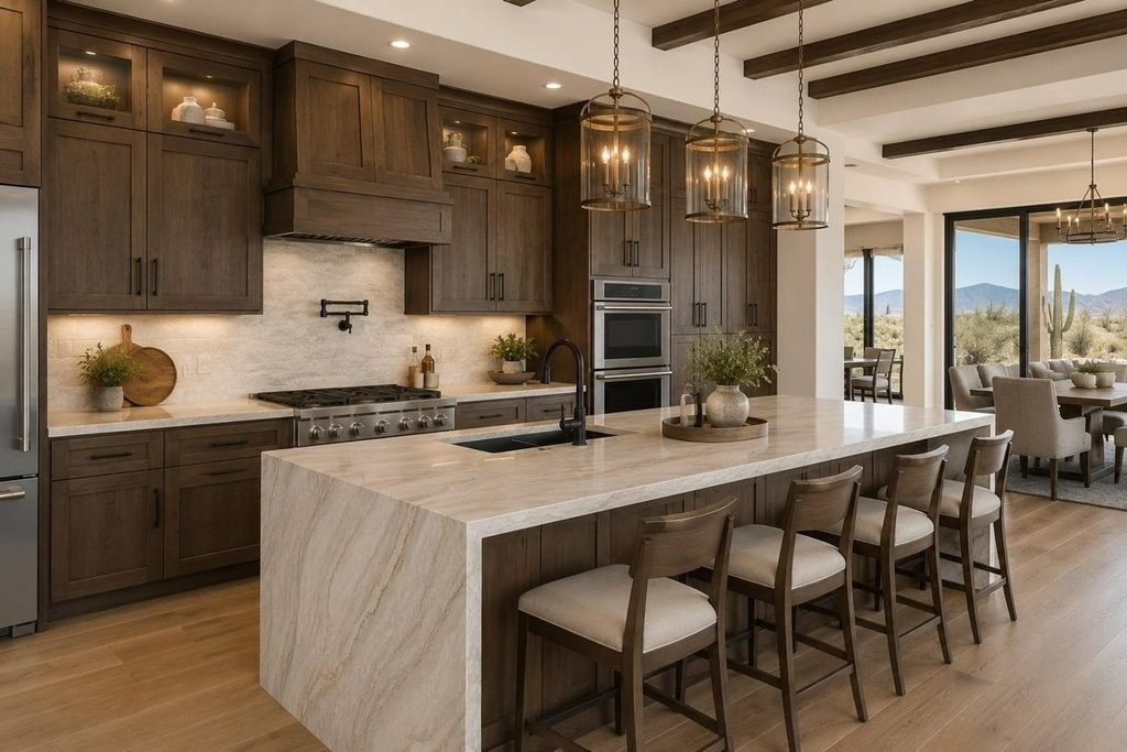
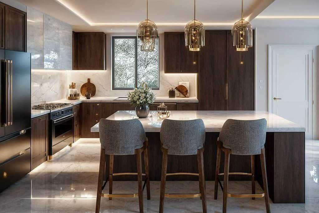
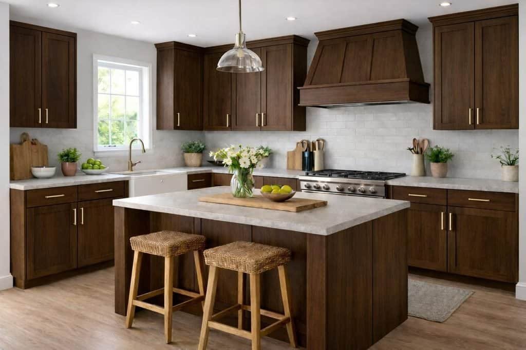
Deep brown is an option worth considering if you want a kitchen that feels warm, refined, and slightly dramatic. Unlike stark black, chocolate brown often has softer undertones that complement wood, warm metals, and creamy stone.
The success of this palette depends on contrast and lighting. Dark cabinetry can create an elegant backdrop, but covering every surface in a deep shade may make a poorly lit room feel smaller.
For a balanced design, combine rich brown with one or two lighter materials. Pale countertops, warm white walls, and a light backsplash help break up the darker surfaces.
Natural walnut is another excellent option. Its grain introduces variation and texture, giving the kitchen a more organic appearance than a flat painted finish.
Try this palette:
- Chocolate brown lower cabinets.
- Creamy white upper cabinets.
- A light beige or ivory countertop.
- Walnut shelving or timber bar stools.
- Bronze or brushed brass cabinet handles.
This combination works well in contemporary, transitional, and modern farmhouse interiors. For a more minimalist look, reduce decorative accessories and let the cabinetry, stone, and wood grain provide the visual interest.
Lighting deserves particular attention with dark brown finishes. Under-cabinet lights can illuminate work surfaces, while pendant lights help prevent an island from disappearing into the darker palette.
Dusty Blue and Soft Blue-Green
12
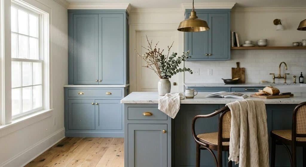
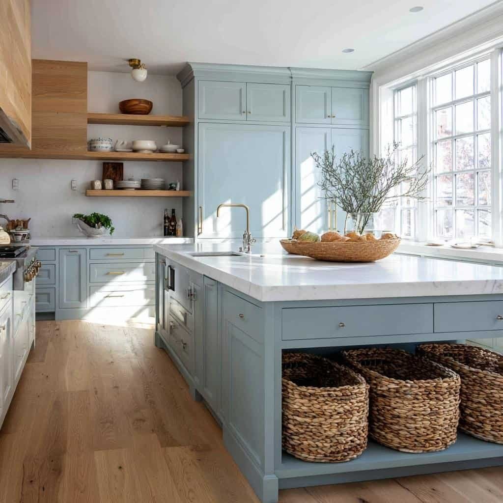
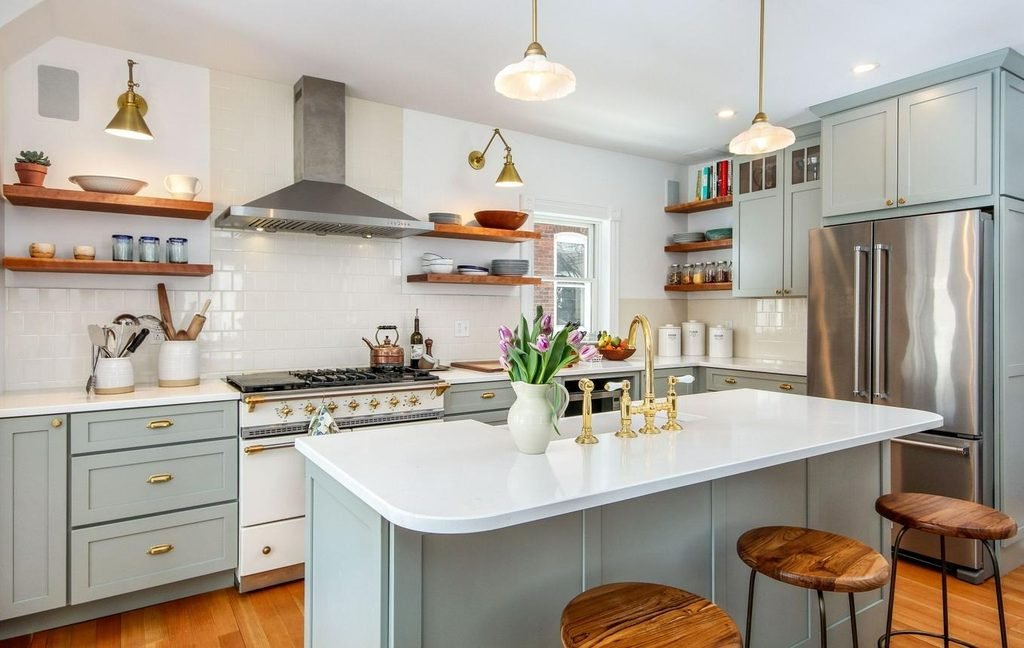
Soft blue is a useful choice for homeowners who want colour without moving too far away from a calm, neutral interior. Dusty blue and blue-green shades feel gentle, making them suitable for both traditional kitchens and streamlined contemporary spaces.
The most successful combinations usually include a warmer element. Pale oak flooring, cream walls, or beige stone can prevent blue cabinetry from feeling too cool.
You can use soft blue across all the cabinets for a coordinated look or introduce it on the island while keeping the main cabinetry white or greige.
Blue-green is another option if you prefer a shade that bridges cool and warm palettes. Depending on its undertones, it can work particularly well with olive accessories, walnut details, or warm metallic finishes.
When planning this colour scheme, consider the surrounding rooms. In an open-plan home, repeating a similar blue in dining chairs, artwork, or textiles can connect the kitchen to the wider interior without making every room look identical.
Choose the finish carefully, too. Matte and satin cabinet finishes tend to create a softer appearance, while glossy surfaces reflect more light and can make the colour appear more pronounced.
Kitchen Colour Schemes 2027 for Every Interior Style
The best kitchen colour scheme is not necessarily the most fashionable one. It is the palette that suits your home’s architecture, existing materials, lighting, and the way you use the space.
Understanding your preferred interior style helps narrow the options and makes it easier to select colours that feel intentional rather than randomly combined.
Modern Minimalist: Warm White, Greige, and Pale Oak
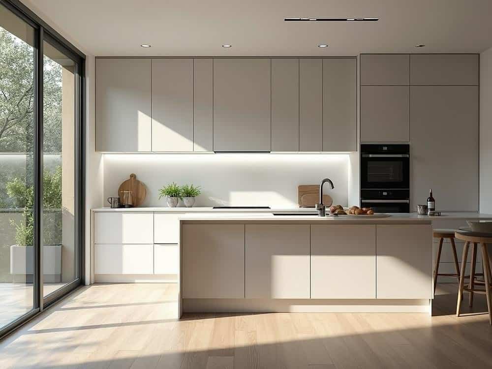
Minimalist kitchens benefit from a restrained palette, but that does not mean every surface needs to be pure white. Warm white, pale greige, and natural oak can create a more inviting version of minimalism.
Use handleless cabinets or simple hardware to maintain clean lines. A lightly textured countertop and subtle wood grain introduce interest without adding visual clutter.
Best for: Small kitchens, contemporary apartments, and homeowners who prefer a clean, uncluttered appearance.
Modern Farmhouse: Sage Green, Cream, and Natural Timber
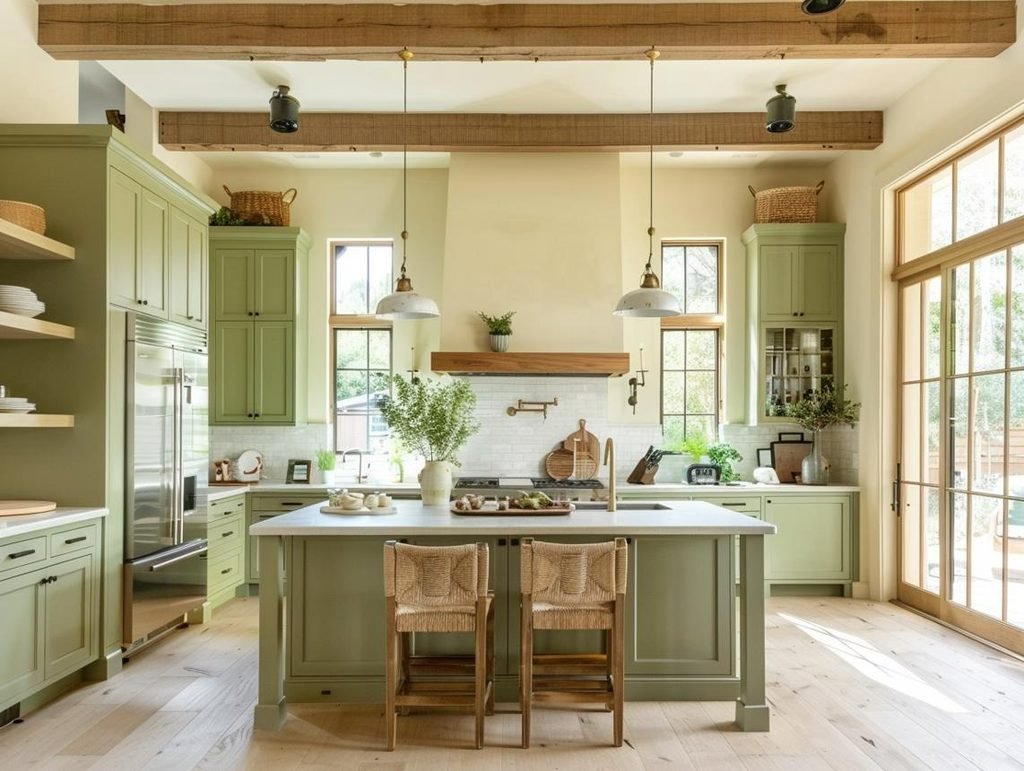
Modern farmhouse kitchens combine familiar materials with a more refined colour palette. Sage green cabinets, creamy walls, and natural timber provide warmth without making the room feel overly rustic.
Shaker-style cabinetry, simple ceramic tiles, and brushed brass or dark metal hardware complement this combination. The overall effect should feel comfortable and practical rather than heavily decorated.
Best for: Family homes, country-inspired interiors, and kitchens that mix traditional cabinetry with contemporary finishes.
Contemporary Luxury: Chocolate Brown, Beige, and Dramatic Stone
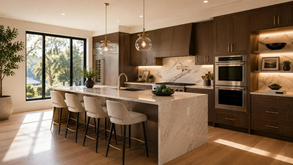
A luxurious kitchen does not need an abundance of glossy surfaces. Rich brown cabinetry, warm beige, and expressive stone can create depth through materials and carefully controlled contrast.
Choose a countertop with natural-looking veining and coordinate the hardware with the room’s other metal finishes. Integrated appliances and simple cabinet fronts help maintain a polished appearance.
Best for: Larger kitchens, open-plan interiors, and homeowners who prefer a sophisticated, understated finish.
Scandinavian-Inspired: Soft Blue, Off-White, and Light Wood
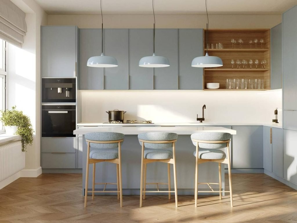
Scandinavian-inspired kitchens often rely on light, natural materials and uncomplicated colour combinations. Soft blue cabinetry adds personality while maintaining the bright, relaxed quality associated with this style.
Combine it with pale timber, off-white walls, and simple pendant lighting. Keep accessories purposeful and allow the natural grain of the wood to contribute texture.
Best for: Compact homes, bright contemporary kitchens, and anyone who appreciates a calm, functional aesthetic.
Rustic and Mediterranean: Terracotta, Sand, and Olive
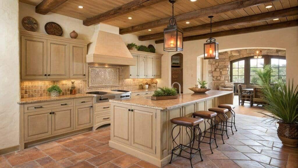
Terracotta, sandy beige, and olive green create a warm palette inspired by natural landscapes and traditional materials. Handmade tiles, stone surfaces, and timber details make these colours feel authentic.
For a modern interpretation, use simple cabinetry and limit decorative elements. A terracotta backsplash or olive island can provide enough character without requiring every surface to feature a different finish.
Best for: Homes with warm wood finishes, Mediterranean-inspired interiors, and kitchens that benefit from earthy colour.
Classic Transitional: Muted Navy, Ivory, and Warm Metallic Details
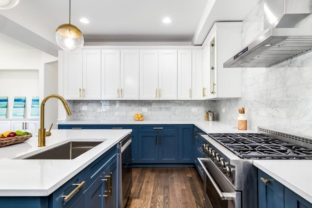
Transitional kitchens blend traditional forms with contemporary simplicity. Muted navy cabinetry, ivory surfaces, and warm metallic hardware create a balanced look that feels structured without being overly formal.
Navy works particularly well on a kitchen island or lower cabinets, where it can provide contrast against lighter surrounding surfaces. Ivory walls and a pale countertop prevent the colour from dominating the room.
Best for: Traditional homes being updated with modern finishes, and homeowners who want a defined colour scheme with lasting flexibility.
The easiest way to narrow your options is to identify the atmosphere you want first. Choose warm neutrals for softness, greens for a natural feel, blues for a calmer contemporary look, or rich earthy shades for greater depth. Build the final palette around your kitchen’s existing materials rather than choosing each colour independently.
Two-Tone Kitchen Cabinets: Colour Combinations That Feel Fresh
Two-tone kitchen cabinets are an excellent way to introduce colour without committing to a single shade across every surface. By combining two complementary finishes, you can create contrast, highlight architectural features, and give the kitchen a more personalised appearance.
For kitchen colour schemes 2027, the most versatile approach is to pair a distinctive cabinet colour with a softer neutral or natural wood finish. This creates visual interest while keeping the overall design balanced.
Sage Green and Warm White
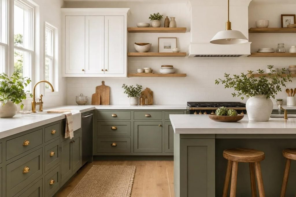
Sage green lower cabinets with warm white upper cabinets create a relaxed, airy atmosphere. The green grounds the room, while the lighter upper cabinets help the kitchen feel open and bright.
This combination works particularly well in smaller kitchens, where dark colours across every cabinet might feel overwhelming. Adding a pale stone countertop and simple brass handles brings warmth without introducing unnecessary contrast.
Styling tip: Choose a sage green with a muted, slightly warm undertone if your kitchen has cream walls or beige flooring. A very cool grey-green can look disconnected from these finishes.
Deep Olive and Natural Oak
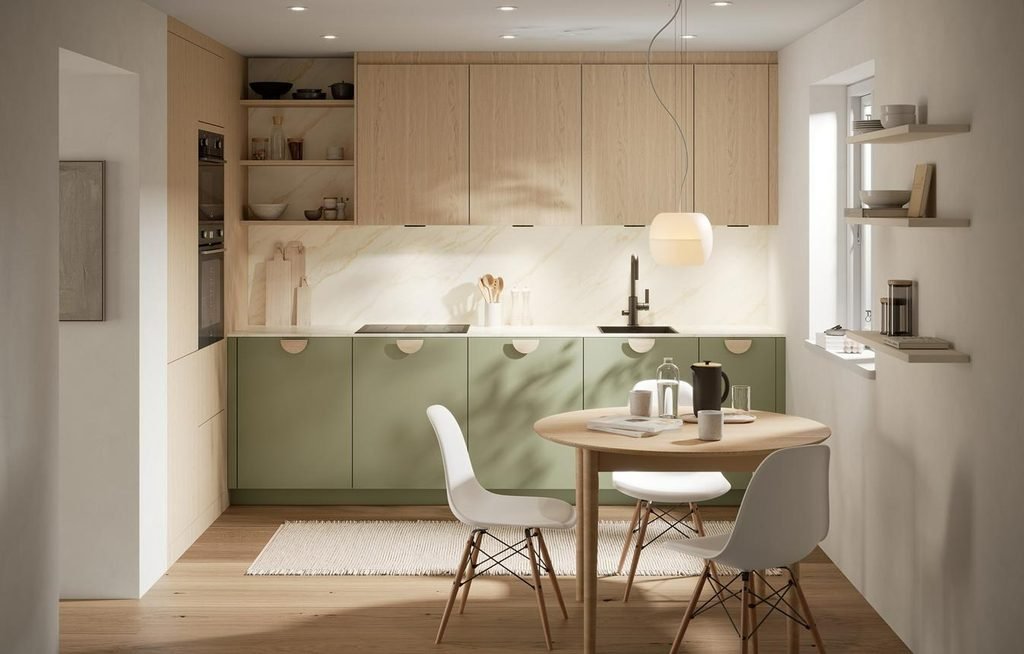
Olive green and natural oak create a richer, more organic combination. The green provides depth, while the wood introduces grain and texture that make the cabinetry feel less uniform.
You can use olive green on the lower cabinets and oak on the upper cabinets, or reverse the arrangement if you want a stronger visual statement. A pale countertop helps connect the two materials.
This palette suits modern farmhouse, contemporary, and nature-inspired kitchens. It also works well in open-plan spaces because the timber can echo wood flooring, dining tables, or living room furniture.
Chocolate Brown and Creamy Beige
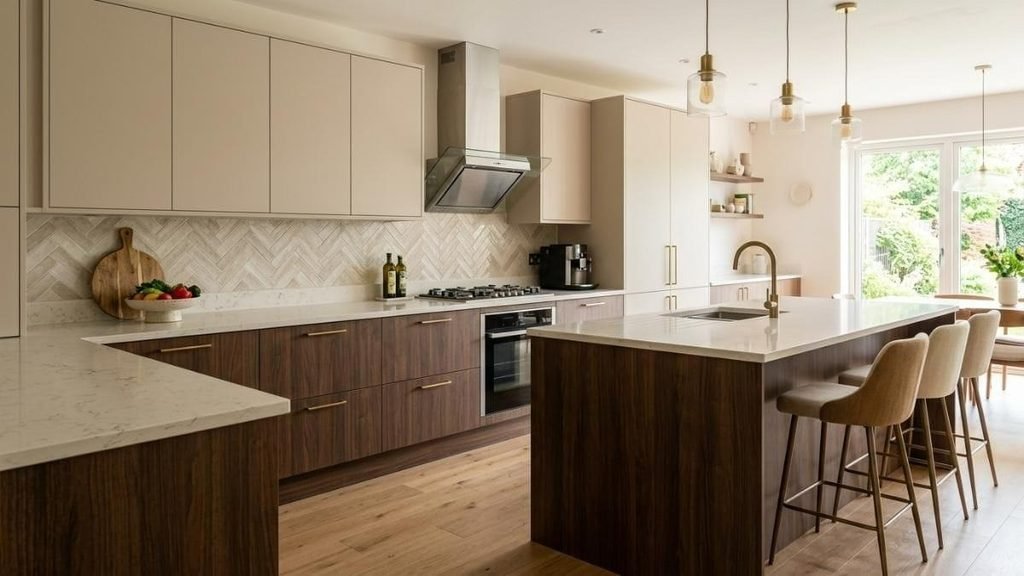
Chocolate brown and creamy beige offer an elegant alternative to the familiar combination of black and white. The deeper shade creates a grounded foundation, while beige softens the contrast and adds warmth.
This palette is particularly effective when you want a sophisticated kitchen that still feels comfortable and inviting. Bronze hardware, subtle stone veining, and warm under-cabinet lighting can enhance the overall effect.
In a compact kitchen, consider using chocolate brown on the island or lower cabinets rather than throughout the room. The lighter upper surfaces will help maintain a sense of openness.
Dusty Blue and Pale Timber
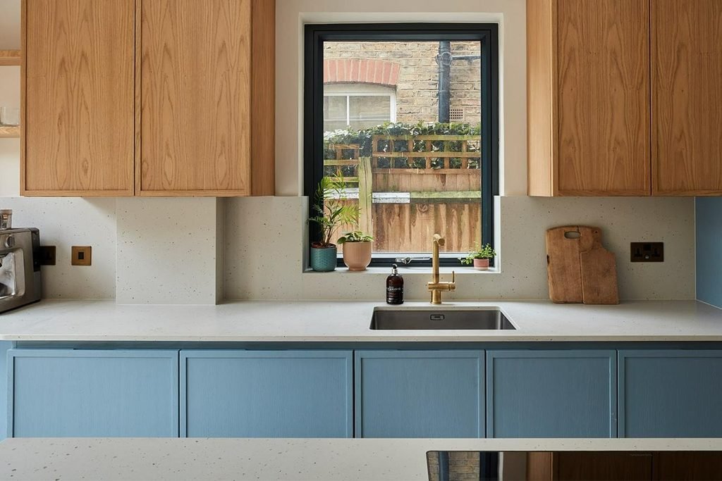
Dusty blue paired with pale timber creates a fresh, understated look. The blue adds personality, while the wood prevents the scheme from feeling too cool or formal.
This combination is well suited to Scandinavian-inspired interiors and contemporary homes with plenty of natural light. A warm white backsplash and simple brushed nickel handles can complete the look without competing with the cabinetry.
For a more distinctive design, use dusty blue on a kitchen island and repeat the timber finish on open shelving or bar stools.
Charcoal and Soft Greige
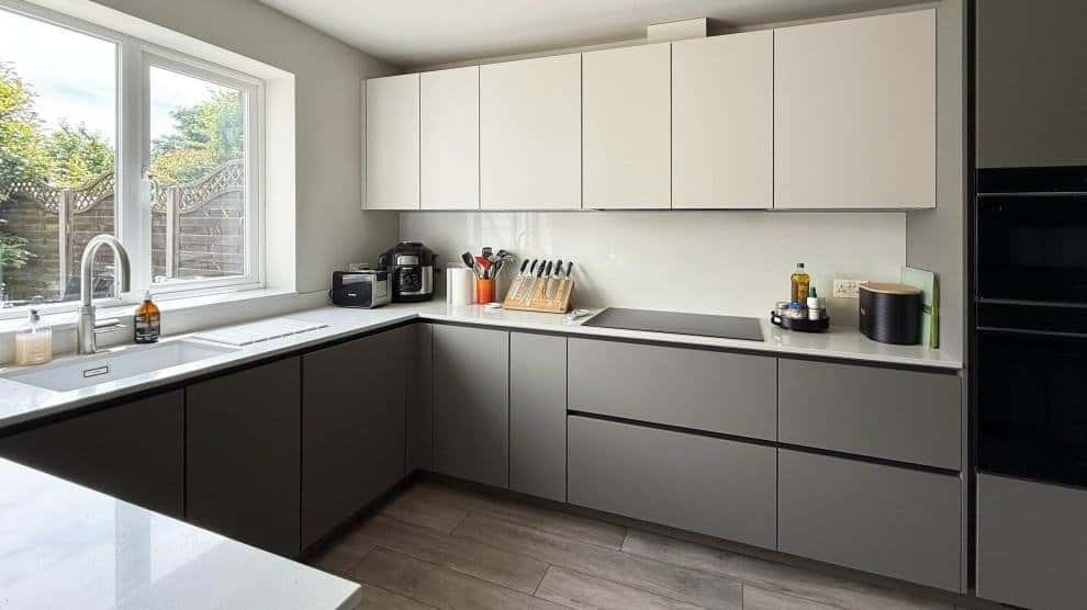
Charcoal and greige provide a modern alternative for homeowners who prefer understated colours rather than obvious greens, blues, or earthy shades.
The key is choosing a charcoal that complements the room’s other finishes. A warm charcoal works well with beige stone and timber, while a cooler version may suit concrete-effect countertops and stainless steel appliances.
Greige upper cabinets help soften the darker lower cabinetry, creating a balanced appearance that works in both contemporary and transitional kitchens.
Should Upper or Lower Cabinets Be Darker?
There is no universal rule, but placing darker colours on the lower cabinets is often the easiest way to create a balanced kitchen.
- Darker lower cabinets: Ground the room and make everyday marks less noticeable.
- Lighter upper cabinets: Keep the upper half of the kitchen visually open.
- Contrasting kitchen island: Introduce a bold colour without changing the entire cabinet scheme.
- Natural wood accents: Add warmth and texture between painted surfaces.
The best arrangement depends on your ceiling height, natural light, and cabinet layout. If your kitchen has tall ceilings and plenty of daylight, darker upper cabinets can look striking. In a small, enclosed kitchen, keeping the upper surfaces lighter is often a safer starting point.
Before choosing a two-tone scheme, place samples of both colours beside the actual countertop, flooring, and backsplash. Two shades that look attractive separately may clash when viewed together under your kitchen’s lighting.
Choosing the Right Kitchen Colour Scheme for Small or Dark Spaces
Small kitchens and rooms with limited natural light need a slightly different approach to colour. The goal is not necessarily to make every surface white, but to create a palette that feels balanced, bright enough for everyday use, and visually connected.
The right kitchen colour scheme can help a compact room feel more spacious while still allowing you to introduce personality through cabinetry, accessories, and carefully selected accents.
Use Warm Whites and Pale Neutrals as Your Foundation
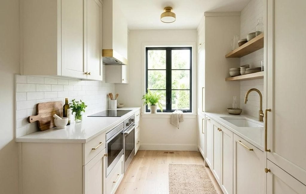
Warm white, ivory, pale beige, and light greige are reliable starting points for small kitchens. These shades reflect available light and work with a wide range of countertops, flooring materials, and cabinet styles.
Pure white can sometimes appear harsh under cool artificial lighting. A softer white with a subtle warm undertone may create a more comfortable atmosphere, particularly when combined with oak or beige stone.
Consider using one main neutral across the upper cabinets and walls to reduce visual interruptions. A similar colour across these surfaces can make the room feel more continuous, especially when the cabinets extend close to the ceiling.
A practical combination: Warm white cabinets, a pale beige backsplash, light oak flooring, and a countertop with subtle veining. This palette creates brightness without making the kitchen feel sterile.
Can You Use Dark Colours in a Small Kitchen?
Absolutely. Dark colours are not automatically unsuitable for compact spaces. Their success depends on how much of the room they cover, the available lighting, and the contrast with surrounding surfaces.
A small kitchen can benefit from a dark green island, navy lower cabinets, or a chocolate brown pantry wall. These elements create depth and give the room a defined focal point.
The important consideration is balance. If the cabinetry, walls, countertops, and flooring are all dark, the space may feel enclosed, particularly when natural light is limited.
Try these approaches:
- Use deep green or navy on lower cabinets while keeping the upper cabinets light.
- Choose a darker island against pale perimeter cabinetry.
- Add reflective or lightly textured surfaces to introduce variation.
- Incorporate under-cabinet lighting to illuminate worktops and reduce shadows.
- Keep decorative accessories selective so the room does not feel cluttered.
Dark colours can look especially attractive in kitchens with a window, glazed door, or good layered lighting. Test the shade in the actual room before making a final decision.
Choose Cabinet Colours That Work With Your Flooring
Flooring is one of the largest visual surfaces in a kitchen, so its undertone can influence how cabinet colours appear.
Light oak flooring pairs naturally with cream, sage green, dusty blue, and warm greige. Medium-toned wood works well with olive, ivory, and muted earthy shades. Dark wood or charcoal flooring may benefit from lighter cabinetry to maintain contrast.
Pay attention to undertones rather than matching everything exactly. A warm oak floor may clash with a strongly blue-grey cabinet colour, while a neutral greige or muted green could connect the finishes more naturally.
If replacing the floor is not part of your renovation budget, choose cabinet colours around the flooring you already have. This can save money and produce a more cohesive result than trying to make every surface follow the same trend.
Use Backsplashes and Countertops to Keep the Palette Light
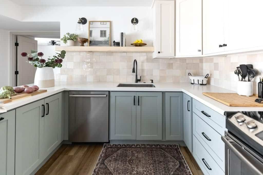
Countertops and backsplashes can make a significant difference to the overall appearance of a small kitchen. Pale stone, cream quartz, warm white tiles, and lightly patterned surfaces help break up darker cabinetry.
A backsplash that closely relates to the countertop can create a more continuous visual effect. Alternatively, a subtle contrast can add character without making the space feel busy.
Consider the following combinations:
| Cabinet colour | Countertop and backsplash | Visual effect |
| Sage green | Warm white quartz and ivory tiles | Soft and fresh |
| Navy blue | Pale grey stone and white tiles | Crisp and contemporary |
| Chocolate brown | Cream stone and beige tiles | Warm and sophisticated |
| Warm white | Pale beige stone and textured cream tiles | Bright and understated |
| Charcoal | Light quartz and simple white tiles | Modern with clear contrast |
For small kitchens, avoid choosing a heavily patterned countertop, highly decorative backsplash, and strongly contrasting cabinetry all at once. One expressive surface is usually enough to give the room character.
Make the Most of Lighting and Reflective Finishes
Colour cannot be considered separately from lighting. A pale shade may look bright in a sunlit showroom but appear dull in a north-facing kitchen or a room lit mainly by artificial light.
Use a combination of ambient lighting, task lighting, and accent lighting to support the colour scheme. Under-cabinet lights are particularly useful because they illuminate preparation areas and reveal the true appearance of countertops and backsplashes.
Glossy finishes can reflect more light, but they also create visible reflections and may show fingerprints more readily. Matte and satin finishes provide a softer appearance and can work beautifully when the room has sufficient lighting.
Before committing to a paint or cabinet colour:
- Place a large sample beside the flooring and countertop.
- View it in morning daylight, afternoon light, and the evening.
- Check the colour with your planned light bulbs switched on.
- Compare it with adjoining rooms if your kitchen is open plan.
- Evaluate the overall combination rather than judging each sample individually.
A thoughtful approach to lighting and colour will generally make a bigger difference than choosing the palest shade available.
Kitchen Island Colours That Make a Statement
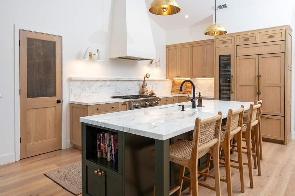
A kitchen island offers one of the easiest ways to experiment with colour without committing to a complete cabinetry makeover. Because the island is often a natural focal point, a distinctive shade can give the entire kitchen more personality.
For kitchen colour schemes 2027, consider deep olive, muted navy, chocolate brown, burgundy-brown, and charcoal as options for creating contrast against lighter surrounding cabinets. These colours can feel contemporary and expressive while remaining easy to coordinate with neutral finishes.
The best island colour depends on the atmosphere you want to create, the size of the room, and the materials already present.
Deep Green for a Natural, Sophisticated Look
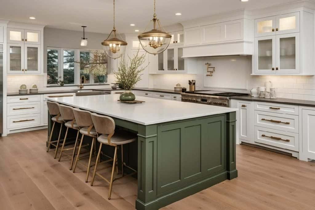
A deep green island creates a strong focal point while maintaining a connection to natural materials. It works particularly well with oak cabinetry, creamy stone, and brass or bronze hardware.
If your perimeter cabinets are white or ivory, the green island introduces contrast without making the kitchen feel too dark. You can reinforce the colour through a few carefully chosen accessories, such as ceramic bowls or upholstered stools.
Choose a muted forest or olive green if you prefer a subtle, grounded appearance. A more saturated green will feel bolder and may suit a contemporary kitchen with simple cabinet fronts.
Navy Blue for Classic Contrast
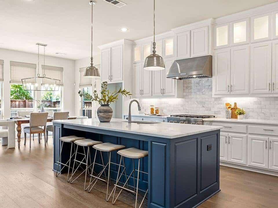
Navy is a versatile choice for an island because it provides depth while working with many familiar kitchen finishes. White cabinets create crisp contrast, while warm beige and pale wood soften the effect.
This combination suits traditional, transitional, and contemporary interiors. For a classic appearance, pair navy with shaker cabinets and marble-effect surfaces. For a modern interpretation, choose a simple island design, minimal hardware, and a streamlined countertop.
If the kitchen already includes blue elsewhere, select a shade that complements those elements rather than introducing a competing blue undertone.
Chocolate Brown for Warmth and Luxury
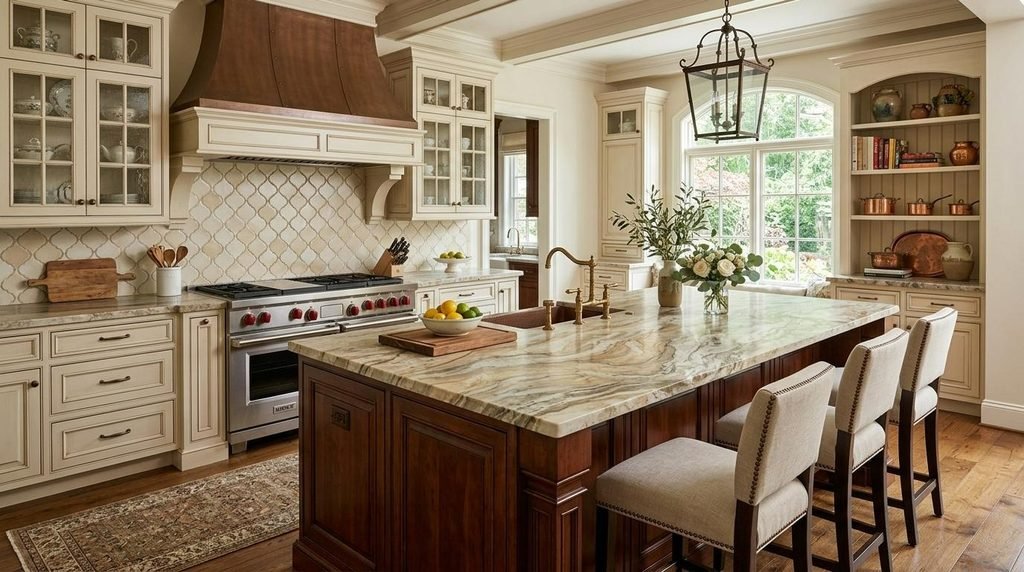
A chocolate brown island brings richness to a kitchen without the sharper contrast of black. It looks especially effective alongside cream cabinetry, beige stone, walnut stools, and warm pendant lighting.
This colour is a strong option if you want to introduce a darker accent while maintaining a welcoming atmosphere. It can also help connect the kitchen to adjoining dining furniture when the home features similar timber tones.
For the most balanced result, repeat a little warmth elsewhere in the room through wood grain, bronze hardware, or a subtly veined countertop.
Burgundy-Brown for a More Expressive Design
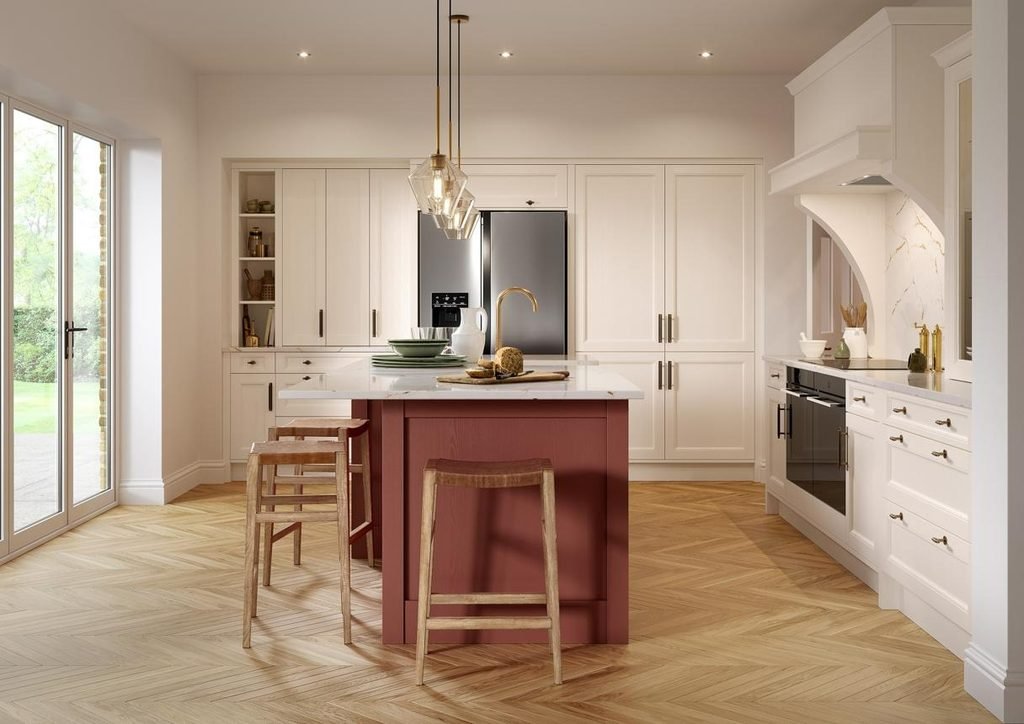
Burgundy-brown and muted wine-inspired shades offer a more distinctive alternative to green or blue. Their red-brown undertones create warmth and can make a simple kitchen feel more individual.
This colour works best when the surrounding finishes are relatively restrained. Pair it with ivory cabinets, pale stone, warm timber, and understated hardware rather than introducing several additional strong colours.
If you are uncertain about committing to a rich shade, test it on a smaller island panel or use it for bar stools and accessories first.
Charcoal for a Modern, Architectural Feel
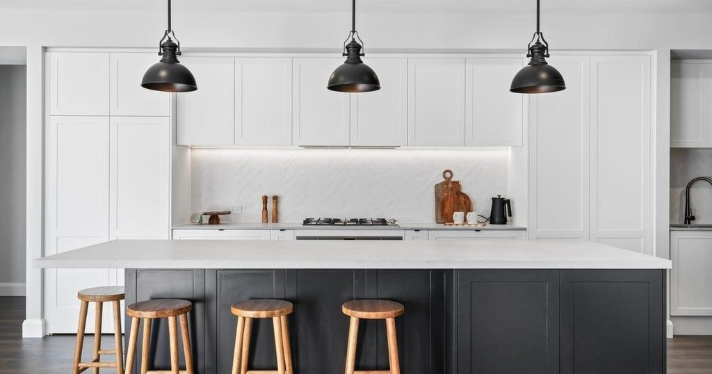
Charcoal creates a structured, contemporary look that suits minimalist kitchens and interiors with clean architectural lines. Its dark finish provides a clear focal point against lighter cabinetry.
To keep the island from appearing too heavy, choose a pale countertop and consider timber stools or warm metallic accents. These elements soften the contrast and prevent the design from feeling overly stark.
Charcoal also works well with stainless steel appliances and concrete-effect surfaces, making it suitable for industrial-inspired kitchens.
How to Coordinate the Island With the Rest of the Kitchen
The island should feel distinctive, but it should not look disconnected from the surrounding room. A few repeated materials or colours can tie the design together.
Use this simple approach:
- Cabinetry: Choose a main cabinet colour that complements rather than competes with the island.
- Countertops: Repeat the same countertop material on the island and perimeter cabinets for continuity, or use a complementary finish for contrast.
- Hardware: Keep handles and other metal finishes consistent where practical.
- Lighting: Select pendant lights that suit the island’s scale and the kitchen’s overall style.
- Seating: Use bar stools that echo the room’s timber, upholstery, or metal accents.
Think about the island’s size before choosing a particularly dark shade. A large island can accommodate a rich, saturated colour, while a narrow island may look more balanced in a medium tone.
The most successful kitchen island colours enhance the overall palette instead of competing with it. Choose a shade you genuinely enjoy, test it against the surrounding materials, and let the island become the focal point without forcing every other element to match exactly.
How to Match Kitchen Cabinets, Walls, Worktops, and Backsplashes
A beautiful kitchen colour scheme depends on more than choosing attractive cabinet colours. The cabinets, walls, worktops, backsplash, flooring, and hardware need to work together to create a balanced interior.
One of the most common decorating mistakes is selecting every finish separately. A cabinet colour might look perfect in a showroom but clash with the undertones in your existing flooring or countertop once everything is installed.
The easiest way to avoid this problem is to choose your largest surfaces first, establish a consistent colour palette, and use smaller details to introduce contrast.
Start With the Largest Colour Surfaces
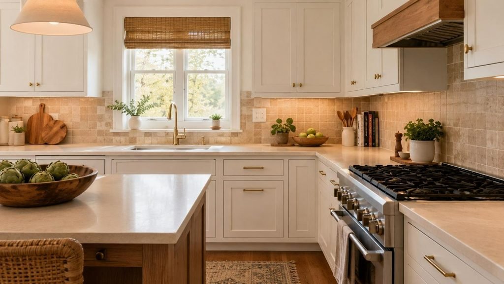
Cabinetry, flooring, and countertops usually have the greatest influence on the appearance of a kitchen. Start by considering these elements before selecting wall paint, decorative tiles, or accessories.
If your countertops and flooring are already installed, treat them as the foundation of the colour scheme. Look closely at their undertones and identify whether they lean towards yellow, red, pink, grey, or brown.
For a kitchen renovation, choose the cabinet colour next. Once that decision is made, select a backsplash and wall colour that complement both the cabinetry and the fixed surfaces.
A practical order of selection is:
- Existing or planned flooring: Establishes the underlying warmth and colour direction.
- Countertops: Adds another major surface and helps determine the cabinet palette.
- Kitchen cabinets: Introduces the main colour or the strongest visual contrast.
- Backsplash and walls: Connects the larger surfaces and adds texture.
- Hardware, lighting, and accessories: Completes the scheme with smaller details.
This sequence is particularly useful when working with fashionable kitchen colour schemes for 2027. It allows you to introduce shades such as sage green, chocolate brown, or dusty blue without having to replace every existing finish.
Pay Attention to Warm and Cool Undertones
Undertones can make the difference between a coordinated kitchen and one that feels slightly mismatched. Two colours may look similar at first glance but appear noticeably different when placed next to each other.
Warm colours generally have yellow, red, or golden undertones. Cool colours tend towards blue, green, or certain grey tones. Neutral shades can contain either, so a colour described as beige is not automatically compatible with every other beige finish.
For example, a creamy cabinet colour may look beautiful beside warm oak flooring but slightly yellow beside a cool grey countertop. Similarly, a blue-grey cabinet can appear disconnected from a strongly golden backsplash.
Try these combinations as starting points:
| Main surface | Complementary finishes | Overall look |
| Cream cabinets | Warm oak, beige stone, brass | Soft and welcoming |
| Sage green cabinets | Ivory tiles, pale timber, warm white quartz | Natural and relaxed |
| Dusty blue cabinets | Light oak, neutral stone, brushed nickel | Fresh and contemporary |
| Chocolate brown cabinets | Creamy stone, walnut, bronze | Rich and sophisticated |
| Charcoal cabinets | Pale quartz, stainless steel, light grey tiles | Modern and structured |
The aim is not to make every colour identical. Instead, choose undertones that relate to one another so that differences in colour and texture feel intentional.
Use a Simple Three-Colour Formula
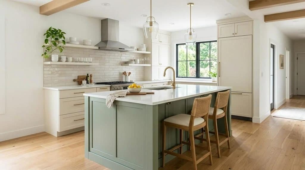
A three-colour formula is an easy way to build a cohesive kitchen palette without overcomplicating the design.
Choose one dominant colour, one supporting colour, and one accent colour. These can be distributed across cabinetry, walls, worktops, tiles, hardware, and accessories.
For example, a nature-inspired kitchen might use:
- Dominant colour: Warm ivory across the main cabinets and walls.
- Supporting colour: Sage green on the island or lower cabinetry.
- Accent colour: Muted brass through handles, taps, and pendant lights.
A more dramatic palette could combine chocolate brown cabinetry, beige stone, and bronze details. A lighter contemporary kitchen might use dusty blue cabinets, warm white walls, and pale oak accents.
The formula is a guide rather than a strict rule. Natural materials often introduce several subtle colours of their own, and these variations can make a kitchen feel more authentic.
If you prefer a more colourful design, keep the largest surfaces relatively restrained and introduce additional shades through smaller, changeable elements.
Bring Texture Into the Colour Scheme
Colour is only one part of a successful kitchen design. Texture gives the palette depth and helps prevent a room from looking flat, particularly when several surfaces use similar shades.
Natural wood grain, softly veined stone, handmade tiles, brushed metal, and textured ceramics can all add interest without requiring additional colours.
A kitchen with cream cabinets, for example, may look ordinary if every other surface is perfectly smooth and uniform. Adding a lightly textured backsplash, oak shelving, and a stone countertop with subtle movement creates a more layered appearance.
Consider these combinations:
- Modern minimalist: Smooth warm-white cabinets, honed stone, and pale timber.
- Modern farmhouse: Sage green cabinetry, handmade cream tiles, and natural oak.
- Contemporary luxury: Chocolate brown cabinets, expressive stone, and brushed bronze.
- Mediterranean-inspired: Terracotta tiles, sandy walls, and textured timber.
The most effective kitchen colour schemes combine visual contrast with material consistency. You do not need numerous decorative features; a few well-chosen textures can make a simple palette feel considered and complete.
The Best Kitchen Colour Schemes 2027 for Different Lighting Conditions
Lighting has a major influence on how kitchen colours appear. A paint shade that looks soft and neutral in bright daylight can seem cooler, darker, or more saturated in a room with limited natural light.
Understanding your kitchen’s orientation and lighting conditions will help you select colours that look attractive throughout the day, rather than only when you first test them.
North-Facing Kitchens: Add Warmth Without Overdoing It
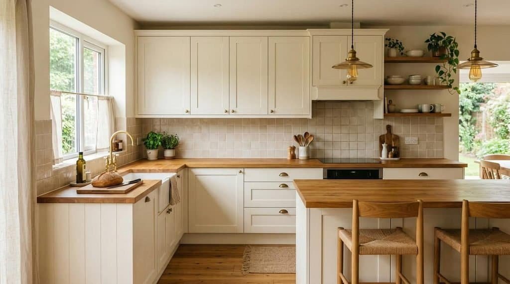
North-facing rooms often receive cooler, more indirect daylight. Warm neutrals, soft beige, creamy white, and muted earthy shades can help balance that light.
Sage green and clay tones can also work well, particularly when they have a warm undertone. Very cool greys and icy whites may feel less inviting in a room that already receives limited direct sunlight.
For a practical palette, consider warm ivory cabinets, mushroom-coloured walls, pale oak flooring, and a beige stone countertop. Under-cabinet lighting can brighten the work surfaces and help the colours appear more balanced in the evening.
Avoid assuming that a darker kitchen must use only pale colours. A deep olive island or chocolate brown lower cabinets can look attractive when the surrounding surfaces and lighting provide sufficient contrast.
South-Facing Kitchens: Make the Most of Natural Light
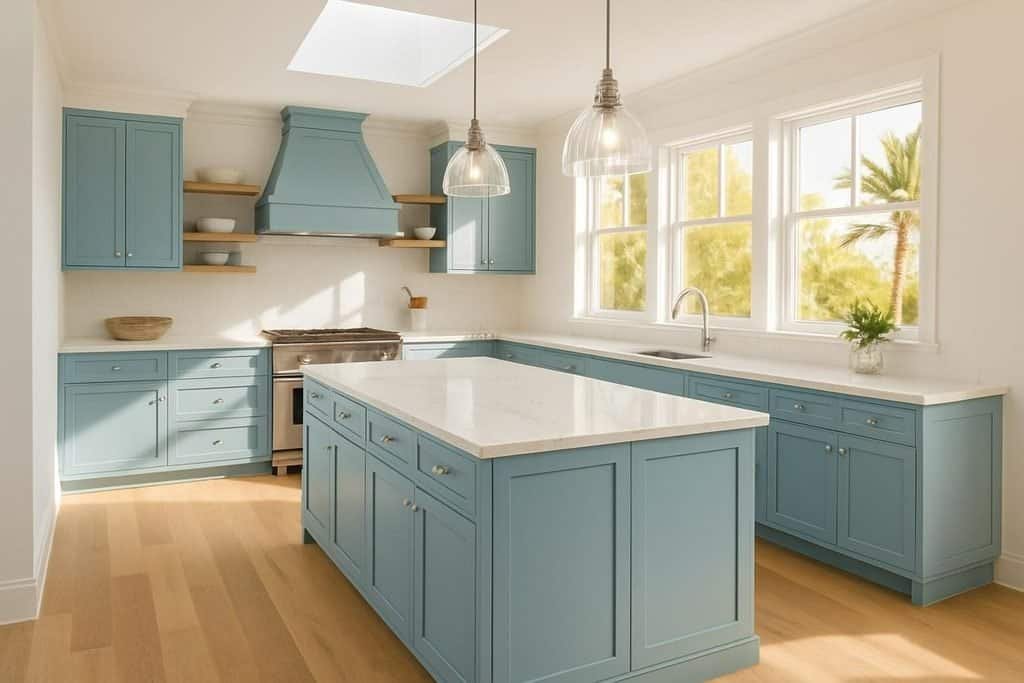
South-facing kitchens generally receive stronger natural light during parts of the day, making them suitable for a broad range of colours.
Dusty blue, olive green, warm white, and balanced greige can all work well. The additional daylight may make some colours appear brighter or more saturated, so testing samples remains important.
If the kitchen becomes very bright during the afternoon, consider muted shades rather than extremely vivid colours. Soft blue cabinets with warm white walls and pale timber can create a fresh appearance without feeling overly stark.
Deeper shades such as forest green or navy may also work beautifully in these spaces, especially when combined with pale countertops.
East-Facing Kitchens: Create a Welcoming Morning Palette
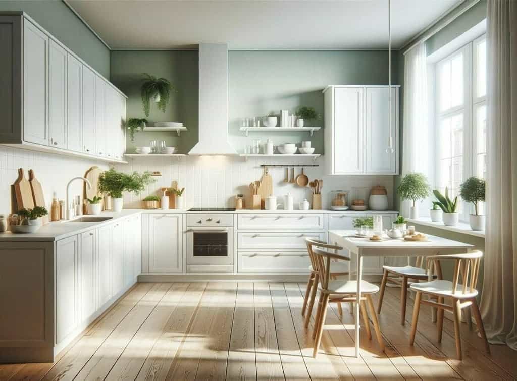
East-facing kitchens typically receive stronger morning light, which changes as the day progresses. Warm whites, soft greens, pale beige, and gentle yellow accents can create an inviting atmosphere during breakfast hours.
If you spend much of your morning in the kitchen, a light palette paired with natural wood can feel especially pleasant. A sage green backsplash or buttery yellow accent can introduce colour without making the space look busy.
Think about the room’s appearance in the afternoon and evening, too. A colour that looks fresh in morning sunshine may appear more muted later, so choose a shade that remains attractive under your planned artificial lighting.
West-Facing Kitchens: Balance Strong Afternoon Light
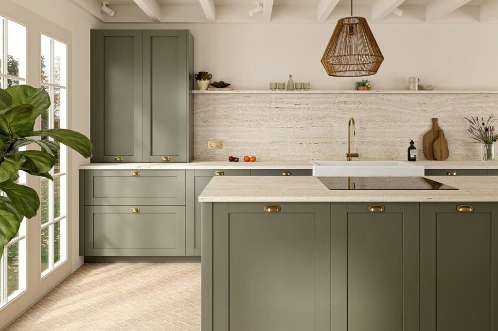
West-facing kitchens often receive warmer, stronger afternoon sunlight. Depending on the room, this can make cream, beige, and warm yellow undertones appear more pronounced.
Muted olive, balanced greige, dusty blue, and earthy brown can help create a composed palette. If you prefer cream cabinets, test them in the afternoon to check that they do not look too yellow for your taste.
Window coverings can help manage glare, while layered artificial lighting ensures that the kitchen remains practical after sunset.
Test Kitchen Colours Before Making a Final Decision
The most reliable way to choose a kitchen colour is to test it in the actual room. Small paint cards and online photographs cannot fully show how a colour will interact with your flooring, countertops, windows, and light bulbs.
Use this checklist before ordering paint or cabinetry:
- Obtain large samples of your preferred colours.
- Place them beside the existing or planned countertop and flooring.
- Check them in morning, afternoon, and evening light.
- View the colours with the kitchen’s artificial lights switched on.
- Compare matte, satin, or other available finishes where relevant.
- Evaluate the palette from different parts of the room, not just one viewpoint.
Pay attention to how the colours work together rather than choosing each finish in isolation. A coordinated palette should look balanced from the doorway, the main preparation area, and any adjoining dining space.
Bold Kitchen Colours: How to Add Personality Without Overdoing It
Neutral kitchens offer flexibility, but bold colours can make a space feel much more personal. Burgundy, forest green, inky blue, deep plum, and saturated brown can introduce character without requiring a complete redesign.
The secret is to control where the colour appears and what surrounds it. A strong shade becomes easier to live with when it has enough breathing room and connects naturally with the rest of the interior.
Try Burgundy and Deep Plum for a Distinctive Accent
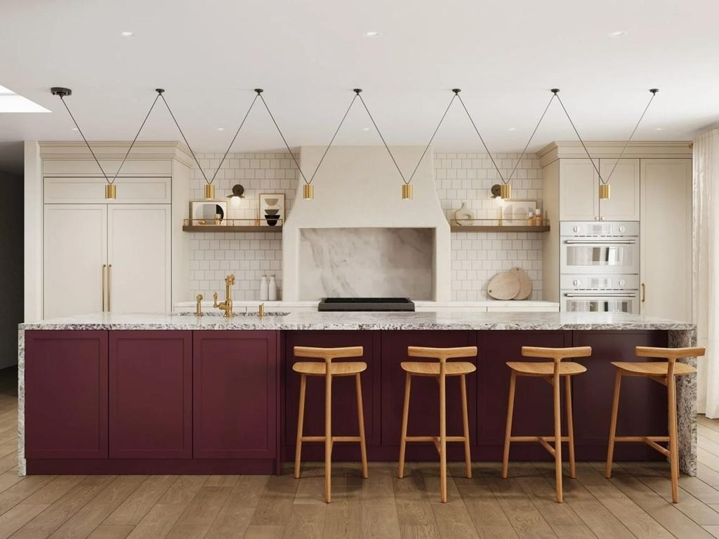
Burgundy and deep plum offer alternatives to the more familiar green and blue kitchen palettes. These shades can feel rich and expressive, especially when paired with creamy neutrals and natural materials.
If you are unsure about using a strong colour across all your cabinets, start with the island or a pantry unit. A burgundy-brown island against ivory cabinetry creates a clear focal point without overwhelming the room.
Keep the surrounding finishes relatively simple. Pale stone, warm wood, and restrained metallic details allow the deeper colour to stand out.
Use Forest Green for Dramatic Contrast
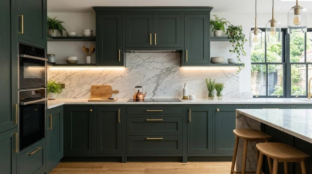
Forest green is a strong choice if you want a dramatic kitchen that still feels connected to nature. It works particularly well with oak, walnut, cream stone, and warm metallic finishes.
You can use it across all the cabinetry in a well-lit kitchen or reserve it for the lower cabinets and island. In a smaller space, keeping the upper cabinets light can prevent the darker shade from dominating the room.
Avoid adding too many competing colours. Cream, timber, and one carefully selected metal finish can provide all the contrast needed.
Make Inky Blue the Focal Point
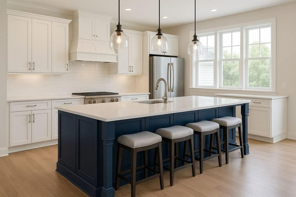
Inky blue creates a strong focal point without the starkness of pure black. It works well on kitchen islands, tall pantry cabinets, and selected lower cabinets.
Pair it with warm white walls, light stone, or pale timber to maintain balance. If the kitchen already contains several dark elements, use the blue selectively rather than extending it across every surface.
A useful approach is to repeat the colour once or twice elsewhere in the room through bar stools, artwork, or accessories. This creates cohesion without making the design feel overly coordinated.
Introduce Bold Colours Through Easy-to-Change Details
You do not need to repaint your cabinets to experiment with a new colour palette. Accessories and smaller design elements can help you discover which shades work in your home before making a larger commitment.
Try introducing colour through:
- Bar stools: Upholstered seating in muted blue, green, or burgundy.
- Pendant lights: Coloured glass or distinctive metal finishes.
- Ceramics: Bowls, vases, and utensil holders in complementary shades.
- Textiles: Tea towels, seat cushions, and window treatments.
- Artwork: A small print that connects the kitchen’s main colours.
- Painted furniture: A freestanding pantry, breakfast table, or sideboard.
These changes are usually easier to update than fixed cabinetry or stone surfaces. They also let you explore stronger colours without worrying that the entire kitchen will become dated quickly.
Keep Bold Colours Cohesive in Open-Plan Homes
Open-plan kitchens need to relate to the living and dining areas around them. A dramatic kitchen island may look attractive on its own but feel disconnected if the surrounding rooms use a completely different palette.
Choose one or two colours that appear in both areas. For example, an olive green kitchen island could connect with green cushions in the living room, while a navy kitchen feature could relate to dining chair upholstery.
The colours do not need to match exactly. Similar undertones, complementary shades, and repeated materials are usually enough to establish a visual connection.
The goal is to create a natural transition between spaces while allowing the kitchen to maintain its own character.
Budget-Friendly Ways to Refresh Your Kitchen Colour Scheme
Updating your kitchen colour scheme does not have to involve replacing cabinets, installing new countertops, or undertaking a complete renovation. A few carefully chosen changes can transform the room while keeping costs manageable.
The most effective budget-friendly approach is to work with the features you already have. If your cabinets are in good condition, refreshing their colour and updating smaller details may deliver a more noticeable improvement than replacing everything.
Repaint Existing Kitchen Cabinets
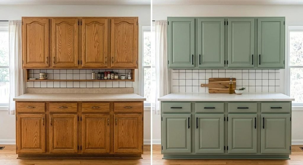
Repainting cabinets is one of the most impactful ways to change the appearance of a kitchen without replacing the existing units.
Sage green, warm white, muted blue, mushroom, and olive are useful options if you want a contemporary look that remains easy to coordinate with other finishes.
Preparation is essential for a durable result. Clean the surfaces thoroughly, remove grease, sand where appropriate, apply a suitable primer, and use a paint specifically designed for cabinetry. Allow the recommended drying and curing time before returning doors and drawers to everyday use.
Before painting, check whether your cabinet material and existing finish are suitable for the product you intend to use. Laminate, previously varnished wood, and painted timber may require different preparation methods.
Budget tip: Paint only the lower cabinets or kitchen island if a full cabinet makeover is beyond your budget. Combining refreshed lower cabinets with existing light upper cabinets can create an attractive two-tone scheme.
Refresh the Walls and Backsplash
Changing the wall colour can make a surprising difference, especially when your existing cabinetry is neutral.
Warm white walls can brighten dark wood cabinets, while soft sage or muted blue can give a predominantly white kitchen more character. Beige and mushroom shades can also help connect contrasting finishes.
If replacing the backsplash is too expensive, consider whether the existing tiles can be cleaned, repaired, or refinished using a product suitable for that surface. Another option is to focus on the exposed wall areas rather than undertaking a full renovation.
Choose wall paint with the appropriate finish for a kitchen environment, where moisture, grease, and frequent cleaning are common considerations.
Update Cabinet Handles and Hardware
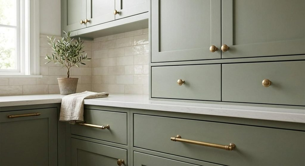
Cabinet handles may be small, but they can influence the overall style of a kitchen.
Brushed brass can warm up cream and green cabinets, while brushed nickel suits soft blue, white, and cooler neutral palettes. Matte black offers stronger contrast and works well with contemporary or industrial-inspired designs.
Before ordering new hardware, measure the distance between the existing screw holes. Choosing handles with matching measurements can help you avoid unnecessary drilling, filling, and repainting.
Replacing hardware is also a useful way to test a new design direction before investing in more substantial changes.
Introduce Colour Through Accessories
If your kitchen is already functional and you simply want to update its appearance, start with accessories.
Ceramic bowls, utensil holders, tea towels, planters, bar stools, and small appliances can introduce a new accent colour without requiring permanent changes.
For example, a neutral kitchen can feel more contemporary with sage green ceramics and natural wood accessories. A white kitchen with dusty blue textiles and brushed metal details can develop a more distinctive identity without changing the cabinets.
Keep the number of accent colours limited. Repeating one or two shades across several accessories usually creates a more cohesive result than introducing a different colour with every purchase.
Where Should You Spend and Where Can You Save?
| Kitchen element | Budget-friendly approach | When to invest more |
| Cabinets | Repaint suitable existing units | Damaged or poorly functioning cabinetry |
| Hardware | Replace handles and knobs | High-use fittings that need better durability |
| Walls | Repaint with a suitable kitchen finish | Surfaces requiring substantial repairs |
| Backsplash | Clean or refinish suitable existing tiles | Damaged tiles or surfaces needing replacement |
| Lighting | Replace selected fixtures or bulbs | Poor task lighting or unsafe electrical fittings |
| Accessories | Introduce colour through small items | Durable, frequently used items such as seating |
The best return often comes from changing the surfaces that occupy the most visual space. Refreshing the cabinets, walls, or island can make the kitchen feel substantially different without replacing every component.
Kitchen Colour Mistakes to Avoid in 2027
Even attractive colours can produce disappointing results when they are poorly matched to the room. Avoiding a few common mistakes will help you create a kitchen that looks coordinated, functions well, and remains enjoyable beyond a single design season.
Choosing Colours From Online Photographs Alone
Online kitchen photographs are excellent sources of inspiration, but they should not be treated as exact colour references.
Lighting conditions, camera settings, editing, and screen calibration can all affect how a shade appears. A sage green that looks pale and muted on a screen might appear darker or more yellow in your home.
Use photographs to identify the general palette you like, then obtain physical samples and test them against your actual materials.
Combining Too Many Competing Undertones
A kitchen can contain several colours without looking chaotic, but those colours need some relationship to one another.
Cream cabinets, cool grey countertops, strongly yellow flooring, and blue-white tiles may each look attractive individually. Together, they can create a disjointed appearance because their undertones do not work naturally as a group.
Before committing to finishes, compare samples side by side. Look for a shared quality, such as warmth, softness, or a similar underlying hue.
Using Dark Colours Without Considering Lighting
Deep brown, navy, charcoal, and forest green can make a kitchen feel sophisticated. However, extensive dark cabinetry in a poorly lit room may make the space feel enclosed.
If you love dark colours, consider using them selectively. A contrasting island, lower cabinets, or a tall pantry unit can create depth while lighter surrounding surfaces help maintain balance.
Plan task lighting carefully, particularly around countertops, sinks, and cooking areas.
Following Trends Without Considering Existing Materials
A fashionable cabinet colour may not work with your current flooring, backsplash, or countertops.
Replacing several fixed finishes simply to accommodate a new trend can become expensive. Instead, identify which existing materials you want to retain and choose colours that complement them.
For example, if your kitchen has warm oak flooring and beige stone, olive green, creamy white, or mushroom may be easier to coordinate than a strongly cool grey.
Ignoring Durability and Everyday Maintenance
A kitchen is a working space, not just a decorative feature. The colour and finish should suit the way you cook, clean, and use the room.
Very dark glossy surfaces can make fingerprints and dust more noticeable, while heavily textured surfaces may require additional cleaning. Pale worktops can also vary considerably in how well they conceal everyday marks.
Consider maintenance alongside appearance when choosing cabinet paint, countertop materials, and backsplash finishes.
Forgetting About Adjacent Rooms
Open-plan kitchens often connect directly to living rooms, dining areas, and hallways. A colour scheme that looks attractive in isolation may feel disconnected from the rest of the home.
Repeat a few complementary colours or materials across adjoining spaces to create continuity. You might echo the kitchen’s oak cabinetry in a dining table or use a similar green in living room textiles.
The aim is not to make every room identical. A consistent underlying palette allows each space to have its own personality while still feeling part of the same home.
Related Inspiration: Kitchen Cabinet Colours and Whole-Home Colour Trends
Kitchen colour decisions become easier when you consider how they connect to broader interior design choices. Cabinetry often establishes the kitchen’s main colour direction, while the surrounding rooms influence how that palette should be balanced.
Explore Kitchen Cabinet Colour Trends
Kitchen cabinets are among the most visually prominent features in the room, so their colour deserves careful consideration.
Explore kitchen cabinet colour trends for more inspiration on painted cabinetry, natural wood finishes, contrasting islands, and combinations that suit different kitchen styles.
This related topic can help you narrow down the best cabinet colour before selecting your backsplash, wall paint, and decorative accents.
Coordinate Your Kitchen With Wider Interior Colour Trends
A kitchen does not need to follow every interior trend to feel current. Choosing a few colours that work throughout the home can create a more cohesive and enduring result.
Our guide to colour trends for 2027 explores broader colour directions that can inspire complementary choices for adjoining living and dining spaces.
Use these ideas as a starting point, then adapt the palette to your home’s natural light, existing materials, and personal preferences.
How to Choose a Kitchen Colour Scheme You Will Love for Years
Trends can provide inspiration, but a successful kitchen colour scheme should suit your everyday life as well as your aesthetic preferences.
Before making a final decision, consider how the room functions, which finishes will remain in place, and how much time and money you want to invest in updating it.
Start With the Features You Cannot Easily Change
Look at your flooring, countertops, backsplash, appliances, and window frames. These fixed elements should influence your colour choices.
If you already have beautiful walnut flooring, a palette of warm ivory, olive, or muted blue may complement it more naturally than a collection of cool grey finishes.
Working with existing materials also reduces renovation costs and gives the finished room a more consistent appearance.
Decide How You Want the Kitchen to Feel
Think about the atmosphere you want to create before choosing individual shades.
- Bright and spacious: Warm white, pale greige, and light oak.
- Relaxed and natural: Sage green, olive, cream, and timber.
- Warm and inviting: Terracotta, clay, beige, and walnut.
- Sophisticated and dramatic: Chocolate brown, deep green, and pale stone.
- Fresh and contemporary: Dusty blue, warm white, and brushed nickel.
- Classic and elegant: Muted navy, ivory, and warm metallic accents.
These combinations are starting points rather than strict rules. Adjust the shades and proportions to suit your kitchen’s layout and lighting.
Choose One Main Colour and Build Around It
Trying to select every colour at once can make the process unnecessarily complicated.
Choose a dominant shade first, whether it is cream cabinetry, sage green lower cabinets, or a rich brown island. Then select supporting colours for the walls, countertops, and backsplash.
Finish with hardware, lighting, and accessories that reinforce the overall palette.
This method helps prevent unnecessary colour changes during a renovation and makes it easier to compare alternative finishes.
Test Samples Before Committing
Physical samples are especially valuable when choosing cabinet paint, wall colours, or expensive stone surfaces.
View the samples together at different times of day, under both natural and artificial lighting. If possible, test larger samples rather than relying on tiny paint cards.
Consider the finish as well as the colour. Matte, satin, and glossy surfaces can produce noticeably different visual effects, even when they use the same shade.
Use Trends Where They Make Sense for Your Home
You do not need to redesign your entire kitchen around a trending colour. Introduce fashionable shades through a kitchen island, painted pantry, backsplash, or accessories if you prefer flexibility.
Larger, more permanent elements can remain relatively timeless, while smaller details provide opportunities to experiment.
The best kitchen colour schemes for 2027 balance contemporary inspiration with practical decisions about materials, lighting, maintenance, and personal taste.
Frequently Asked Questions About Kitchen Colour Schemes 2027
What are the most popular kitchen colour schemes for 2027?
Promising kitchen colour directions for 2027 include warm cream and beige, sage and olive green, earthy terracotta, chocolate brown, and dusty blue. Combining these shades with natural wood, pale stone, and warm metallic details can create a contemporary, balanced kitchen.
What is the best colour for kitchen cabinets in 2027?
Sage green is a versatile option for homeowners who want colour without an overly dramatic effect. Warm white, mushroom, olive, dusty blue, and chocolate brown are also worth considering. The best choice depends on your lighting, existing materials, and preferred interior style.
Are white kitchens going out of style in 2027?
White kitchens remain a flexible design choice. The main alternative is to use warmer whites, ivory, or cream and introduce contrast through wood, coloured islands, textured tiles, and distinctive hardware. You can update an all-white kitchen without replacing its cabinets.
What kitchen colours make a small kitchen look bigger?
Warm white, ivory, pale greige, and other light neutrals can help a small kitchen feel brighter. Using similar colours on upper cabinets and walls can create visual continuity. Dark shades can still work as accents on lower cabinets or an island.
Are green kitchen cabinets still a good choice for 2027?
Green cabinets remain a versatile option because they work with natural wood, warm neutrals, stone, and several metallic finishes. Sage creates a softer look, while olive and forest green provide more depth. Choose an undertone that complements your kitchen’s existing surfaces.
What colours go best with cream kitchen cabinets?
Cream cabinets pair well with sage green, olive, dusty blue, warm beige, oak, walnut, and terracotta. Brushed brass and bronze can enhance their warmth, while pale stone countertops help maintain a light and coordinated appearance.
What is the best two-tone kitchen colour combination for 2027?
Sage green lower cabinets with warm white upper cabinets are a versatile choice. Other appealing combinations include olive and oak, chocolate brown and cream, dusty blue and pale timber, and charcoal with soft greige.
Are dark kitchen cabinets a good idea for small spaces?
Dark cabinets can work in small kitchens when balanced with lighter countertops, walls, and upper cabinets. Good task lighting is important, especially in rooms with limited natural daylight. Using a dark colour on an island or lower cabinets can introduce depth without overwhelming the space.
How can I update my kitchen colour scheme without renovating?
Repainting suitable cabinets, changing handles, refreshing the walls, and introducing colourful accessories are practical options. Start with the elements that occupy the most visual space, and choose new finishes that complement your existing flooring and countertops.
How do I choose a timeless kitchen colour scheme instead of following short-lived trends?
Build the main palette around colours you enjoy living with, existing materials, and the room’s lighting. Keep expensive, permanent finishes relatively versatile, then introduce trend-led shades through paint, accessories, or a contrasting island that can be updated more easily.
Create a Kitchen That Reflects Your Style
The most inspiring kitchen colour schemes for 2027 combine warmth, personality, and practicality. Creamy neutrals create a comfortable foundation, green and blue shades introduce subtle colour, and rich browns or earthy tones bring depth to contemporary interiors.
You do not need to follow every trend to achieve a beautiful result. Start with your existing materials, decide how you want the room to feel, and select a small group of colours that work naturally together.
Ready to refresh your kitchen? Choose your favourite palette from this guide, collect a few paint and material samples, and compare them in your own space before making a final decision. A little planning can help you create a kitchen that feels fresh for 2027 and remains enjoyable for years to come.
