
Color trends 2027 are bringing a richer, more personal approach to interior design, with earthy browns, botanical greens, warm neutrals, dusty blues, and expressive accent shades creating homes that feel both comfortable and distinctive. Rather than relying on one dominant color or an entirely neutral palette, the emerging direction embraces layered combinations that balance natural warmth with fresh personality.
Whether you’re planning a complete room makeover or simply looking for an affordable way to refresh your home, the right colors can transform the atmosphere without requiring new furniture or expensive renovations. From sophisticated chocolate brown and calming sage green to bold burgundy and soft butter yellow, there are plenty of ways to explore the latest interior color trends while keeping your space timeless.
This guide explores the key color trends for 2027, explains how to combine popular shades, and shares practical ideas for bringing them into living rooms, kitchens, bedrooms, and other spaces. You’ll also discover which colors work particularly well together, how lighting affects your choices, and how to create a beautiful palette that reflects your personal style.
In This Article
Color Trends 2027 at a Glance: The Shades Worth Knowing
The most interesting color trends 2027 are centered on balance. Soft, understated shades provide a calming foundation, while deeper earthy tones and carefully chosen accents introduce character. The result is an approach to decorating that feels welcoming rather than overly coordinated.
Instead of treating every trend as a separate look, think of these colors as building blocks. You can combine several within one room or choose a single shade to update an existing interior.
The Leading Color Families to Watch
Explore these color directions for inspiration when planning your 2027 interior palette.
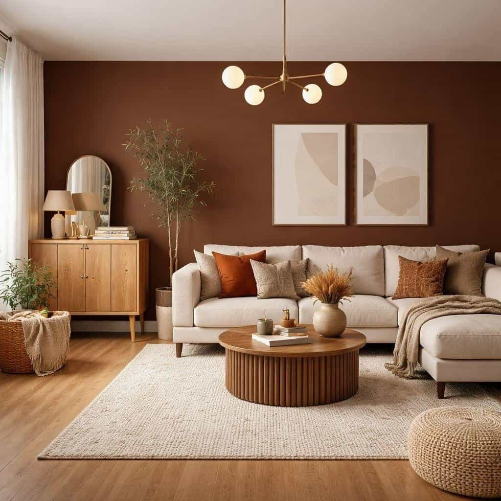
Earthy browns and clay tones
Rich chocolate, caramel, terracotta, and tobacco brown bring depth and warmth to modern interiors. They work particularly well with natural wood, textured fabrics, stone, and creamy whites.
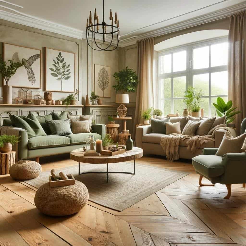
Botanical and muted greens
Sage, moss, olive, and forest green offer a connection to nature. Lighter greens create a relaxed atmosphere, while deeper shades provide contrast and sophistication.
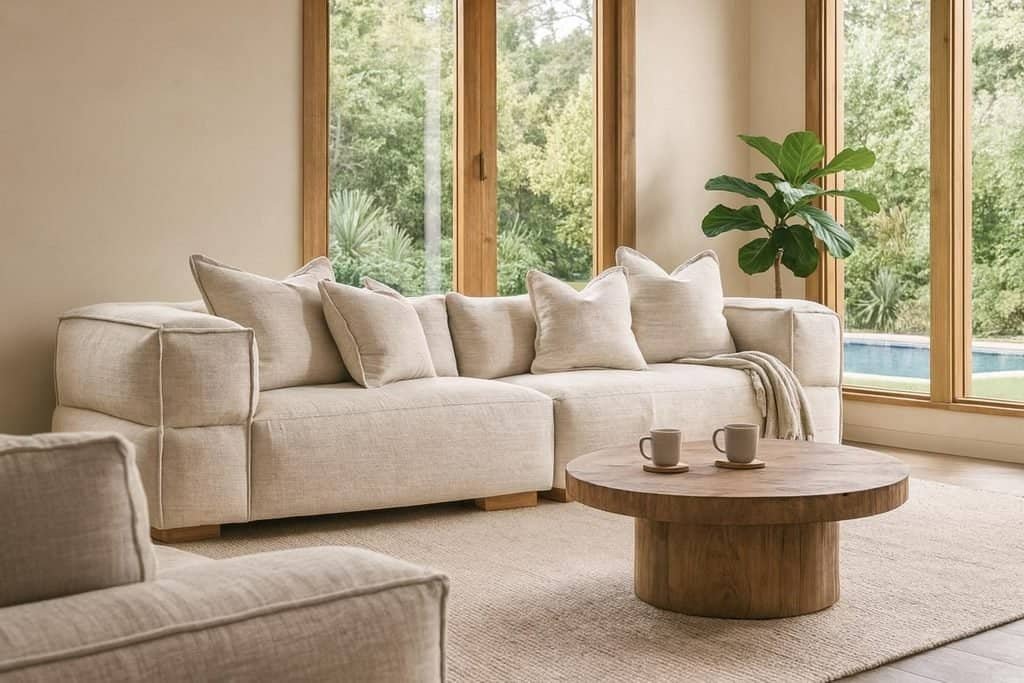
Creamy whites and warm neutrals
Ivory, sand, mushroom, and soft greige create versatile foundations. These shades complement both traditional and contemporary furniture and allow decorative details to stand out.
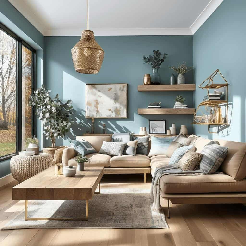
Dusty blues and blue-greens
Smoky blue, faded denim, and muted teal provide a refreshing alternative to conventional neutrals. Their subtle depth makes them suitable for both restful and expressive interiors.
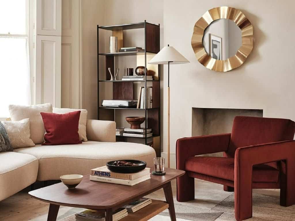
Burgundy, berry, and deep reds
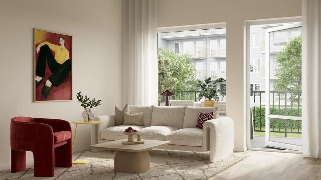
These dramatic colors add richness to otherwise restrained spaces. Use them in upholstery, artwork, accent walls, or accessories for a confident but controlled statement.
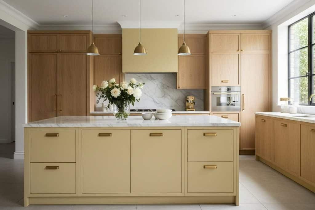
Butter yellow and golden ochre
Soft yellow introduces brightness and optimism, while deeper ochre feels grounded and mature. Both can bring warmth to kitchens, dining areas, and understated living spaces.
These color families offer different ways to shape a room’s personality. Warm browns and greens create a grounded atmosphere, blues introduce a cooler counterpoint, and reds or yellows provide energy.
What Makes the 2027 Color Palette Feel Different?
One defining direction is the move toward more nuanced color combinations. Instead of pairing stark white with a single bold accent, decorators can build depth by combining several related shades and contrasting their textures.
For example, a living room might feature warm ivory walls, a chocolate brown sofa, olive cushions, and terracotta ceramics. Each color has its own identity, yet the shared earthy quality makes the overall scheme feel cohesive.
Another important consideration is how a room feels as well as how it looks. Muted greens and dusty blues can support a restful atmosphere, while burgundy and deeper browns introduce a more intimate, dramatic mood.
Natural materials also play an important role. Oak furniture, linen curtains, wool rugs, stone surfaces, and woven accessories soften stronger colors and prevent a palette from appearing flat.
The most useful approach is to treat 2027 color trends as inspiration rather than a fixed set of rules. Choose the shades that complement your existing home, then introduce new colors where they make the biggest difference.
Earthy Browns, Clay, and Terracotta Bring Warmth Back
Earthy colors are an appealing direction for anyone who wants a home to feel inviting, grounded, and visually rich. Brown, terracotta, and clay-inspired shades can add warmth without relying on bright colors or complicated decorative details.
These tones also work across a wide range of styles, from modern organic interiors and contemporary apartments to rustic homes and understated traditional spaces.
The secret is choosing the right depth of color and balancing it with lighter surfaces, natural materials, and thoughtful lighting.
From Chocolate Brown to Soft Mushroom
Brown offers far more variety than many people realize. A deep chocolate shade creates drama, caramel feels warm and relaxed, and mushroom brown sits comfortably between gray and beige.
Each version creates a different effect.
- Chocolate brown: Ideal for statement sofas, accent walls, dining furniture, and cabinetry.
- Caramel and tobacco: Excellent for leather upholstery, wooden furniture, cushions, and warm decorative accents.
- Mushroom brown: A versatile choice for walls, curtains, rugs, and larger surfaces when you want subtle depth.
- Walnut-inspired tones: Particularly effective when paired with cream, muted green, and natural stone.
A simple way to introduce brown is to begin with furniture rather than paint. A chocolate-colored sofa or walnut coffee table can establish a warm foundation while leaving the walls light.
For a more dramatic transformation, consider painting a feature wall in a deep brown shade. Balance it with ivory upholstery, pale flooring, or lighter artwork so the room retains a sense of openness.
Brown can become overwhelming when every surface is dark and visually heavy. Mixing finishes is an effective solution: combine smooth wood, textured linen, soft wool, and matte ceramics to create interest without introducing too many colors.
Terracotta and Clay Add Depth Without Overwhelming a Room
Terracotta brings a softer, more expressive quality to the earthy palette. Its reddish-orange undertones feel warm and natural, making it a useful choice for rooms that need more personality than a neutral scheme provides.
The shade can range from pale clay and dusty rust to deep burnt orange. Softer versions are easier to use across larger surfaces, while saturated terracotta is particularly effective in smaller doses.
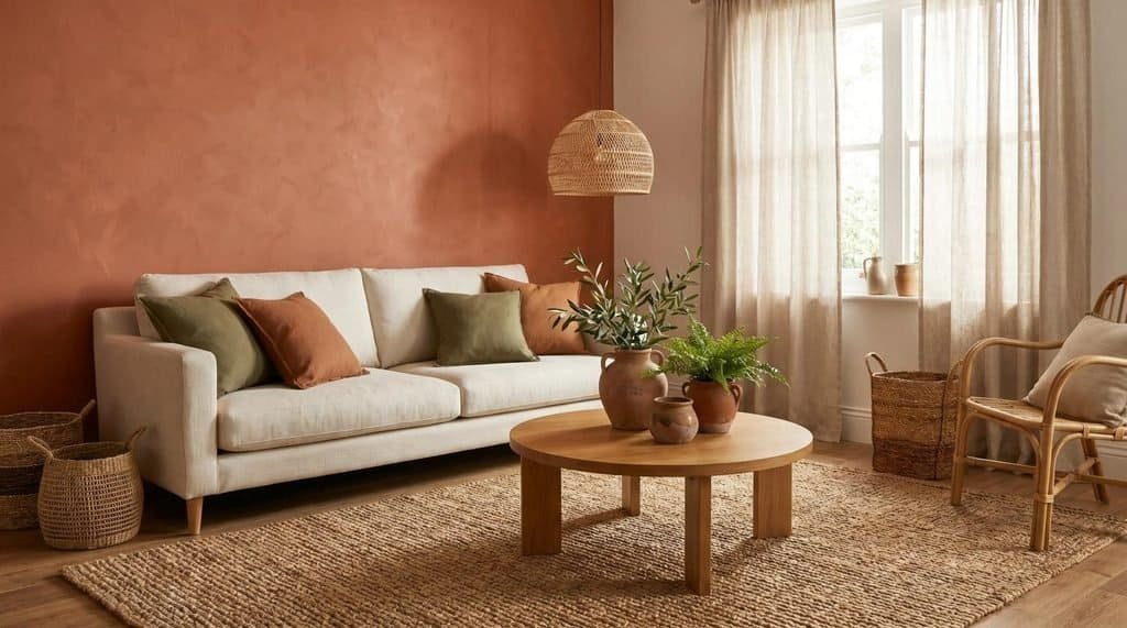
Try these combinations to see how terracotta can work in different interiors:
- Terracotta and ivory: Creates a light, welcoming scheme with a gentle contrast between warm color and pale neutrals.
- Terracotta and olive green: Combines two nature-inspired shades for a layered, organic look.
- Terracotta and walnut: Emphasizes warmth and works especially well with mid-century or contemporary furniture.
- Terracotta and dusty pink: Produces a softer, more tonal palette that suits bedrooms and relaxed living spaces.
Terracotta does not need to cover an entire wall to make an impact. A pair of ceramic lamps, patterned cushions, a rug with rust-colored details, or a painted side table can introduce the shade without committing to a major change.
For kitchens and dining areas, terracotta accessories can add warmth to cream cabinetry and wooden dining furniture. In bedrooms, softer clay tones work beautifully with natural bedding and warm white walls.
The Best Rooms for Warm Earth Tones
Earthy browns and clay shades are versatile, but their success depends on how they are distributed throughout the room.
Living rooms: Use a brown sofa as an anchor and add cream cushions, terracotta ceramics, and olive-green accents. This creates a layered appearance without making every element compete for attention.
Bedrooms: Choose mushroom or muted clay for the walls, then introduce chocolate brown through a headboard, bedside furniture, or bedding. Keep fabrics soft and lighting gentle to maintain a restful atmosphere.
Dining rooms: Walnut furniture, terracotta tableware, and warm neutral walls create an inviting setting for everyday meals and entertaining.
Small rooms: Use lighter clay shades or mushroom neutrals on larger surfaces, reserving dark brown for smaller details. This allows you to enjoy the warmth of the trend without making the space feel visually crowded.
Lighting deserves particular attention when working with earthy colors. A brown that appears rich and balanced in daylight may look much darker under weak artificial lighting. Test paint samples on more than one wall and view them at different times before making a final decision.
The most successful earthy interiors are not necessarily the darkest ones. A thoughtful balance of warm color, natural texture, and lighter elements often creates a more sophisticated result.
Green Color Trends 2027: From Botanical Calm to Deep Drama
Green remains a versatile choice for interiors because it can feel understated, natural, or richly dramatic depending on the shade. Its range makes it suitable for almost any room, whether you want a calm bedroom, a welcoming living area, or kitchen cabinetry with more personality.
The most useful way to approach green color trends for 2027 is to consider both the shade and the surface on which it will appear. A pale sage wall creates a very different effect from deep forest-green cabinetry, even when both colors belong to the same family.
Sage and Soft Olive for Understated Interiors
Sage green is a gentle, muted shade that combines green with subtle gray undertones. Olive is generally warmer and earthier, with yellow or brown undertones that make it particularly compatible with natural wood.
Both are practical alternatives to beige when you want a neutral-looking room with a little more character.
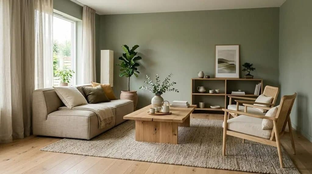
Sage green is especially useful when you want color without a strong visual statement. It works well on bedroom walls, kitchen cabinets, built-in shelving, and living room upholstery.
Pair sage with:
- Warm white and ivory for a light, relaxed atmosphere.
- Pale oak and natural linen for a modern organic look.
- Muted pink for a gentle contrast.
- Soft brown and taupe for a warmer, more grounded palette.
Olive green has more visual weight, making it particularly effective on cabinetry, accent furniture, and decorative details. Its earthy undertones help it sit comfortably beside walnut, caramel leather, brass-colored hardware, and creamy stone.
For example, olive kitchen cabinets paired with a warm white backsplash and oak shelves can create a distinctive look without relying on elaborate decoration. In a living room, olive cushions or curtains can add depth to a neutral sofa.
Small rooms can benefit from these greens too. A light sage shade can make walls feel softer than stark white, while olive accents provide contrast without requiring a large amount of space.
Moss, Forest, and Deeper Botanical Greens
Deep greens offer a more dramatic interpretation of nature-inspired color. Moss, pine, and forest green can make a room feel intimate and sophisticated, especially when combined with warm lighting and tactile materials.
These shades are particularly effective when you want one element to stand out.
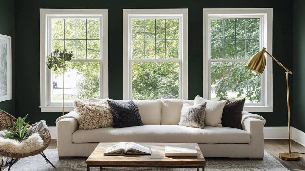
Consider using deeper green in the following ways:
- Paint built-in bookcases or shelving to create a strong architectural feature.
- Choose forest-green cabinetry for a kitchen with warm stone counters and wooden accents.
- Introduce a moss-green velvet chair against a cream or mushroom-colored wall.
- Use dark green in a bedroom through an upholstered headboard, curtains, or bedding.
Dark green can work across an entire room, but the surrounding elements need to provide enough contrast. Pale ceilings, lighter upholstery, reflective surfaces, and carefully positioned lamps can help prevent the color from feeling too heavy.
A useful technique is to repeat the green in two or three places rather than concentrating it in a single corner. For instance, forest-green shelving can be echoed in a cushion and a small piece of artwork. These subtle repetitions make the scheme feel intentional.
Pay attention to the undertone, too. Blue-based forest greens tend to look cooler and more dramatic, while yellow-based moss and olive shades often feel warmer. Choosing a green that complements your flooring and furniture is more important than choosing the darkest or most fashionable shade.
Color Combinations That Make Green Look Modern
Green becomes particularly interesting when paired with a contrasting color rather than surrounded entirely by neutrals. The right combination creates depth while preserving a cohesive look.
| Green shade | Best color partners | Overall effect |
| Sage green | Ivory, pale oak, dusty pink | Soft and understated |
| Olive green | Terracotta, caramel, warm beige | Earthy and inviting |
| Forest green | Burgundy, walnut, cream | Rich and sophisticated |
| Moss green | Mushroom, brass, muted brown | Organic and layered |
| Blue-green | Warm white, dusty blue, natural stone | Fresh and contemporary |
One particularly effective combination is olive green and burgundy. The green grounds the palette, while the red introduces richness. Use olive on a larger surface, such as cabinetry or a wall, and add burgundy through upholstery, artwork, or accessories.
Sage and warm beige provide a more restrained option for people who prefer subtle color. The two shades work together on walls, curtains, furniture, and bedding, creating a relaxed appearance without looking overly coordinated.
For a more contemporary interior, combine forest green with walnut and ivory. The dark wood reinforces the richness of the green, while ivory prevents the overall palette from becoming too dense.
The key is to establish a clear visual hierarchy. Let one shade lead, use a second to support it, and introduce the remaining colors in smaller amounts. This approach makes green color trends for 2027 easier to adapt to your own home, regardless of room size or decorating style.
Warm Whites and Refined Neutrals Are Getting More Interesting
Warm neutrals continue to offer a versatile foundation for interiors, but the most appealing color trends for 2027 go beyond plain beige walls and bright white ceilings. Cream, ivory, sand, mushroom, and soft greige bring subtle variation to a room while maintaining the flexibility that makes neutral decorating so popular.
These shades work particularly well for homeowners who want a timeless interior but still want their spaces to feel current. They can complement colorful furniture, natural materials, statement lighting, and decorative accessories without competing for attention.
The secret is choosing neutrals with the right undertones and layering them thoughtfully. A room decorated entirely in similar shades can feel flat, but a combination of warm whites, textured fabrics, and contrasting finishes creates a much more considered result.
Cream, Ivory, and Buttery Off-White
Creamy whites provide a softer alternative to brilliant white. Their subtle yellow, beige, or warm undertones can make an interior feel more welcoming, especially when paired with natural wood, linen, and stone.
Unlike stark white, which can sometimes appear cold under certain lighting conditions, warm white shades often blend more naturally with the materials found in everyday homes.
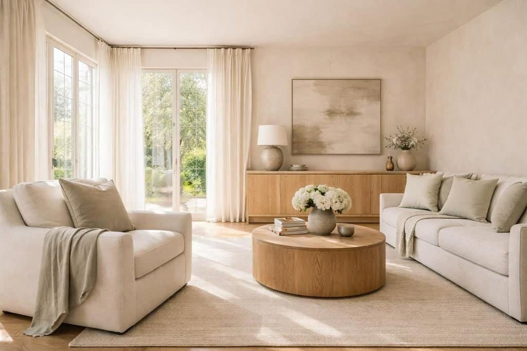
There are several variations worth considering:
- Cream: A classic warm white that works well in living rooms, bedrooms, and traditional interiors.
- Ivory: Slightly refined and versatile, making it suitable for walls, upholstery, curtains, and decorative accessories.
- Buttery off-white: A gentle yellow-based neutral that can give a room a subtle glow.
- Linen white: A natural-looking shade that complements woven fabrics, pale wood, and relaxed interior styles.
Cream and ivory are especially useful when you want to combine several colors in one room. For example, ivory walls can provide a quiet background for a chocolate brown sofa, olive-green cushions, and terracotta accessories.
In kitchens, creamy white cabinets offer a softer alternative to bright white finishes. Pair them with oak shelves, warm stone countertops, and brushed metal hardware for a timeless look that still feels fresh.
Bedrooms also benefit from warm whites. Layer ivory bedding with cream curtains and a pale beige headboard to create a restful environment. Slight differences between the shades add depth without introducing strong visual contrast.
A practical tip: Test warm white paint samples beside your flooring and existing furniture. Some whites appear distinctly yellow in afternoon sunlight, while others reveal pink, gray, or beige undertones. Checking the color throughout the day helps you avoid an expensive mismatch.
Greige, Sand, Mushroom, and Putty
Neutral color trends for 2027 also make room for shades that sit between traditional color categories. Greige blends gray and beige, mushroom combines muted brown and gray, sand has a gentle golden quality, and putty often carries a subtle earthy undertone.
These colors provide more depth than plain white while remaining adaptable enough for long-term decorating.
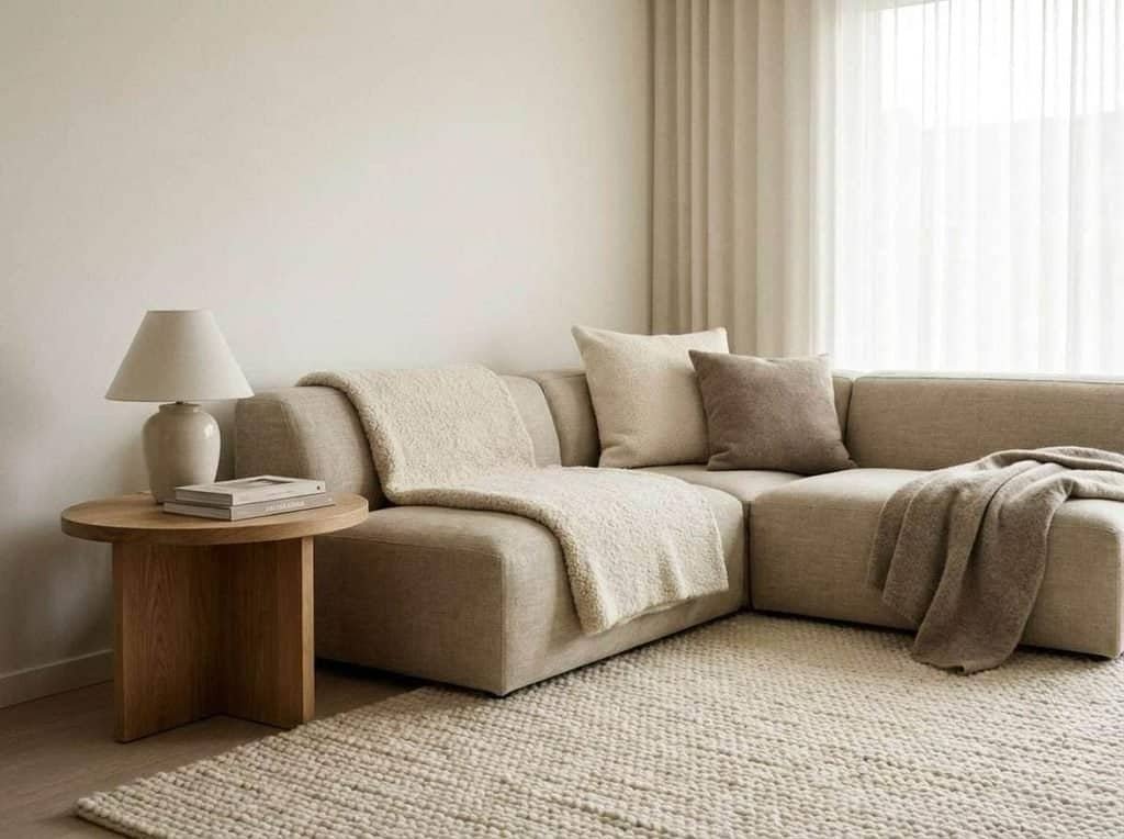
Choosing between them depends on the mood you want to create.
Greige is useful when you want a restrained neutral that works with both contemporary and traditional furnishings. Choose a warmer version if your room contains oak floors, cream upholstery, or warm metallic finishes.
Mushroom creates a softer, earthier impression. It works beautifully on bedroom walls, upholstered headboards, cabinetry, and built-in shelving, particularly when combined with walnut or chocolate brown.
Sand brings a subtle warmth that suits rooms with natural materials. It pairs easily with linen, rattan, light wood, and soft green accents.
Putty offers a slightly more grounded appearance. It is a good option for kitchen cabinets, interior doors, and walls when white feels too stark but a darker color seems too bold.
Room orientation and natural light should influence your decision. A room receiving limited daylight may benefit from a warmer beige-based neutral, while a bright space can often accommodate a more muted greige without appearing dull.
Avoid selecting a neutral based on a tiny paint-card sample alone. Large sample boards reveal how the color interacts with your surroundings, and moving them between walls can help you identify the most flattering shade.
How to Layer Neutrals Without Creating a Flat Interior
A neutral room does not need to look plain. The most successful designs use differences in texture, tone, and material to create depth without relying on strong colors.
The goal is to make each element contribute something distinctive while allowing the overall palette to feel connected.
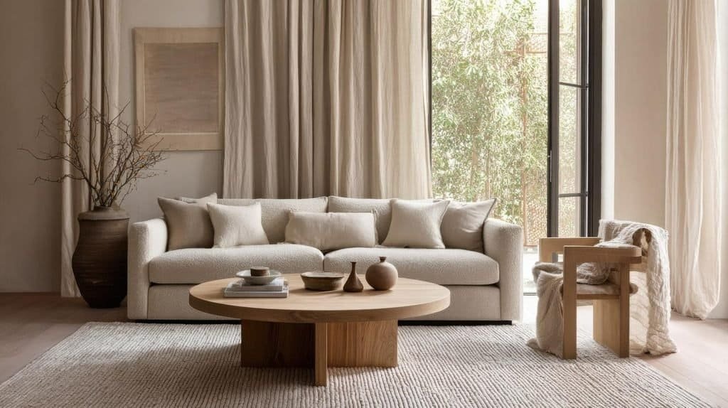
Try these practical techniques:
- Combine different neutral shades. Pair ivory walls with sand-colored curtains, mushroom upholstery, and darker wood furniture rather than matching everything to one beige.
- Mix textures. Linen, boucle, wool, velvet, stone, and woven materials create contrast even when their colors are similar.
- Introduce natural wood. Oak brings a light, organic quality, while walnut creates a richer and more dramatic effect.
- Vary the finishes. Matte walls, textured fabrics, glazed ceramics, and subtle metallic details keep the palette from appearing one-dimensional.
- Use darker accents selectively. Chocolate brown, charcoal, or deep olive can provide definition around a neutral room.
For example, imagine a living room with warm ivory walls, a sand-colored sofa, mushroom cushions, and a walnut coffee table. A textured cream rug softens the floor, while olive-green artwork or a few terracotta accessories introduce enough contrast to keep the space interesting.
The same principle works in smaller homes. Instead of introducing several bold colors, create variety through material choices and slight tonal differences. The result feels layered and personal without making a compact room visually busy.
Warm neutrals are also practical for anyone who likes to update their home regularly. A neutral foundation allows you to change cushions, rugs, artwork, and seasonal accessories without needing to repaint the entire space.
Dusty Blues and Blue-Greens Create a Softer Kind of Statement
Blue is an appealing option for homeowners who want a little more color but prefer something calmer than saturated reds or bright yellows. For 2027-inspired interiors, dusty blues, smoky tones, faded denim, and muted blue-greens offer a balance between freshness and depth.
These colors can work as subtle alternatives to gray, particularly when paired with warm neutrals and natural materials. Their success depends on choosing the right shade and preventing cooler tones from making the room feel unwelcoming.
A dusty blue wall, for instance, can look elegant beside creamy white trim and oak furniture. A deeper blue-green kitchen cabinet can provide a confident statement while remaining versatile enough to coordinate with stone, brass-colored hardware, and wooden surfaces.
Powder Blue, Smoky Blue, and Faded Denim
Soft blues offer several decorating possibilities, from airy and delicate to muted and sophisticated.
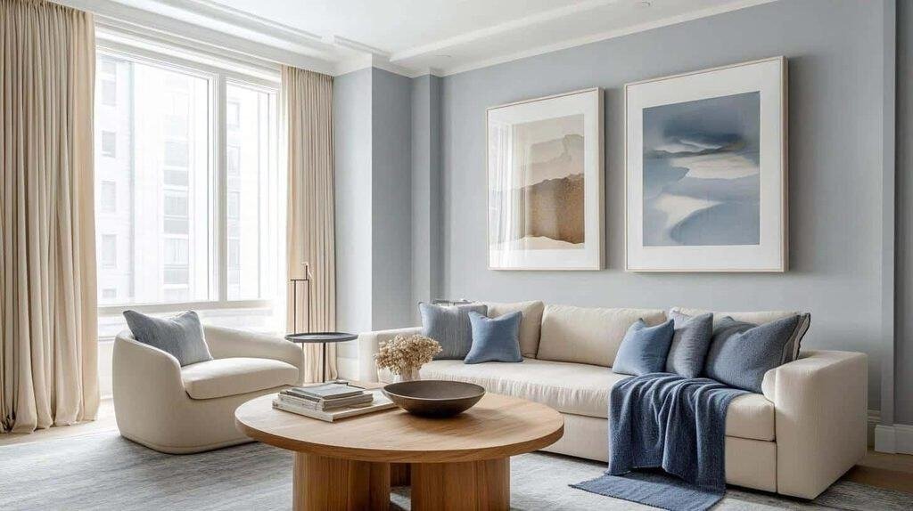
Powder blue has a light, gentle appearance that works well in bedrooms, bathrooms, and rooms where you want a fresh atmosphere. It pairs particularly well with warm white, pale timber, and soft beige.
Smoky blue contains a more subdued quality, often with gray undertones. This makes it a practical choice for larger surfaces because it introduces color without becoming overly bright.
Faded denim blue feels relaxed and slightly more casual. Use it in upholstery, cushions, painted furniture, or decorative textiles to bring character to a neutral interior.
Consider these combinations:
- Dusty blue and warm ivory: A balanced scheme for living rooms and bedrooms.
- Powder blue and pale oak: A light, natural combination that works particularly well in compact spaces.
- Smoky blue and mushroom: A more sophisticated palette with subtle depth.
- Faded denim and caramel brown: An appealing mix of cool blue and warm earthy tones.
In a bedroom, smoky blue walls can be paired with cream bedding, walnut bedside tables, and linen curtains. This combination creates visual interest without relying on a complicated color scheme.
For a living room, consider using dusty blue in an armchair or patterned rug rather than painting every wall. The shade can become a gentle focal point against ivory walls and warm wood furniture.
Blue also works well in transitional spaces such as hallways and home offices. A muted shade can introduce personality without overwhelming the surrounding rooms, especially when the color is repeated in artwork or small decorative details.
The key is warmth. If the room already has cool gray flooring and limited natural light, adding more cool-toned blue may make the space feel subdued. Introduce warm wood, creamy textiles, and appropriately warm lighting to create a more balanced result.
Teal and Blue-Green for Added Depth
Blue-green shades sit between blue and green, offering a richer alternative to pale blues. Depending on their undertones, they can feel fresh and aquatic, earthy and botanical, or dark and dramatic.
Teal and muted blue-green are particularly effective when you want to create a stronger visual feature without relying on an extremely bright color.
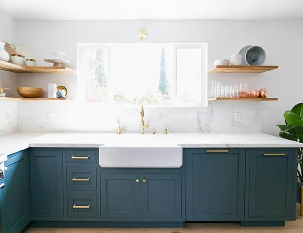
One of the most attractive applications is kitchen cabinetry. Blue-green cabinets provide depth while working well with pale stone countertops, warm white backsplashes, and natural oak shelving.
The same shades can be used elsewhere in the home:
- Paint a built-in bookcase in muted teal to create a distinctive architectural feature.
- Choose blue-green upholstery for a statement chair in a neutral living room.
- Introduce the color through bathroom cabinetry, towels, or decorative tiles.
- Use blue-green bedding or curtains to add richness to a bedroom without changing the wall color.
Darker blue-green shades often look particularly effective beside warm metals and natural wood. Brass-colored handles or lamps introduce a subtle glow, while oak and walnut prevent the palette from feeling too cool.
For a softer approach, combine muted teal with ivory, sand, and pale gray-beige. This allows the blue-green to stand out while keeping the room visually relaxed.
When choosing a shade, pay attention to whether it leans more toward blue or green. A blue-dominant teal may coordinate better with dusty blue and cool stone, while a greener version often pairs more naturally with olive, terracotta, and earthy browns.
Testing samples against the actual materials in your room is essential. A blue-green shade can shift noticeably under different lighting conditions, and its undertones may become more obvious when placed beside a contrasting wall color.
The Most Versatile Blue Color Combinations
Blue becomes easier to use when you pair it with colors that balance its temperature and intensity. Warm neutrals and natural materials are particularly helpful because they soften cooler shades without taking away their distinctive character.
| Blue shade | Color combination | Best application |
| Powder blue | Ivory and pale oak | Bedrooms and small living rooms |
| Smoky blue | Mushroom and walnut | Living rooms and home offices |
| Faded denim | Caramel and cream | Casual, comfortable interiors |
| Muted teal | Sand and warm white | Kitchens and bathrooms |
| Deep blue-green | Terracotta and natural wood | Statement walls and cabinetry |
For a welcoming living room, try dusty blue with caramel brown. A blue accent chair beside a warm brown wooden table creates contrast, while ivory upholstery or a cream rug ties the scheme together.
For a more understated interior, combine smoky blue with mushroom and walnut. The result is deeper than a traditional neutral palette but remains easy to coordinate with existing furniture.
If you prefer a nature-inspired look, muted teal can be paired with terracotta and warm white. The combination brings together cool and warm shades, creating a room that feels layered rather than overly coordinated.
A useful guideline is to let blue provide the contrast while warmer colors supply the balance. You do not need equal amounts of every shade. A predominantly neutral room with blue curtains, a teal cabinet, or a few dusty-blue cushions may be enough to introduce the trend.
These blue and blue-green combinations offer flexibility for different decorating styles, from minimalist interiors to warmer, more eclectic spaces. Choose the shade that suits your lighting and existing materials, then repeat it in a few carefully selected places to make the entire room feel connected.
Bold Reds, Berry Tones, and Unexpected Accent Colors
Not every interior color trend for 2027 is about creating a calm, neutral space. Rich reds, deep berry shades, and muted pinks offer an opportunity to make rooms feel more expressive, particularly when they are balanced with earthy colors and understated materials.
These shades can look sophisticated rather than overwhelming when used intentionally. Burgundy upholstery, a wine-colored accent wall, or dusty rose accessories can introduce warmth and personality without requiring an entire room to be repainted.
The most effective approach is to treat stronger colors as part of a balanced palette. Pair them with warm neutrals, natural wood, or muted greens to give the eye somewhere to rest.
Burgundy, Oxblood, and Wine-Inspired Shades
Burgundy and oxblood bring depth to interiors through their dark red, brown, and sometimes purple undertones. Wine-inspired shades feel particularly rich alongside walnut furniture, creamy upholstery, and warm metallic details.
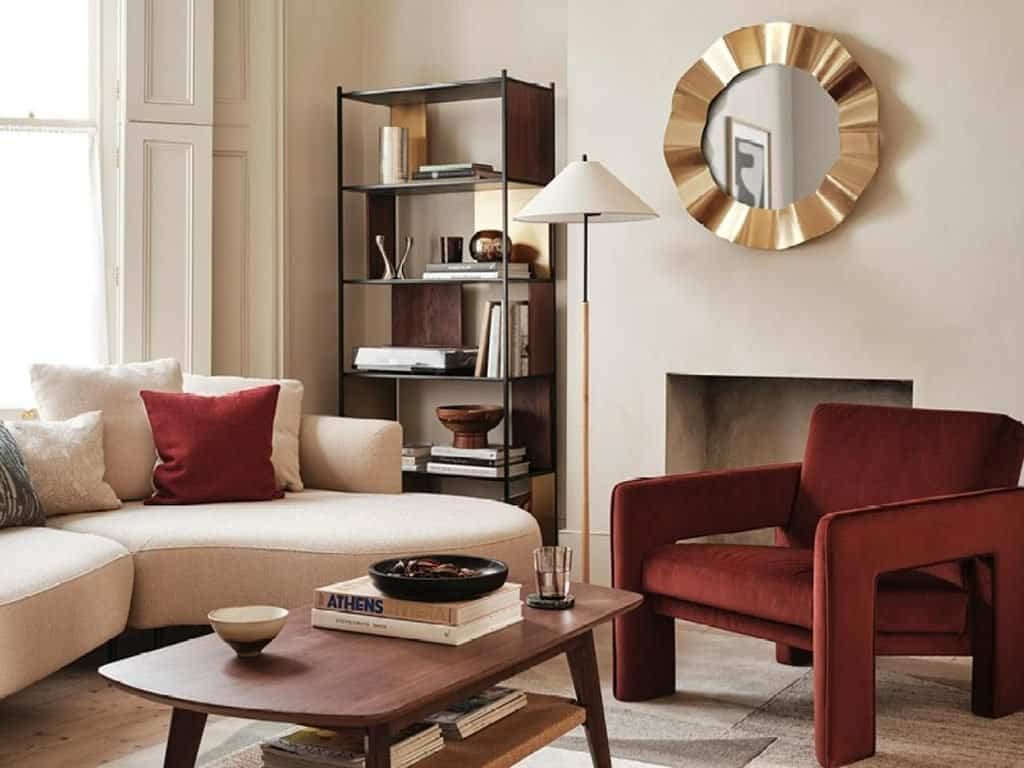
Although these colors are dramatic, they do not need to dominate a room. A single piece of burgundy furniture can become the focal point of a neutral interior, while smaller accessories provide a more subtle introduction.
Here are several ways to use these deeper reds:
- Living rooms: Introduce a burgundy velvet armchair, decorative cushions, or a rug with wine-colored details.
- Bedrooms: Use burgundy in bedding, an upholstered headboard, or curtains against warm white or mushroom-colored walls.
- Dining rooms: Combine dark red dining chairs with a walnut table and creamy walls for an inviting, sophisticated look.
- Kitchens: Consider a wine-colored island or lower cabinets paired with warm stone countertops and lighter upper cabinets.
- Entryways: Use a burgundy console, artwork, or a painted interior door to create a distinctive first impression.
Burgundy also pairs beautifully with green. Olive and burgundy create an earthy, slightly dramatic combination, while forest green and wine red produce a richer, more traditional effect.
For a softer look, combine burgundy with ivory, sand, and pale oak. These lighter elements prevent the deep red from making the space feel too dark.
Painted surfaces require a little more consideration. A burgundy wall can look striking in a dining room or reading nook, but it may feel heavy in a small room with limited daylight. Test the shade in the actual space before committing, and consider using it on a single wall or a smaller architectural feature.
Styling tip: Burgundy looks especially effective when repeated in small details. A wine-colored cushion, a piece of artwork, and a ceramic accessory can make a neutral room feel thoughtfully coordinated without turning the entire space red.
Muted Pinks and Dusty Rose
Muted pink is another way to bring warmth into interiors without choosing a highly saturated color. Dusty rose, subdued blush, and earthy pink shades have enough softness to complement neutrals while providing more personality than plain beige.
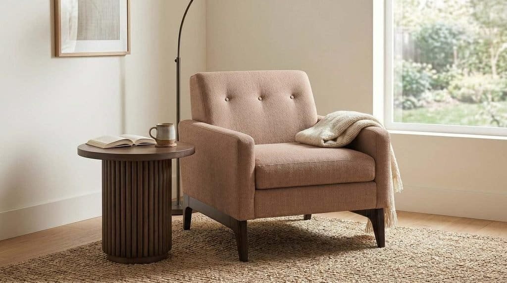
The most versatile versions of pink have a slightly muted or earthy quality. They work well with brown, clay, taupe, and olive green, creating palettes that feel layered rather than overly sweet.
Consider these combinations:
- Dusty rose and chocolate brown: A warm, sophisticated pairing for living rooms and bedrooms.
- Muted pink and olive green: A nature-inspired contrast that feels both distinctive and balanced.
- Blush and warm ivory: A light, understated scheme for rooms that need a gentle touch of color.
- Dusty rose and burgundy: A tonal combination that adds depth through different levels of red and pink.
- Earthy pink and terracotta: A warm, cohesive palette that works well with natural materials.
In a bedroom, dusty rose bedding can soften a room with ivory walls and walnut furniture. Add textured cream throws and linen curtains to keep the scheme relaxed.
Living rooms offer more opportunities to experiment. A dusty pink armchair can become a statement piece against a neutral sofa, while pink cushions and artwork introduce color without requiring new furniture.
For a more contemporary look, avoid relying exclusively on delicate fabrics and pale finishes. Combine muted pink with dark wood, textured stone, matte ceramics, or black accents to create contrast.
Pink can also work in kitchens and bathrooms. Muted pink tiles, painted cabinetry, or small decorative details can soften hard surfaces and add character. When using pink on a large surface, choose a shade that complements the fixed finishes rather than one that simply looks attractive on a paint card.
Where Bold Color Works Best
Strong accent colors are often easiest to incorporate when they have a clear purpose. Rather than scattering several unrelated shades throughout a room, identify one or two places where color can create a noticeable visual effect.
The following areas are particularly suitable for experimenting with richer colors:
Accent furniture: An armchair, sideboard, ottoman, or dining chair can introduce burgundy or dusty rose without changing the rest of the room.
Feature walls: A carefully chosen wall in a reading corner, dining room, or bedroom can create depth. Keep nearby furnishings relatively simple to avoid visual competition.
Decorative accessories: Cushions, lampshades, vases, artwork, and throws are useful for testing a new color before investing in a larger change.
Interior doors and built-ins: A painted door, bookcase, or cabinet offers a more permanent-looking statement while allowing the surrounding walls to remain neutral.
Small spaces: A powder room, entryway, or compact reading nook can be an ideal place to experiment with a more dramatic shade because the color is contained within a defined area.
A useful rule is to begin with one dominant accent and repeat it two or three times throughout the room. For example, a burgundy armchair can be echoed in a cushion and a detail in the artwork. The repetition creates a visual connection without making every object match.
Remember that contrast matters as much as the color itself. A deep red against cream looks more dramatic than the same red beside chocolate brown. Decide whether you want a bold contrast or a layered, tonal appearance before selecting the surrounding shades.
Rich reds and muted pinks allow you to personalize the wider color trends of 2027. Used thoughtfully, they can make even a simple neutral interior feel distinctive, inviting, and individual.
Soft Yellow, Golden Ochre, and Optimistic Color Accents
Yellow brings a different kind of energy to the 2027 color palette. While earthy browns and botanical greens create a grounded atmosphere, softer yellows introduce brightness and warmth. Golden ochre and muted mustard offer a deeper alternative for people who prefer colors with more visual weight.
The key is choosing a yellow that suits the room. Pale, creamy versions can feel gentle and understated, while stronger golden shades work best when balanced with neutral walls, natural wood, and complementary colors.
Yellow also offers a relatively easy way to refresh an existing interior. You can introduce it through a lampshade, artwork, cushions, or ceramics before deciding whether to use it on a larger surface.
Butter Yellow for Gentle Warmth
Butter yellow is a soft, creamy shade that sits between pale yellow and warm off-white. Its appeal comes from its ability to brighten a room without the intensity of a vivid primary yellow.
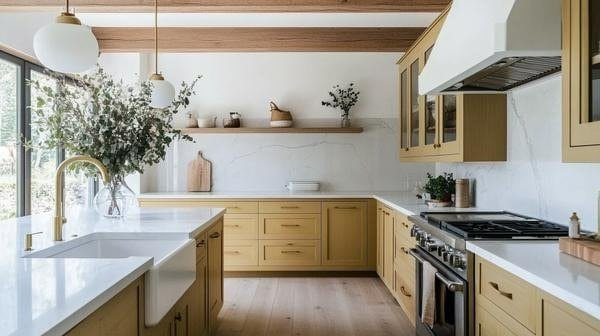
This shade works particularly well in kitchens, breakfast areas, bedrooms, and relaxed living spaces. It brings a subtle warmth to interiors that might otherwise rely entirely on white or beige.
Here are some practical ways to use butter yellow:
- Kitchen cabinets: Choose a muted buttery shade for cabinetry and combine it with a warm white backsplash and natural wood.
- Dining spaces: Introduce yellow through dining chairs, table linens, ceramics, or pendant shades.
- Living rooms: Use butter-yellow cushions, a throw, or an upholstered accent chair against a cream sofa.
- Bedrooms: Add pale yellow through bedding or curtains, balanced with ivory and light wood.
- Hallways: Use a soft yellow on a small wall or console table to create a welcoming first impression.
Butter yellow pairs naturally with sage green, warm beige, cream, and pale oak. These combinations create a light, organic look that feels more nuanced than a simple yellow-and-white scheme.
For a stronger contrast, try butter yellow with dusty blue. The blue tempers the warmth of the yellow, while the yellow stops the blue from feeling too cool. This combination works especially well in patterned textiles, artwork, or rooms where you want a gentle balance between warm and cool tones.
Yellow-based paints can change considerably under artificial lighting. A soft buttery shade may look creamier in warm light and more distinctly yellow in direct sunlight. Test samples on different walls before choosing a color for an entire room.
Golden Ochre and Muted Mustard for Earthy Depth
Golden ochre and muted mustard offer a richer interpretation of yellow. Their earthy undertones make them particularly compatible with brown, terracotta, olive green, and other nature-inspired colors.
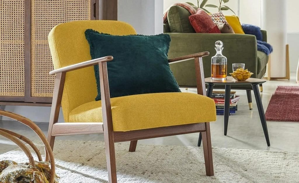
Unlike pale yellow, these shades can stand out more clearly against neutral backgrounds. They work well when you want an accent to feel substantial without choosing a very dark or highly saturated color.
Golden ochre has a warm, mineral quality that pairs well with natural wood, textured fabrics, and earthy wall colors. Use it in upholstery, artwork, rugs, or decorative ceramics.
Muted mustard often has a deeper, slightly brown quality. It is particularly effective in vintage-inspired interiors, mid-century spaces, and rooms with walnut furniture or warm leather.
Consider these combinations:
| Yellow shade | Colors to pair it with | Decorating idea |
| Butter yellow | Cream and sage green | Light kitchen or breakfast nook |
| Pale yellow | Dusty blue and ivory | Relaxed bedroom or living room |
| Golden ochre | Terracotta and warm beige | Earthy living room |
| Muted mustard | Chocolate brown and olive | Vintage-inspired seating area |
| Soft yellow | Mushroom and natural oak | Understated neutral interior |
Golden ochre can also work with burgundy for a richer, more dramatic palette. Keep one shade dominant and use the other as an accent to avoid making the room feel overly busy.
If you already have a neutral living room, a mustard armchair or ochre-colored rug can introduce warmth without requiring a complete redesign. Repeating the shade in artwork or smaller accessories helps connect the room visually.
How to Use Yellow Without Overwhelming a Room
Yellow can be an effective decorating tool, but the wrong shade or distribution may make a space feel too intense. The solution is to consider how much yellow you need and what other colors will surround it.
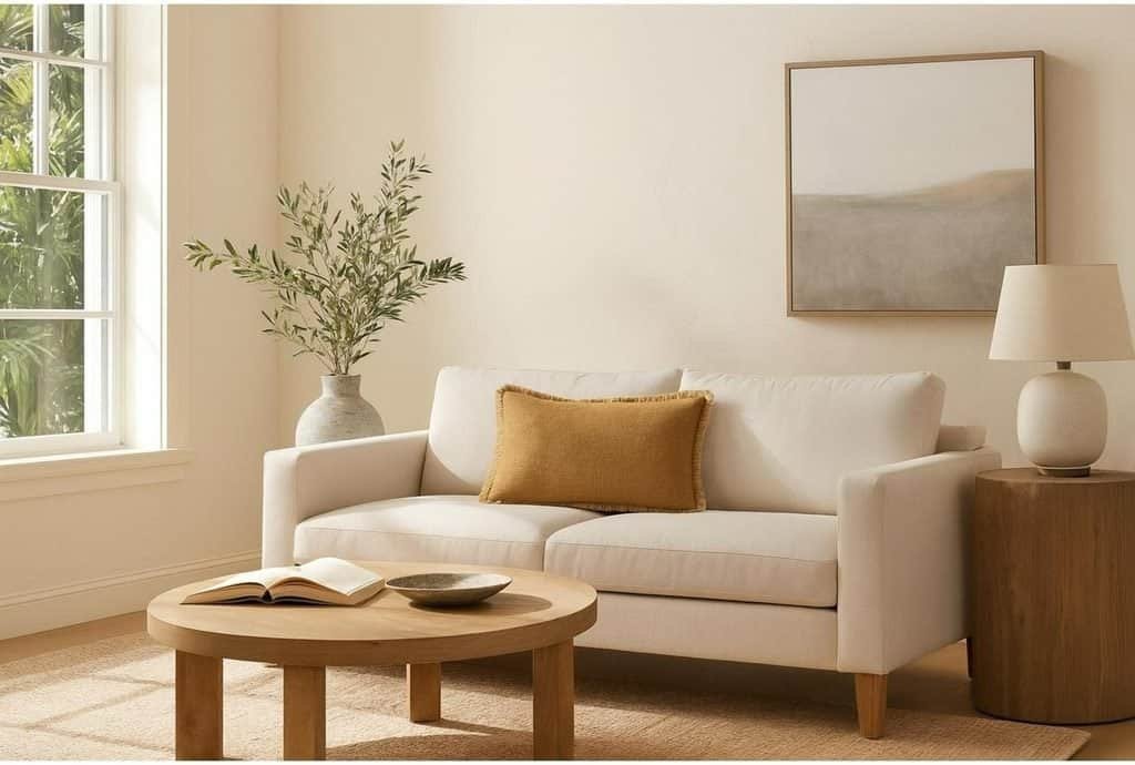
Follow these practical guidelines:
- Start with accessories. Cushions, vases, artwork, and lampshades allow you to explore the color without making a permanent commitment.
- Choose softer shades for larger surfaces. Creamy yellow and pale butter tones are generally easier to live with on walls than vivid yellow.
- Balance yellow with natural materials. Wood, stone, linen, and woven textures give yellow a more grounded appearance.
- Introduce contrasting colors carefully. Sage, dusty blue, and chocolate brown can balance yellow without competing with it.
- Consider existing lighting. Check how the shade looks in daylight and under your usual evening lighting before painting.
In a small kitchen, for example, butter-yellow accessories can brighten a predominantly cream scheme. If you want a more noticeable transformation, use muted yellow on the lower cabinets while keeping the walls and upper cabinets light.
In a living room, yellow can be introduced through a single accent chair, cushions, or a rug with warm golden details. Pair these elements with olive green or brown for a richer palette.
A yellow feature wall can also work, especially in a breakfast nook or an area that receives limited natural light. Choose a restrained shade and sample it first, because yellow can appear much stronger across a large surface than it does on a small color card.
The most successful yellow interiors use the shade with intention. A little can add warmth and personality, while a carefully balanced larger application can create a distinctive look that still feels comfortable.
How to Combine Color Trends 2027 Without Clashing
Knowing which colors are popular is only the first step. The real challenge is combining them in a way that feels cohesive, especially when you want to use several 2027 interior color trends within the same room.
A successful palette does not need many colors. It needs a clear foundation, supporting shades, and enough contrast to prevent the space from looking flat. Once these elements are established, you can introduce trend-led accents without making the room feel disjointed.
Start With One Dominant Shade
Begin by choosing the color that will have the greatest visual presence. This is often the wall color, but it could also be a large sofa, kitchen cabinetry, flooring, or a prominent rug.
The best starting point is usually something you already know you want to keep. If your home has walnut floors, a cream sofa, or existing stone countertops, use those elements to guide your choices rather than selecting a completely unrelated palette.
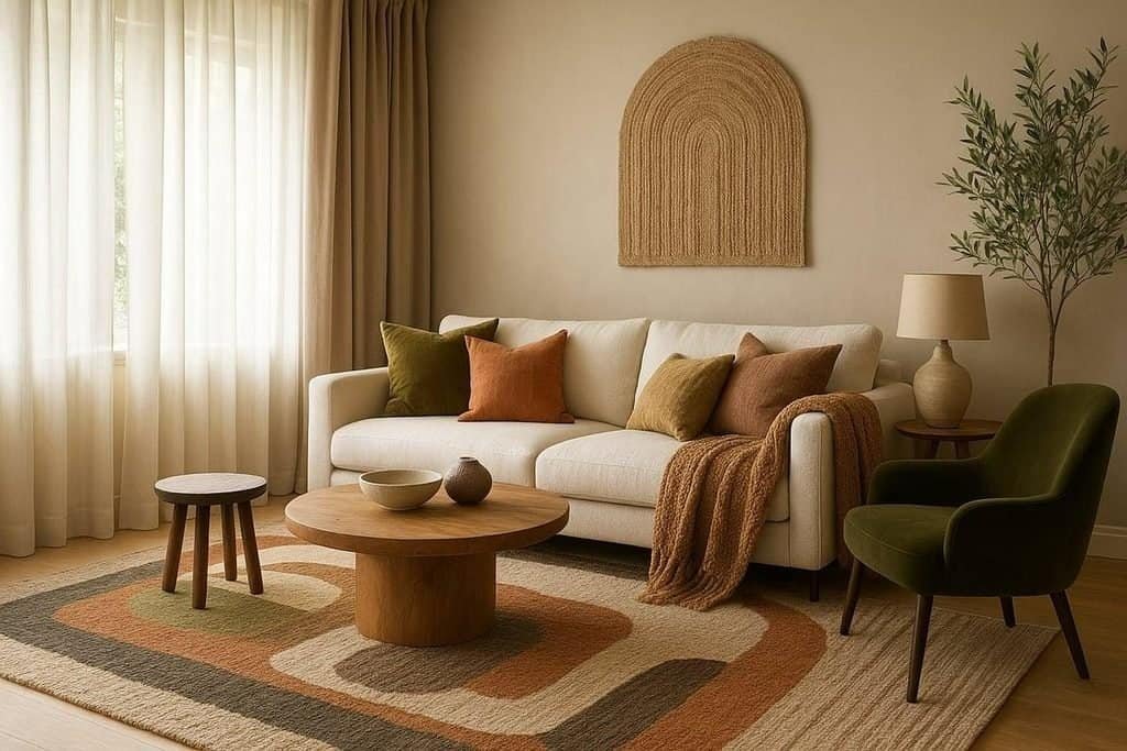
Follow this simple process:
Choose your foundation. Select a dominant neutral or a muted color that works with your largest existing surfaces. Warm ivory, mushroom, sage, and sand are versatile options.
Add a supporting shade. Introduce a color that complements the foundation without competing with it. For example, sage walls can work with warm beige upholstery, while cream walls can support chocolate brown furniture.
Select an accent. Choose one more expressive shade, such as burgundy, terracotta, butter yellow, or dusty blue. Use it in smaller quantities to create contrast.
Connect the colors through materials. Wood, linen, stone, wool, and ceramics help different shades feel related, even when they belong to different color families.
Imagine that you’re refreshing a living room with cream walls and a brown sofa. Rather than replacing the large furniture pieces, add olive cushions, a terracotta vase, and a rug that includes both warm beige and muted green. The result feels current because the accessories introduce a considered palette, not because every item is new.
This approach is particularly useful in rental properties and smaller homes where repainting or replacing large pieces of furniture may not be practical.
Use the 60-30-10 Color Rule as a Starting Point
The 60-30-10 rule is a popular decorating guideline that helps distribute colors across a room. It provides a useful starting point when you’re unsure how much of each shade to use.
The idea is to divide the palette into three proportions:
- 60% dominant color: The main visual foundation, often walls, large furniture, or other substantial surfaces.
- 30% secondary color: A supporting shade used for upholstery, curtains, rugs, or cabinetry.
- 10% accent color: A smaller amount of a more distinctive shade introduced through accessories, artwork, or decorative details.
These proportions are flexible rather than mathematical requirements. A room with patterned wallpaper, colorful furniture, or extensive wood finishes may not fit the formula neatly, and that is perfectly fine.
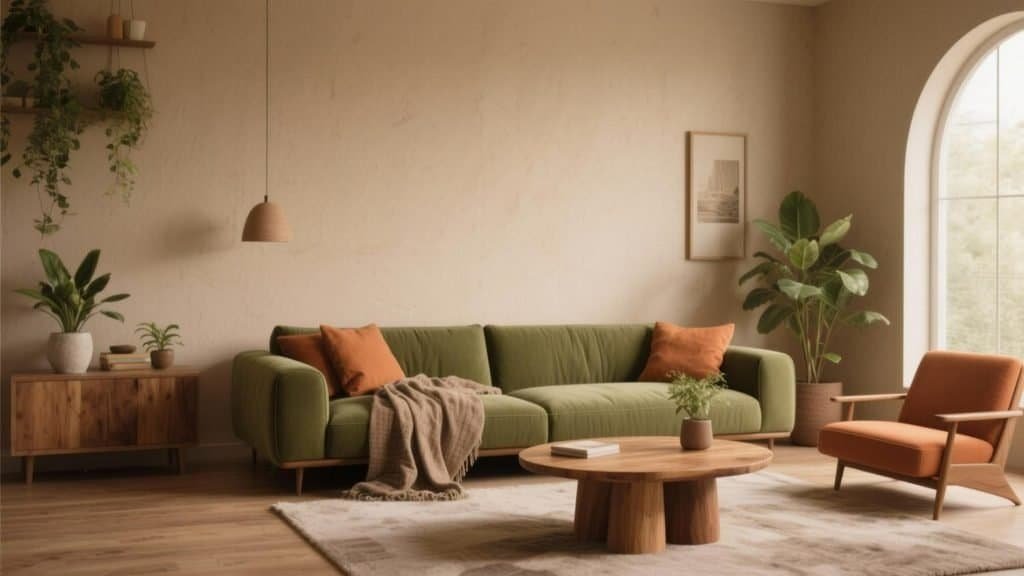
Here are three examples of how the rule can work with 2027 color trends:
| Dominant shade | Secondary shade | Accent shade | Overall mood |
| Warm ivory | Olive green | Terracotta | Natural and welcoming |
| Cream | Chocolate brown | Burgundy | Rich and sophisticated |
| Sand beige | Dusty blue | Butter yellow | Light and relaxed |
For a room with ivory walls, the dominant color might cover most of the visual space. Olive-green upholstery and curtains could provide the secondary color, while terracotta ceramics and artwork introduce the accent.
A bedroom might use sand-colored walls and bedding as the foundation, dusty blue for curtains or upholstery, and small butter-yellow details to add warmth.
The rule is most helpful when the colors feel unbalanced. If a room looks too busy, reduce the number or amount of accent shades. If it feels dull, introduce more contrast through textiles, artwork, or furniture.
Remember that a dominant color does not need to cover exactly 60% of the physical surfaces. The goal is to create a visual hierarchy in which one color leads, another supports it, and the accent provides interest.
Try These Ready-to-Use 2027 Color Palettes
Choosing colors individually can be difficult because shades often look different when viewed together. Starting with a coordinated palette makes the process easier and helps you picture the finished room.
The following combinations draw on the color directions explored throughout this article.
Warm and Organic
Cream · Chocolate brown · Terracotta · Sand
This palette combines soft neutrals with rich earthy tones. Use cream on the walls, brown on large furniture, and terracotta in accessories. It works particularly well in living rooms, dining areas, and homes with natural wood finishes.
Nature-Inspired
Sage · Olive · Warm ivory · Taupe
A balanced choice for bedrooms, kitchens, and calm living spaces. Layer sage and ivory across larger surfaces, then add olive through cabinetry, upholstery, or decorative details.
Modern and Moody
Warm ivory · Burgundy · Walnut brown · Mushroom
This deeper palette suits dining rooms, reading corners, and sophisticated living rooms. Keep the lighter neutral prominent, then use burgundy and brown to introduce depth.
Fresh and Relaxed
Dusty blue · Sand · Off-white · Caramel
An adaptable combination for bedrooms, home offices, and living rooms. Use dusty blue for a wall or accent piece, then balance it with warm neutrals and natural wood.
Soft and Uplifting
Butter yellow · Muted green · Warm ivory · Beige
A gentle palette for kitchens, breakfast nooks, and smaller rooms that need warmth. Keep yellow in measured amounts and use green and ivory to create a balanced background.
Once you choose a palette, repeat its colors in different ways instead of using identical shades on every surface. For instance, an olive-green wall can be complemented by a lighter green cushion, while terracotta appears in a vase and a small detail within the rug.
Patterns can help tie colors together. A rug, wallpaper design, or piece of artwork containing two or three colors from your palette provides a natural connection between furniture and accessories.
Before buying paint or larger furnishings, create a simple sample board. Include paint swatches, fabric samples, flooring references, and photographs of your existing furniture. Viewing everything together makes it easier to spot colors that clash or undertones that feel out of place.
The best color palette is one that looks good in your actual home and suits the way you use the space. Use these 2027 combinations as a starting point, adjust the proportions to your preference, and allow your existing materials to guide the final choices.
How Lighting, Materials, and Finishes Change the Way Colors Look
Choosing the right shade is only part of creating a successful interior. The same paint color can look warm and inviting in one room but cool, dull, or unexpectedly dark in another. Natural light, artificial lighting, nearby materials, and surface finishes all influence how colors appear once they are used in a real space.
Understanding these factors can help you make better decisions when exploring color trends 2027. Before investing in paint, furniture, or decorative finishes, consider how your chosen shades will interact with the room’s existing features.
Natural Light Can Transform Your Color Palette
Natural light changes throughout the day, affecting the appearance of both warm and cool colors. The direction a room faces can provide a useful starting point, although the size of the windows, nearby buildings, climate, and surrounding landscape also influence the result.
Rooms with north-facing windows in the Northern Hemisphere often receive cooler, more indirect daylight. Warm whites, creamy beige, terracotta, and soft browns can help create a more inviting atmosphere in these spaces.
South-facing rooms in the Northern Hemisphere typically receive stronger, warmer daylight for much of the day. These rooms can accommodate a wider range of shades, including dusty blue, sage green, and deeper neutrals, although direct sunlight may make some colors appear more intense.
East-facing rooms tend to receive brighter morning light, while west-facing spaces often experience warmer light later in the day. A color that looks subtle in the morning may appear much richer by late afternoon.
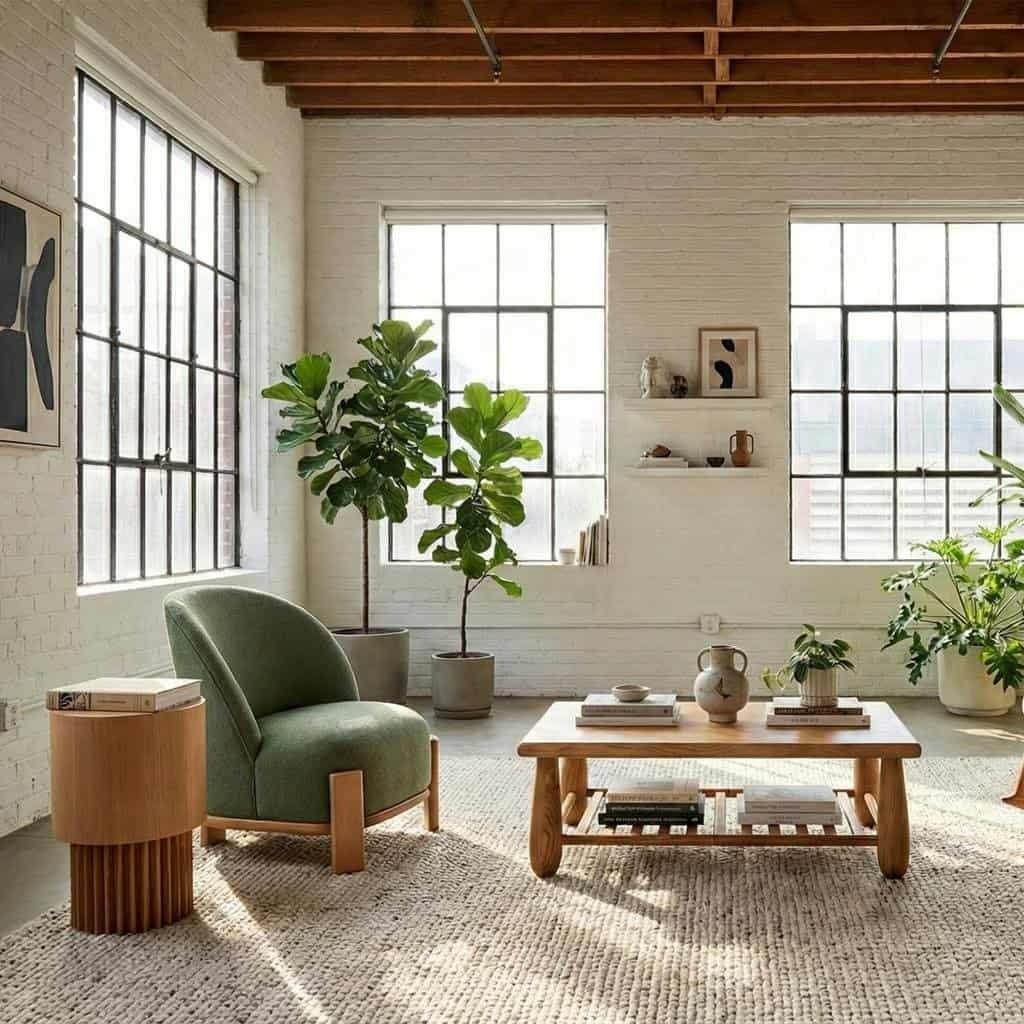
When testing colors, follow these practical steps:
- Paint large sample areas rather than relying on a small color card.
- Observe the samples in the morning, afternoon, and evening.
- Compare them beside flooring, furniture, curtains, and other permanent finishes.
- Check how the color looks on different walls, especially in rooms with uneven lighting.
- Avoid making a final decision based only on photographs or online color previews.
One of the most useful decorating habits is to live with a paint sample for a few days. This gives you time to see how the color changes and whether you still enjoy it under your normal lighting conditions.
Artificial Lighting Can Change Warm and Cool Shades
Artificial lighting becomes particularly important after sunset. A room that looks balanced during the day may feel completely different when illuminated by ceiling lights, table lamps, or decorative pendants.
Warm-white lighting often emphasizes the yellow, red, and brown undertones in a color. This can make terracotta, chocolate brown, and creamy neutrals feel richer and more inviting.
Cooler lighting may emphasize blue and gray undertones, making certain whites appear crisper and some warm colors less pronounced.
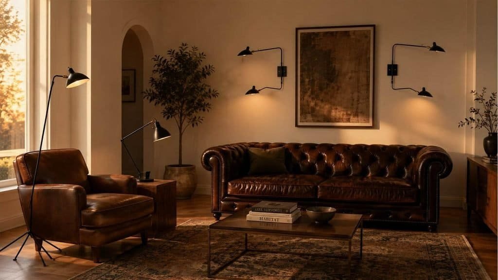
Consider these combinations when planning your lighting:
- Warm neutrals: Pair cream, sand, and mushroom with warm-white lighting for a comfortable atmosphere.
- Earthy colors: Use layered lamps to bring out the richness of brown, terracotta, and olive.
- Dusty blues: Test the shade under your actual evening lighting to make sure it does not become too gray or dull.
- Deep greens and burgundy: Add several light sources to reveal texture and prevent darker colors from disappearing into shadow.
Rather than relying on one bright overhead fixture, combine ambient lighting with task and accent lighting. Floor lamps, table lamps, wall lights, and carefully positioned pendants can create depth while helping decorative colors remain visible.
Consistency matters, too. Using bulbs with similar color temperatures in the same room generally creates a more harmonious result. The best choice depends on the room’s function, the mood you want, and how the light interacts with your finishes.
Materials and Paint Finishes Make Colors Feel Different
Color does not exist in isolation. A sage-green wall beside pale oak flooring will create a different impression from the same wall color paired with dark walnut, glossy tile, or black metal.
Natural materials are especially useful when working with the 2027 color palette because they introduce texture and variation without adding many competing shades.
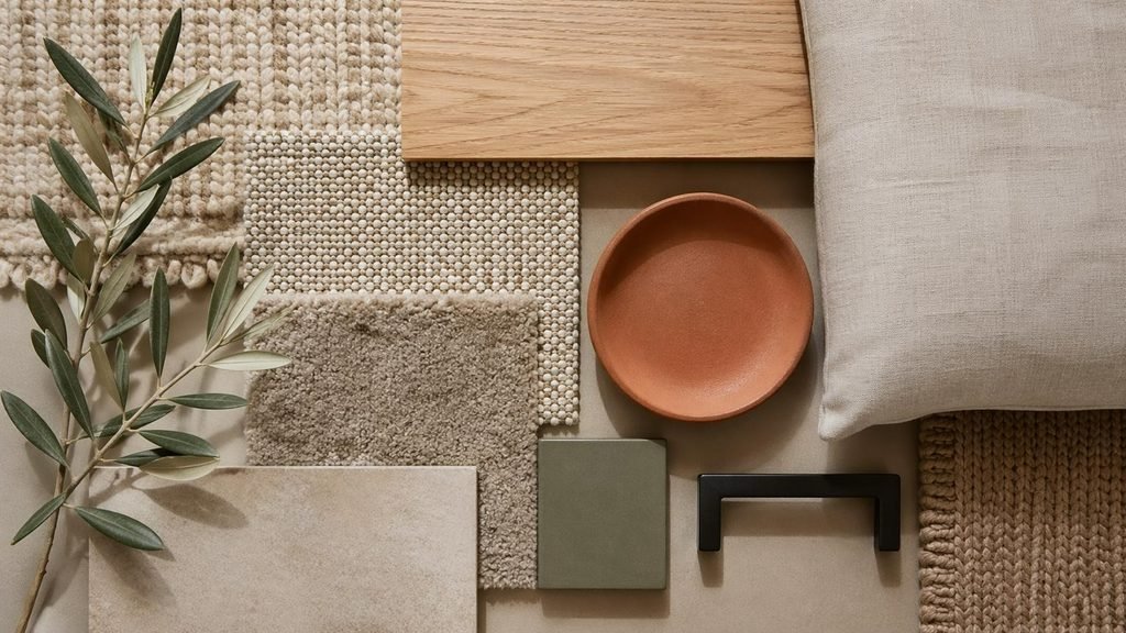
Consider how these materials influence a room:
- Oak and ash: Introduce a lighter, natural quality that works well with sage, dusty blue, and creamy whites.
- Walnut and darker woods: Reinforce chocolate brown, burgundy, forest green, and other rich shades.
- Stone and marble: Provide natural variation and help connect warm or cool colors through their underlying tones.
- Linen and wool: Soften bold colors and create depth through texture.
- Metallic finishes: Brass-colored details complement warm palettes, while chrome and brushed steel can reinforce cooler schemes.
- Ceramics and glass: Offer an easy way to introduce contrasting colors and reflective surfaces.
Paint finish also affects the result. Matte finishes generally have a softer appearance, while satin and gloss reflect more light. A glossy surface can make a color feel more vivid, whereas a matte finish often creates a more subdued impression.
For walls, matte or low-sheen finishes are popular choices when you want an understated appearance. Higher-sheen finishes may be useful on trim, doors, or cabinetry, depending on the product and the practical requirements of the surface.
The most effective approach is to coordinate color, texture, and finish together. A deep green cabinet, for example, may look particularly refined beside a pale stone countertop, natural wood shelving, and understated metal hardware.
How to Bring 2027 Color Trends Into Your Home on Any Budget
You do not need to replace your furniture or repaint every room to explore color trends 2027. Some of the most effective updates involve changing a few carefully chosen details, especially when your existing furniture and finishes already provide a good foundation.
The best approach depends on your budget, how long you plan to stay in your home, and whether you want a subtle refresh or a more substantial transformation.
Low-Cost Updates With a Noticeable Impact
Accessories are one of the easiest ways to experiment with emerging colors. They are relatively simple to change, and you can test a new palette before committing to larger purchases.
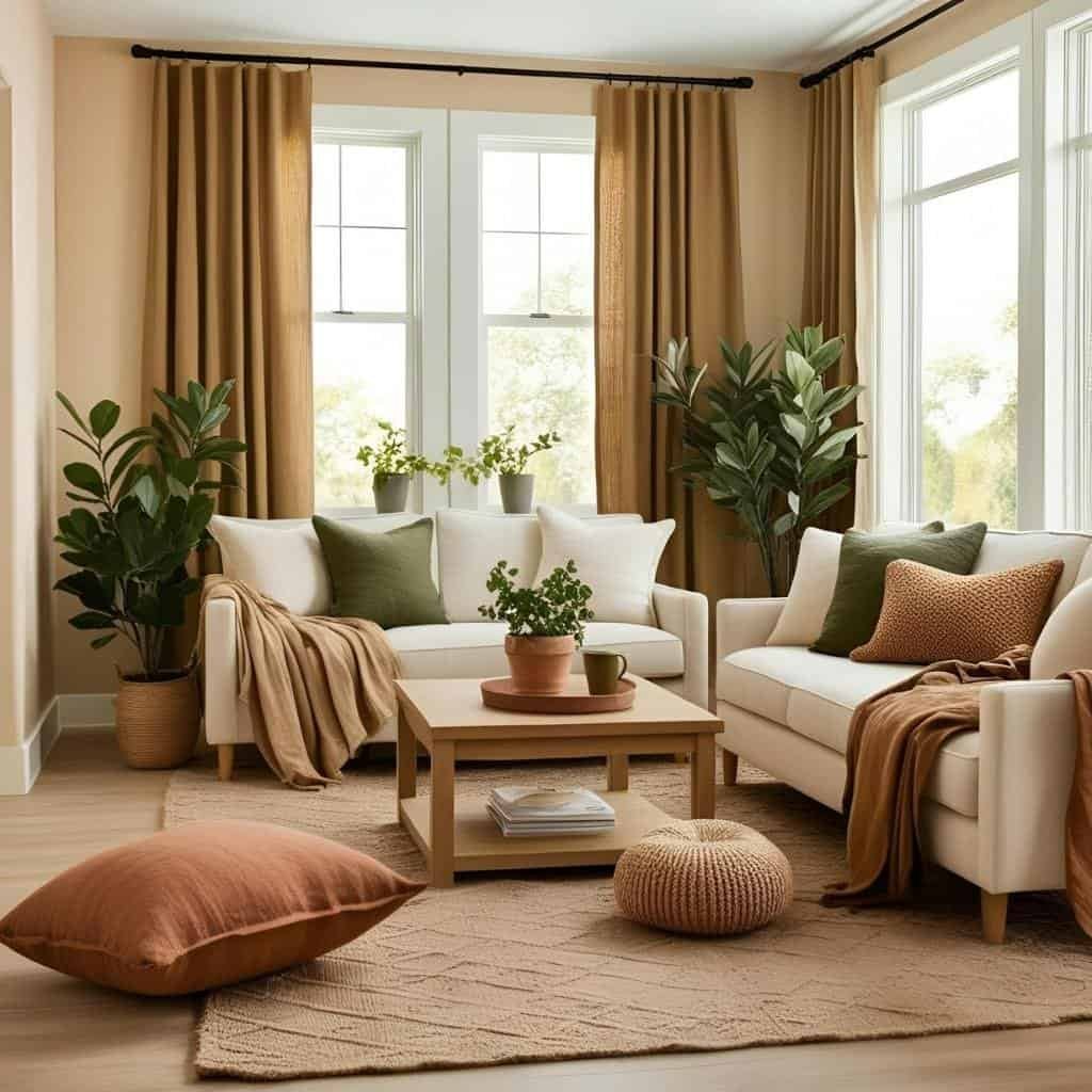
Start with items that already exist in your room and consider what could be rearranged or updated.
Cushions and throws: Add dusty blue, olive, burgundy, or terracotta to a neutral sofa. Mixing solid colors with subtle patterns creates a layered look.
Lampshades: A colored lampshade can introduce warmth and connect with other decorative elements without changing the main color scheme.
Artwork: Choose artwork that incorporates two or three shades from your preferred palette. This can help connect furniture, walls, and accessories.
Vases and ceramics: Terracotta pots, deep green vessels, and burgundy decorative objects can introduce color in small but noticeable ways.
Table linens and bedding: These items allow you to experiment with butter yellow, muted pink, and dusty blue without making permanent changes.
Rugs: A rug containing several of your chosen colors can become the foundation for the rest of the room’s accessories.
You can also refresh a space without buying anything. Move accessories between rooms, remove items that compete visually, and group existing objects by color. A collection of cream ceramics and wooden accessories, for example, may look more intentional when arranged together rather than scattered across several surfaces.
When shopping, focus on how each item works with what you already own. A beautiful burgundy cushion may be less useful if it clashes with the undertones of your sofa or rug.
Medium-Budget Transformations
A moderate budget can make a bigger difference through paint, updated textiles, and small furniture changes. These improvements allow you to alter the room’s overall appearance while keeping the largest investments in place.
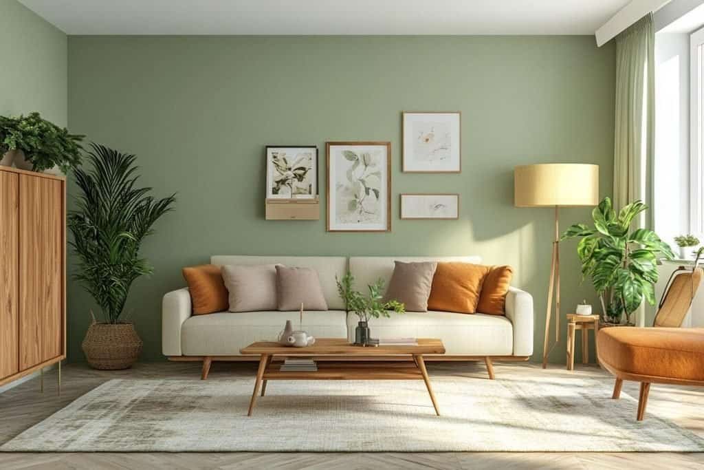
Consider these projects:
- Repaint the walls: Warm ivory, mushroom, sage, or smoky blue can change the atmosphere without requiring new furniture.
- Refresh a cabinet or sideboard: Painting an existing piece in olive, muted teal, or a deeper earthy shade can create a distinctive focal point.
- Update curtains: Replace faded or mismatched textiles with a color that complements the walls and upholstery.
- Change cabinet hardware: New handles can help existing cabinetry work better with a refreshed color scheme.
- Reupholster an accent chair: A dusty rose, olive, or burgundy fabric can bring new life to a piece you already love.
- Create a feature area: Paint a built-in shelf, interior door, or small architectural feature rather than an entire room.
Painting is often one of the most accessible ways to make a visible change, but preparation matters. Clean the surface, repair imperfections, use the appropriate primer, and choose a finish suited to the room and material.
If you are updating kitchen cabinetry, test the paint color against the countertop, backsplash, flooring, and appliances. These fixed elements can strongly influence whether a color looks harmonious.
A medium-budget project should also have a clear goal. Rather than buying several new items in different trending colors, choose one main change and coordinate smaller updates around it.
Larger Investments Worth Planning Carefully
Some color decisions are more difficult or expensive to reverse. Kitchen cabinetry, bathroom tiles, flooring, and large upholstered furniture deserve more careful consideration because they may remain in place for many years.
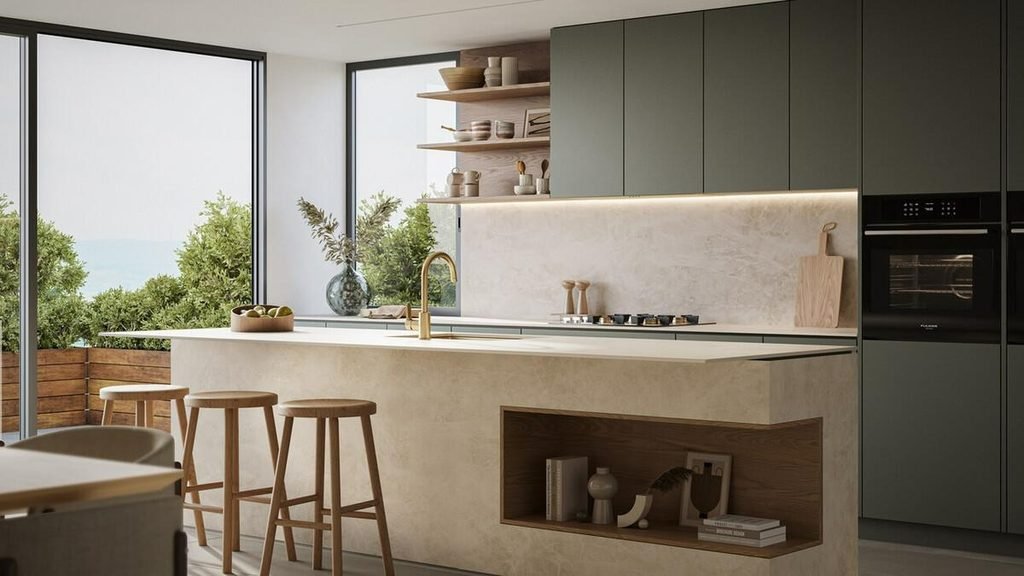
For larger renovations, consider the following principles.
Keep permanent finishes versatile. Flooring, countertops, and large fixed surfaces often benefit from colors that can accommodate future decorating changes. Warm neutrals, natural wood tones, and understated stone finishes offer flexibility.
Use stronger colors where they make sense. Olive cabinetry, burgundy upholstery, or deep green built-ins can become beautiful long-term features if they suit your taste and the surrounding architecture.
Request samples before ordering. View cabinet doors, tiles, and upholstery samples in your own home. Store lighting and showroom displays may make colors appear different from how they will look in your space.
Consider maintenance as well as appearance. Some finishes show fingerprints, dust, scratches, or water marks more readily than others. Choose materials that fit your daily routine.
Plan the whole palette together. Before committing to a large purchase, check how the proposed color works with adjacent rooms, flooring, doors, and natural materials.
A useful strategy is to divide your budget between long-lasting foundations and easier-to-change accents. You might choose warm neutral flooring and countertops, then introduce olive cabinetry or burgundy seating where you want more personality.
Color trends should help you make informed choices, not pressure you into replacing finishes that still work well. A well-planned room can feel current for years when its colors suit your home and reflect your preferences.
Related Trends to Explore: Furniture Colors and Homewares Palettes
Color works best when it is considered across the entire room rather than as an isolated wall-paint decision. Furniture, textiles, lighting, and decorative accessories all contribute to the finished palette.
Exploring related color trends can help you connect the larger elements of a room with its smaller details.
Furniture Color Trends 2027
Furniture can provide the strongest color statement in an interior, particularly when the walls and flooring are relatively neutral.
Chocolate brown upholstery, olive-green accent chairs, warm wood finishes, and muted blue fabrics are all useful directions to consider when refreshing a living room or bedroom.
If you prefer flexibility, introduce stronger colors through a single chair, ottoman, or sideboard instead of choosing several large pieces in different shades. This keeps the room cohesive and makes future updates easier.
Explore more ideas in our guide to furniture color trends 2027, including ways to coordinate statement furniture with wall colors, natural wood, and contemporary decorating styles.
Homewares Colour Trends 2027
Smaller decorative objects provide another way to experiment with color. Cushions, ceramics, lampshades, vases, table linens, and decorative trays can introduce a new palette without requiring major changes.
Try repeating two or three colors throughout the room. Olive-green cushions might connect with a ceramic vase, while terracotta appears in a decorative bowl and a detail within the rug.
For a more understated look, choose homewares in related tones rather than identical shades. A pale sage cushion, a deeper olive vase, and natural linen curtains create variation while maintaining a shared color direction.
Our guide to homewares colour trends 2027 can help you explore decorative accents and textile combinations that complement the wider interior palette.
How to Choose the Right 2027 Color Palette for Your Home
With so many appealing colors available, it can be tempting to try several at once. A more effective approach is to narrow your choices according to your home’s existing features, the mood you want to create, and how much change you are prepared to make.
You do not need to follow every emerging trend. The right palette is one that works with your surroundings and remains enjoyable after the initial excitement of a makeover has passed.
Start With the Mood You Want to Create
Think about how you use each room before choosing a color.
If you want a relaxed living room, consider warm ivory, sage, mushroom, and natural wood. For a more dramatic dining area, burgundy, walnut, and creamy neutrals may provide the right balance. A bright kitchen might benefit from butter yellow, warm white, and pale oak.
Use the following guide as a starting point:
| Desired atmosphere | Colors to consider |
| Calm and restful | Sage, warm white, dusty blue |
| Warm and welcoming | Terracotta, caramel, cream |
| Sophisticated and dramatic | Burgundy, chocolate brown, forest green |
| Light and natural | Ivory, sand, pale oak |
| Fresh and uplifting | Butter yellow, muted green, warm beige |
| Modern and distinctive | Muted teal, mushroom, walnut |
These combinations are starting points rather than fixed rules. You can adjust their intensity to suit the room’s size, lighting, and existing furnishings.
Work With Your Existing Furniture and Finishes
Before choosing a paint color, identify the elements that are staying. Flooring, countertops, large furniture pieces, tiles, and wood finishes will influence which shades look harmonious.
A room with reddish wood floors, for example, may work better with warm ivory, olive, or muted earthy colors than with a cool gray that clashes with the floor’s undertones.
If your sofa is charcoal gray, you could introduce warmth through caramel, terracotta, or creamy neutrals. If you already have a walnut dining table, sage, dusty blue, and burgundy can all provide interesting contrast.
Take photographs of the room and collect paint, fabric, and material samples. Viewing them together can reveal undertones that are difficult to identify when each item is considered separately.
Test Two or Three Palettes Before Committing
You do not need to test every color you like. Narrow your options to two or three coordinated palettes and compare them in the actual room.
For each option, consider:
- How it looks in daylight and artificial light.
- Whether it complements the flooring and existing furniture.
- How much contrast it creates.
- Whether the colors work with adjoining rooms.
- How easy it will be to update the scheme later.
Try to evaluate the entire combination rather than choosing a shade simply because it looks attractive on its own.
A color can be beautiful but still unsuitable for a particular room. The best palette is the one that works with the space you have, not an idealized version of it.
Treat Trends as Inspiration, Not Rules
The most successful interiors usually combine enduring elements with a few more current details. You might keep your neutral sofa and wooden flooring while introducing a new shade through artwork, a painted cabinet, or updated cushions.
This approach allows your home to evolve gradually. It also helps you avoid expensive changes driven by short-lived preferences.
For additional guidance on creating a cohesive interior, the Architectural Digest website offers design inspiration, decorating ideas, and advice on working with color, furniture, and materials.
Choose colors that support the way you live, complement your existing surroundings, and make you feel comfortable in your own home. A trend is most useful when it gives you a fresh idea rather than a reason to replace everything.
Frequently Asked Questions About Color Trends 2027
What are the biggest color trends for 2027?
Key interior color directions to explore for 2027 include earthy browns, terracotta, botanical greens, warm whites, mushroom neutrals, dusty blues, burgundy, and soft yellow. These shades can be combined to create interiors that feel warm, layered, and personal.
What is the best color for living rooms in 2027?
Warm ivory, sage green, mushroom, chocolate brown, and dusty blue are versatile choices for living rooms. The best option depends on your natural light, existing furniture, and preferred atmosphere. Warm neutrals provide flexibility, while deeper greens and burgundy can create a more dramatic focal point.
Are warm or cool colors better for home interiors in 2027?
Both can work well. Warm colors such as terracotta, caramel, and creamy beige create an inviting atmosphere, while dusty blue and blue-green introduce a cooler balance. Combining warm and cool shades often creates more depth than relying exclusively on one temperature.
Which neutral colors will be popular for interiors in 2027?
Cream, ivory, sand, mushroom, putty, and warm greige are useful neutral shades to consider. They provide more nuance than stark white while remaining easy to coordinate with natural wood, colorful upholstery, and decorative accessories.
How can I update my home with 2027 color trends on a budget?
Start with affordable items such as cushions, throws, lampshades, artwork, ceramics, and bedding. Rearranging existing accessories by color can also refresh a room without spending money. If you have a little more to invest, repainting a wall or updating a small piece of furniture can make a noticeable difference.
What colors go well with sage green in 2027?
Sage green pairs particularly well with warm ivory, pale oak, mushroom, muted pink, and terracotta. Choose ivory and wood for a calm, natural look, or add terracotta and dusty rose if you want more contrast.
Is beige still a good choice for home interiors in 2027?
Yes. Beige remains a versatile foundation, especially when you choose a shade with undertones that complement your room. Sand, mushroom, and warm greige can create more depth than a flat beige scheme when combined with different textures, natural materials, and carefully selected accent colors.
How do I choose the right paint color for a room with little natural light?
Consider warm whites, creamy neutrals, and lighter earthy shades if you want the room to feel brighter. However, deeper colors can also create a cozy atmosphere when used intentionally. Test large paint samples under both daylight and your usual artificial lighting before deciding.
Can I mix several 2027 color trends in one room?
Yes, provided the shades work together. Start with one dominant color, add a supporting shade, and introduce one or two accents. Olive green, terracotta, and cream make a cohesive earthy palette, while dusty blue, sand, and warm white create a lighter combination.
Should I choose trendy colors for permanent features such as kitchen cabinets and flooring?
You can, but consider how long you expect the finishes to remain in place and whether you will continue to enjoy the color. Versatile flooring and countertops can provide a flexible foundation, while stronger colors can be introduced through cabinetry, furniture, or accents that are easier to update.
Bring Color Trends 2027 Into Your Home
Color trends 2027 offer plenty of inspiration for creating interiors that feel fresh without sacrificing comfort or individuality. Earthy browns and terracotta bring warmth, botanical greens create a natural connection, and creamy neutrals provide a flexible foundation. Dusty blues, burgundy, and butter yellow offer additional ways to introduce contrast and personality.
You do not need a complete renovation to make these ideas work. Start with one room, choose a palette that complements your existing furniture, and experiment with a few carefully selected colors. Test paint samples in different lighting conditions, pay attention to texture, and introduce stronger shades where they have the greatest impact.
Ready to refresh your home for 2027? Choose your favorite color family, try one of the suggested palettes, and make a small change this week. A new accent color, a freshly painted wall, or a thoughtfully coordinated set of accessories can be the beginning of a home that feels more inviting and more uniquely yours.
