
Furniture color trends 2027 are moving toward warmer neutrals, nature-inspired greens, rich chocolate browns, and expressive accent shades that make living spaces feel more personal. From elegant burgundy sofas to earthy terracotta chairs and timeless oak furniture, the colors gaining attention offer plenty of ways to refresh a home without completely redesigning it.
The appeal of these emerging furniture colors lies in their versatility. Some create a calm, understated atmosphere, while others introduce depth, contrast, and personality. The best choices work with your existing flooring, wall colors, lighting, and decorative accessories rather than competing with them.
Whether you’re planning to buy a new sofa, update your dining room, replace bedroom furniture, or simply introduce a fresh accent color, understanding the leading furniture color trends can help you make more confident decisions.
This guide explores the furniture colors to consider for 2027, how to combine them successfully, and practical ways to bring these shades into your home on different budgets.
In This Article
The Biggest Furniture Color Trends 2027 Has in Store
The furniture color trends 2027 point toward a more thoughtful approach to decorating. Instead of relying entirely on cool gray furniture or matching every piece to the same neutral palette, homeowners can explore warmer tones, natural materials, and carefully chosen statement colors.
The goal isn’t to fill every room with bold furniture. It’s to create a balanced interior where color contributes to the atmosphere and helps individual pieces feel intentional.
Warm, Earthy Colors Are Taking Center Stage
Earth-inspired shades are a strong direction to consider for 2027. Chocolate brown, caramel, olive green, muted terracotta, and warm beige work particularly well with natural wood, textured fabrics, and understated accessories.
These colors have an inviting quality that suits many decorating styles, including contemporary, rustic, organic modern, and transitional interiors.
A chocolate brown sofa, for example, can become the foundation of a living room when paired with ivory cushions, a light oak coffee table, and a textured cream rug. The result feels layered and comfortable without relying on several competing colors.
Soft Neutrals Are Becoming More Layered
Neutral furniture remains a practical choice, but the emphasis is shifting toward shades with more warmth and character.
Instead of choosing flat white or cool gray for every major piece, consider:
- Oatmeal and ivory: Ideal for creating light, relaxed interiors.
- Mushroom and warm taupe: Offer subtle depth without looking too dark.
- Sand and caramel beige: Work beautifully with wood finishes and natural textiles.
- Greige: Combines gray and beige for a flexible, understated look.
Layering several related neutrals can make a room feel more sophisticated than using a single shade throughout. An oatmeal sofa, mushroom-colored armchair, and warm beige curtains can create a cohesive palette while allowing differences in texture to provide visual interest.
Rich Accent Colors Are Adding Personality
Another direction worth exploring is the use of saturated colors on selected furniture pieces. Burgundy, plum, deep blue, and forest green can bring character to an otherwise neutral room.
These shades are particularly effective when used on one or two focal pieces rather than every item of furniture.
Imagine a living room with warm white walls, a walnut coffee table, and a deep burgundy armchair. The chair introduces a distinctive color without making the room feel visually crowded.
The key trend for 2027 is balance: combine versatile foundational colors with a few expressive shades that reflect your personal style.
Natural Wood Tones Continue to Matter
Furniture color isn’t limited to paint and upholstery. The visible grain and stain of wood also influence the overall color palette of a room.
Warm oak, walnut, smoked wood, and honey-toned finishes can complement the emerging preference for earthy, comfortable interiors. These materials also provide a natural counterpoint to colorful upholstery.
For a modern dining room, try a walnut table with muted green chairs. In a bedroom, pale oak furniture can soften darker bedding or a richly colored upholstered headboard.
When selecting furniture, consider the undertones of the wood as carefully as you would the color of a painted surface. Yellow-toned oak, reddish walnut, and cool gray-washed wood create different effects, even when used alongside the same upholstery color.
Earthy Browns and Chocolate Tones Bring Warmth Back to Furniture
Brown is one of the most versatile furniture colors to consider for 2027. From deep espresso and chocolate to lighter caramel and chestnut, brown offers a sense of warmth that works across contemporary and traditional interiors.
Unlike stark black, many brown shades feel softer and more approachable. They also pair naturally with wood, stone, linen, leather, and other materials commonly used in home decorating.
Chocolate Brown Creates a Sophisticated Foundation
Chocolate brown is an excellent choice for larger furniture pieces, especially sofas, armchairs, bed frames, and dining furniture.
Its depth can anchor a room, making lighter walls and accessories stand out. The color also works well with both modern silhouettes and more traditional furniture designs.
Consider these combinations:
- Chocolate brown and ivory: A timeless pairing that balances richness with brightness.
- Chocolate brown and olive green: Creates an earthy, nature-inspired palette.
- Chocolate brown and dusty blue: Introduces a cooler contrast without feeling harsh.
- Chocolate brown and caramel: Builds a warm, tonal look with plenty of depth.
- Chocolate brown and burgundy: Gives a living room a dramatic, sophisticated character.
For a living room, a chocolate brown sofa with ivory cushions and a pale rug can feel grounded without making the space appear too dark. Adding a walnut side table or brushed brass lamp reinforces the warmth.
One practical consideration is the amount of natural light. Deep brown upholstery can look beautiful in a bright room, but it may feel heavier in a small space with limited daylight. If your room is darker, balance the sofa with light walls, reflective surfaces, and pale textiles.
Caramel and Chestnut Make Brown Furniture Feel Lighter
Deep brown isn’t the only option. Caramel, chestnut, and tobacco-inspired shades offer a softer alternative while maintaining the warmth associated with the color family.
These mid-tone browns work particularly well for leather armchairs, wooden dining chairs, ottomans, and accent furniture.
Caramel upholstery is especially useful when you want a room to feel warm but not overly dark. Pair it with cream walls, natural oak, soft white curtains, and a muted green accent to create a relaxed contemporary interior.
Chestnut furniture can also complement vintage-inspired spaces. A chestnut leather chair, for instance, looks attractive alongside a traditional wooden bookcase, a textured wool rug, and understated artwork.
Styling tip: When combining several brown furniture pieces, vary their tones and textures. A dark chocolate sofa, medium walnut table, and caramel leather chair will usually look more interesting than three pieces in nearly identical shades.
How to Style Brown Furniture Without Making a Room Feel Heavy
Brown furniture can create a rich, welcoming atmosphere, but too many dark surfaces may make a room feel smaller or less balanced.
Use contrast to keep the space visually open.
- Choose cream, ivory, or warm white for walls and larger textiles.
- Introduce lighter wood finishes when the main furniture pieces are dark.
- Use linen, cotton, wool, or boucle to soften leather and polished wood.
- Add greenery for a natural contrast against chocolate or chestnut tones.
- Incorporate warm lighting to bring out the depth of brown finishes.
A practical example is a living room with a chocolate sofa, a natural oak coffee table, an ivory rug, and olive green cushions. Each piece supports the same earthy palette, but the variation in color and texture prevents the arrangement from looking monotonous.
Brown is also a strong option for long-term furniture investments. While a particular shade may gain or lose popularity, brown can remain adaptable when the surrounding accessories change.
Sage, Olive, and Moss Green Furniture Make Nature-Inspired Interiors Feel Fresh
Green furniture is another important direction to explore when planning furniture colors for 2027. From soft sage to deep olive and moss, green offers a connection to nature while providing more personality than a conventional neutral.
Its versatility comes from the range of available shades. Pale greens can make furniture feel light and understated, while darker greens introduce richness and definition.
Green also pairs naturally with wood, stone, warm whites, and earthy accents, making it suitable for many rooms throughout the home.
Sage Green Offers a Calm, Understated Look
Sage green is a muted shade that combines a soft green appearance with subtle gray undertones. It works particularly well when you want color without creating a strong visual contrast.
Sage green furniture can suit living rooms, bedrooms, dining areas, and home offices. Consider an upholstered sage armchair, a painted bedside table, or a set of dining chairs in a muted green finish.
The shade pairs especially well with:
- Warm white and ivory.
- Pale oak and natural ash.
- Beige, oatmeal, and mushroom.
- Soft terracotta and muted rust.
- Natural linen and woven textures.
For a bedroom, sage green bedside tables can add color to a neutral scheme without competing with the bedding. In a living room, a sage armchair can complement a cream sofa and a light wood coffee table.
Sage is also a useful option for smaller rooms because its muted appearance can introduce color without the visual intensity of a very dark or saturated shade.
However, lighting matters. Some sage greens appear grayer in north-facing rooms, while warmer daylight can make them look more yellow or herbal. Test fabric swatches or paint samples in the actual room before committing to a large furniture purchase.
Olive Green Brings Depth to Living Rooms and Dining Areas
Olive green offers a deeper, warmer alternative to sage. Its earthy undertones make it particularly effective alongside walnut, caramel leather, brass, and warm neutral fabrics.
An olive green sofa can become the focal point of a living room, especially when the rest of the palette remains relatively simple. Combine it with cream cushions, a walnut coffee table, and a beige rug to create a comfortable, contemporary setting.
Olive also works beautifully on dining chairs. Paired with a natural wood dining table, the color gives the space definition without relying on black or charcoal upholstery.
For a more layered interior, consider combining olive green with chocolate brown. The two colors share earthy qualities, so they complement one another naturally. Introduce ivory or sand-colored accessories to keep the palette from becoming too dark.
A useful rule: If your main furniture piece is olive green, repeat the color in smaller details, such as artwork, cushions, or a decorative vase. A few subtle connections help the room feel coordinated without requiring every item to match.
Moss Green Adds a Richer, More Dramatic Touch
Moss green sits between muted green and deeper forest-inspired shades. Depending on its undertones, it can appear earthy, slightly golden, or almost charcoal-like in low light.
This makes it an appealing option for furniture that needs to stand out.
A moss green velvet armchair can add depth to a reading corner, while a moss-colored upholstered headboard can create a more distinctive bedroom scheme. The color can also work on painted cabinets, occasional tables, and vintage furniture pieces.
To keep moss green looking sophisticated, pair it with materials that provide contrast:
- Light oak: Introduces a natural, brightening element.
- Cream boucle: Softens the darker green with texture.
- Warm brass: Adds a subtle decorative highlight.
- Stone beige: Creates a quiet, balanced background.
- Muted terracotta: Introduces warmth without overwhelming the green.
Moss green is particularly effective when the room already contains natural materials or botanical elements. Plants, wooden accessories, woven baskets, and linen textiles can reinforce the nature-inspired look without making the design feel overly themed.
How to Choose the Right Green Furniture Color
The best green depends on the mood you want to create and the existing colors in your home.
| Green shade | Best furniture choices | Overall effect | Colors to pair with it |
| Sage green | Accent chairs, bedside tables, dining chairs | Soft and relaxed | Ivory, pale oak, beige |
| Olive green | Sofas, dining chairs, cabinets | Warm and grounded | Walnut, cream, caramel |
| Moss green | Velvet chairs, headboards, statement pieces | Rich and distinctive | Brass, stone, terracotta |
| Deep forest green | Sofas, occasional chairs, selected cabinets | Dramatic and elegant | Warm white, natural wood, muted gold |
Before choosing, consider the room’s natural light, the size of the furniture, and how much green is already present in the space.
A pale sage chair may be ideal for a bright, minimalist room, while a deep olive sofa can bring character to a larger living area. Neither choice is automatically better; the most successful option is the one that works with your surroundings.
The easiest way to introduce green furniture in 2027 is to start with one piece you genuinely love. Build the rest of the palette around it using complementary wood tones, neutral fabrics, and a small number of carefully selected accent colors.
Warm Neutrals Are Evolving Beyond Beige and Gray
Warm neutrals remain an appealing choice for furniture in 2027, but the look is becoming more layered and nuanced. Instead of furnishing an entire room with cool gray or plain white pieces, homeowners can explore oatmeal, mushroom, warm taupe, sand, and creamy ivory.
These colors provide a flexible foundation for decorating. They work with natural wood, colorful accessories, textured upholstery, and a wide range of wall colors, making them especially useful for anyone who wants a timeless interior without sacrificing personality.
Oatmeal, Ivory, and Cream Create an Airy, Inviting Atmosphere
Light neutral furniture helps a room feel open, relaxed, and welcoming. Oatmeal sofas, ivory armchairs, and cream upholstered beds are particularly versatile because they complement both contemporary and traditional interiors.
Unlike bright white, these softer shades tend to have warmer undertones that work beautifully with natural materials.
Consider an oatmeal sofa paired with a light oak coffee table, cream curtains, and a textured wool rug. The colors remain subtle, but the different materials create enough contrast to prevent the room from feeling plain.
These lighter neutrals are particularly suitable for:
- Small living rooms: Light upholstery can help maintain an open, uncluttered appearance.
- Minimalist interiors: Cream and oatmeal support a simple palette without making it feel cold.
- Scandinavian-inspired homes: These shades complement pale wood, natural fabrics, and functional furniture.
- Relaxed bedrooms: Ivory upholstered beds and oatmeal benches create a soft, restful atmosphere.
Practicality matters when choosing pale furniture, especially for busy households. If you have children or pets, look for removable, washable covers, stain-resistant upholstery, or performance fabrics designed for everyday use. A slightly textured oatmeal fabric may also be more forgiving than a completely smooth, uniform ivory material.
Mushroom and Warm Taupe Add Subtle Sophistication
Mushroom and warm taupe are excellent alternatives to conventional beige. They sit between brown and gray, creating a restrained color that feels more dimensional than a basic neutral.
Mushroom-colored furniture works especially well when you want a sophisticated room without introducing strong accent colors. A mushroom sofa, for example, can complement walnut furniture, warm white walls, and muted green accessories.
Warm taupe is equally versatile. It can look understated in a contemporary living room or elegant in a bedroom with layered bedding and soft lighting.
For a coordinated palette, combine these shades with:
- Walnut or medium-toned oak furniture.
- Cream and ivory upholstery.
- Muted olive or sage green accents.
- Brushed brass or bronze hardware.
- Natural stone and textured ceramics.
The key is to pay attention to undertones. A taupe with a strong gray undertone may look cooler beside warm oak, while a brown-based taupe can blend more naturally with caramel, walnut, and beige.
When purchasing furniture, compare samples beside your existing flooring and wall color. A shade that looks perfectly warm in a showroom may appear noticeably cooler under the lighting in your home.
Greige Offers a Flexible Alternative to Cool Gray
Greige combines gray and beige, making it a practical option for people who like the understated appearance of gray but want a warmer result.
A greige sofa can work with white walls, oak flooring, dark wood furniture, or colorful accent chairs. Its adaptability also makes it useful for open-plan homes where the living room, dining area, and kitchen need to feel connected.
For example, a greige sectional sofa can anchor a living area while a walnut dining table and olive green dining chairs introduce additional color. Cream cushions and a natural fiber rug can bring the different elements together.
Greige is also a useful choice for furniture you expect to keep for several years. You can update the surrounding room with new cushions, curtains, rugs, or artwork without needing to replace the main pieces.
How to Layer Neutral Furniture Without Making It Look Boring
The biggest challenge with neutral furniture is creating enough variation to keep the room interesting. Using the same beige tone on every surface can make even a well-furnished space feel flat.
The solution is to combine different shades, finishes, and textures.
Try this living room palette:
- Main furniture: A warm taupe or oatmeal sofa.
- Secondary seating: An ivory armchair with textured upholstery.
- Wood elements: A natural oak coffee table and walnut side table.
- Soft furnishings: Cream cushions with subtle brown or olive patterns.
- Finishing touches: A woven rug, ceramic lamps, and muted artwork.
Each element stays within a restrained color family, but differences in texture and depth provide visual interest.
Neutral furniture also creates an opportunity to introduce seasonal accents. Rust cushions and warm brown throws can make the room feel cozier in cooler months, while sage accessories and lightweight linen can create a fresher atmosphere during warmer weather.
The takeaway: Warm neutrals are not simply background colors. When chosen carefully, they can form a sophisticated, flexible foundation for furniture color trends in 2027.
Burgundy, Plum, and Wine-Red Furniture Add Unexpected Sophistication
Burgundy, plum, and wine-red are compelling options for homeowners who want more personality than a neutral palette provides. These deep shades introduce richness and visual depth while maintaining a more refined appearance than many brighter reds.
Their appeal lies in how they balance boldness with warmth. A burgundy armchair or plum velvet sofa can make a room feel distinctive without requiring dramatic wall colors or elaborate decorations.
The most effective approach is to treat these shades as intentional focal points and balance them with quieter colors and natural materials.
Burgundy Furniture Makes a Memorable Statement
Burgundy combines the richness of red with deeper, sometimes brown or purple undertones. Depending on the finish and lighting, it can look warm and traditional or sleek and contemporary.
A burgundy sofa is a striking choice for a living room with cream walls, walnut furniture, and understated accessories. The upholstery becomes the main visual feature while the surrounding elements keep the overall design balanced.
If a burgundy sofa feels too bold, introduce the color through smaller pieces such as:
- An upholstered accent chair.
- A velvet ottoman or footstool.
- A dining chair with burgundy fabric.
- A bedroom bench at the foot of the bed.
- A compact occasional chair in a reading nook.
These options let you experiment with a deeper color without making a major investment in a large furniture piece.
Burgundy works especially well with warm neutrals, chocolate brown, walnut, and antique brass. For a softer contrast, combine it with oatmeal or ivory. For a more dramatic interior, pair it with deep brown and muted plum accents.
Be mindful of lighting when selecting dark red upholstery. In a bright room, burgundy may look rich and clearly red. Under warm, low lighting, the same fabric can appear much darker or more brown. Always inspect a sample in the room where the furniture will be used.
Plum and Aubergine Bring Depth to Contemporary Interiors
Plum and aubergine offer a slightly different interpretation of rich furniture colors. Their purple undertones create a distinctive look that can feel luxurious, artistic, and modern.
These shades work particularly well on velvet upholstery, occasional chairs, upholstered headboards, and compact statement furniture.
A plum accent chair, for example, can introduce depth into a bedroom with ivory bedding, warm taupe walls, and dark wood furniture. In a living room, an aubergine ottoman can add color without competing with a neutral sofa.
To style plum furniture successfully, consider pairing it with:
- Warm ivory: Softens the richness of the purple.
- Mushroom taupe: Creates a sophisticated, low-contrast combination.
- Walnut: Adds natural warmth and depth.
- Muted sage: Introduces an earthy contrast.
- Brushed brass: Provides a subtle highlight against dark upholstery.
Avoid introducing too many saturated colors at once. Plum furniture often looks most effective when one or two supporting shades repeat elsewhere in the room.
How to Balance Deep Red Furniture With Lighter Colors
Deep reds can make a room feel intimate and inviting, but excessive use may overwhelm a small or poorly lit space.
The simplest solution is to combine one substantial burgundy or plum piece with lighter surrounding colors.
Imagine a living room featuring a burgundy sofa, warm white walls, a cream rug, and a walnut coffee table. A few muted green cushions introduce contrast, while brass lighting adds a restrained decorative detail.
The sofa remains the focal point, but the lighter surfaces prevent the room from feeling enclosed.
For a more subtle approach, use burgundy on a single armchair or bench and repeat the shade in artwork or small accessories. This creates continuity without making the color dominate every corner.
Styling tip: Rich red and purple furniture often looks especially effective when paired with tactile materials. Velvet, woven wool, natural wood, and brushed metal help the color feel integrated into the room rather than simply added as a bold accent.
Is Burgundy Furniture a Timeless Choice or a Passing Trend?
Burgundy may become more visible in furniture collections and interior inspiration for 2027, but its suitability depends on how you use it.
A large burgundy sofa is a stronger commitment than a small accent chair. If you’re investing in an expensive piece, choose a shade that complements your existing flooring, wall colors, and preferred decorating style.
For greater flexibility, keep the surrounding furniture relatively neutral. A burgundy chair can remain attractive even when you replace your cushions, curtains, or artwork.
The same principle applies to plum and aubergine. These colors do not need to dictate the entire room’s design. They can provide a memorable focal point while the rest of the furniture remains adaptable.
Blue Furniture Trends 2027: From Dusty Blue to Deep Navy
Blue furniture offers a versatile alternative to both warm earth tones and traditional neutrals. Depending on the shade, it can feel peaceful, crisp, sophisticated, or dramatic.
The furniture color trends to explore for 2027 include dusty blue, muted denim, slate blue, teal-blue, and deep navy. Each has a different character, so the right choice depends on the room’s lighting, existing materials, and desired atmosphere.
Blue also works across a variety of furniture types, including sofas, dining chairs, upholstered beds, occasional chairs, and home office furniture.
Dusty Blue Creates a Calm, Relaxed Interior
Dusty blue is a muted blue with gray undertones. Its softness makes it an attractive choice for rooms where you want color without a strong visual statement.
A dusty blue armchair can add interest to a neutral living room, while a blue upholstered headboard can introduce color into a bedroom without overwhelming the bedding or wall finish.
The shade pairs particularly well with:
- Warm white and ivory.
- Light oak and natural ash.
- Mushroom and warm taupe.
- Soft caramel and tan leather.
- Muted sage and pale green.
For example, a dusty blue sofa with ivory cushions, pale oak furniture, and a beige rug creates a balanced contemporary look. The blue provides a gentle contrast, while the natural materials keep the room warm.
Dusty blue can also be useful in compact rooms because it is less visually intense than many saturated blues. However, rooms with limited daylight may make gray-based blues look cooler than expected, so test upholstery samples under your usual lighting.
Muted Denim and Slate Blue Add Contemporary Character
Muted denim and slate blue sit between pale blue and deep navy. These shades provide more definition than dusty blue while remaining relatively easy to combine with other colors.
Denim-inspired upholstery can create a relaxed, informal appearance, making it suitable for family living rooms, casual dining spaces, and multifunctional rooms.
Slate blue offers a slightly more structured look. It works well on contemporary sofas, office chairs, and upholstered furniture with clean lines.
Consider these combinations:
Muted denim and caramel: A denim-blue sofa paired with tan leather chairs and a natural wood coffee table creates a comfortable, relaxed interior.
Slate blue and warm beige: Slate blue dining chairs can provide contrast against a light wood table, beige walls, and cream curtains.
Slate blue and olive green: These colors create a layered palette that feels connected to nature without relying entirely on brown and green.
The important consideration is undertone. Some slate blues lean toward purple, while others have green or gray undertones. Choose complementary accessories accordingly instead of assuming every blue will work with the same palette.
Deep Navy Brings Definition to Larger Furniture Pieces
Navy remains a strong option for homeowners who want a darker furniture color without choosing black. Its depth can create a clear focal point, especially against lighter walls and flooring.
A navy sofa can look sophisticated with ivory cushions, a cream rug, and walnut furniture. In a bedroom, a navy upholstered headboard can provide contrast against white bedding and warm neutral walls.
Navy is also suitable for dining chairs, upholstered benches, and office furniture where a more defined appearance is desirable.
To keep dark blue furniture from feeling too heavy, balance it with brighter surfaces and varied textures. A navy sofa against a dark wall with dark flooring may blend into the background, whereas the same sofa against warm white walls can become an attractive centerpiece.
Metal finishes can further influence the overall look. Brushed brass introduces warmth, while chrome and brushed steel create a cooler, more contemporary effect.
Teal-Blue Adds a More Expressive Twist
Teal-blue sits between blue and green, offering a richer and more distinctive option for accent furniture.
A teal-blue armchair can bring energy to a neutral living room, while a teal upholstered bench can add character to an otherwise understated bedroom.
This shade works particularly well with warm wood, cream, caramel, and muted terracotta. For a more dramatic combination, use teal-blue alongside deep brown or burgundy, keeping the rest of the palette restrained.
Teal-blue can be particularly effective on one standout piece rather than throughout an entire room. Its intensity makes it easy to notice, so repeating it in a few smaller accessories is often enough to establish a coordinated look.
Which Blue Furniture Color Should You Choose?
The best blue depends on how much contrast you want and where the furniture will sit.
| Blue shade | Best furniture applications | Ideal color pairings |
| Dusty blue | Accent chairs, headboards, compact sofas | Ivory, pale oak, taupe |
| Muted denim | Casual sofas, dining chairs, benches | Caramel, beige, natural wood |
| Slate blue | Contemporary sofas, office chairs, dining furniture | Warm white, walnut, olive |
| Deep navy | Statement sofas, headboards, upholstered benches | Cream, brass, warm wood |
| Teal-blue | Accent chairs, ottomans, occasional furniture | Terracotta, caramel, ivory |
For a versatile investment, dusty blue or muted denim can be easier to integrate into a relaxed, neutral home. Navy suits homeowners who prefer stronger contrast, while teal-blue is ideal when a single furniture piece needs to make a more distinctive impression.
The best approach is to choose blue furniture that complements the materials already in your home. Check it against your flooring, wall color, and nearby wood finishes before committing, then use cushions, rugs, and accessories to connect the palette.
Terracotta, Clay, and Muted Rust Bring Earthy Color Into Everyday Spaces
Terracotta, clay, and muted rust are excellent furniture colors to consider for 2027 if you want to introduce warmth without relying entirely on brown or beige. These earthy shades have a natural, slightly weathered quality that works beautifully with wood, linen, stone, and other tactile materials.
Unlike brighter orange or red, muted terracotta feels grounded and relatively easy to incorporate into everyday interiors. It can bring warmth to a neutral living room, add personality to a dining area, or create a welcoming accent in a bedroom.
The key is to choose a shade that complements your existing palette rather than competing with it.
Terracotta Furniture Creates a Warm, Relaxed Atmosphere
Terracotta draws inspiration from natural clay and fired earthenware. Its color can range from soft, dusty orange to deeper reddish brown, making it suitable for both subtle accents and more noticeable furniture pieces.
An upholstered terracotta armchair is an easy way to introduce this color into a neutral living room. Pair it with an oatmeal sofa, a light oak coffee table, and cream curtains to create a warm, balanced interior.
Terracotta also works well on dining chairs, upholstered benches, and compact occasional furniture. These smaller pieces can add character without requiring a complete room makeover.
For a cohesive look, consider combining terracotta furniture with:
- Warm ivory: Softens the intensity of the orange undertones.
- Sage green: Creates a natural contrast that feels fresh and balanced.
- Chocolate brown: Deepens the palette and adds visual richness.
- Natural oak: Keeps the overall look light and organic.
- Muted beige: Provides a quiet background that allows terracotta to stand out.
Terracotta is particularly effective in interiors that already include natural textures. Linen upholstery, woven rugs, wooden furniture, and handmade ceramics can reinforce the earthy aesthetic without making the room feel overly themed.
Muted Rust Adds Depth Without Looking Too Bold
Muted rust is a deeper, often browner variation of orange-red. It offers a slightly more dramatic appearance than pale terracotta while remaining warmer and softer than a bright red accent.
Rust-colored upholstery can look especially attractive on accent chairs, velvet ottomans, dining chairs, and bedroom benches. It also pairs naturally with brown leather and medium-toned wood.
For example, imagine a living room with a cream sofa, a rust-colored armchair, a walnut coffee table, and a textured beige rug. The rust provides a clear focal point, while the surrounding neutrals keep the arrangement comfortable and understated.
Rust can also work with burgundy or plum, although these combinations require a little more care. Choose shades with compatible warm undertones and use a neutral color to separate the stronger hues.
Styling tip: If you’re uncertain about introducing rust, start with one upholstered chair or a small bench. This allows you to see how the color interacts with your lighting and other furniture before investing in a larger piece.
Clay and Dusty Terracotta Suit Softer Interiors
Clay-inspired furniture colors tend to be more subdued than classic terracotta. Depending on the shade, they can have pink, beige, brown, or gray undertones.
These variations make clay colors particularly useful for homeowners who like warm interiors but prefer a softer, less saturated palette.
A dusty clay accent chair can complement a mushroom-colored sofa and pale oak furniture. In a bedroom, a muted clay upholstered headboard can introduce warmth while remaining subtle enough to work with cream bedding.
Clay tones are also worth considering for painted furniture. A small side table, bedside cabinet, or vintage chest in a dusty terracotta finish can add color without overwhelming the room.
For the most harmonious result, repeat the shade in one or two smaller details, such as a cushion, ceramic lamp, or piece of artwork. The repetition helps the furniture feel connected to the rest of the interior.
How to Use Earthy Furniture Colors in Small Rooms
Terracotta and rust can work in compact spaces, but the amount of color matters.
A large, dark rust sofa in a small room with limited daylight may dominate the space. A terracotta accent chair against warm white walls can create a similar sense of personality with less visual weight.
Try these practical approaches:
- Choose a muted or dusty version of the color rather than a highly saturated orange.
- Balance warm upholstery with pale flooring, cream walls, or light wood.
- Keep bulky furniture silhouettes relatively simple.
- Introduce darker brown or rust accents in small doses.
- Use natural light and warm, well-positioned lamps to reveal the color’s undertones.
The result can be a room that feels inviting and individual without appearing crowded.
The takeaway: Terracotta, clay, and muted rust are useful furniture colors for creating warmth and character. Choose the shade according to your existing finishes, then let texture and carefully selected neutrals complete the look.
Which Furniture Color Combinations Will Look Most Current in 2027?
Choosing a trending furniture color is only part of creating a successful interior. The way that color interacts with other furniture, wall finishes, flooring, and accessories determines whether the room feels coordinated or visually disconnected.
The furniture color combinations worth exploring for 2027 balance warmth, contrast, and texture. Some rely on earthy shades, while others combine muted colors with deeper statement tones.
You don’t need to use every trending color in one room. In most cases, two or three main colors, supported by natural materials and a few smaller accents, will create a more cohesive result.
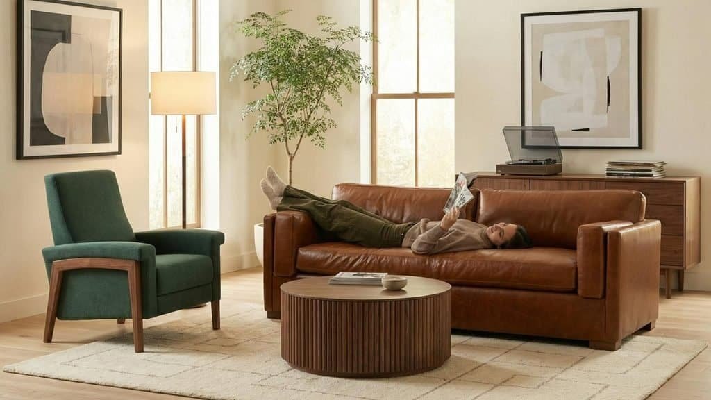
Chocolate Brown, Cream, and Olive Green
Add to Favorites
This combination brings together three colors that work naturally with wood and textured materials.
Chocolate brown provides depth, cream keeps the room light, and olive green introduces an earthy accent. The result suits contemporary, organic modern, and transitional interiors.
How to use it:
- Choose a chocolate brown sofa as the main furniture piece.
- Add cream cushions and a light neutral rug.
- Introduce olive through an accent chair or smaller upholstered piece.
- Use walnut or oak furniture to connect the colors.
This palette is particularly effective in living rooms where comfort and visual warmth are priorities.
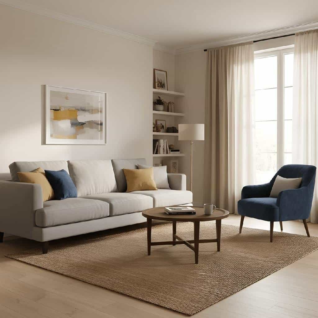
Warm Taupe, Dusty Blue, and Natural Oak
Add to Favorites
For a lighter, more understated interior, warm taupe and dusty blue offer a balanced alternative to darker earth tones.
Taupe provides a neutral foundation, dusty blue adds subtle color, and natural oak introduces warmth through its grain and finish.
This combination works well in apartments, smaller living rooms, and contemporary homes where the furniture needs to feel coordinated without dominating the space.
How to use it:
- Start with a taupe sofa or sectional.
- Introduce dusty blue through an armchair or upholstered bench.
- Choose oak tables and shelving.
- Finish with ivory curtains and a textured neutral rug.
The result is relaxed and versatile, with enough contrast to keep the room from looking monochromatic.
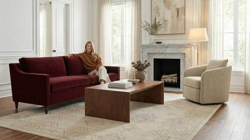
Burgundy, Oatmeal, and Walnut
Add to Favorites
Burgundy brings richness to this combination, while oatmeal and walnut prevent the darker color from feeling too intense.
The palette is suitable for homeowners who want a more distinctive living room without using multiple saturated shades.
A burgundy sofa can act as the focal point, while an oatmeal armchair and walnut coffee table establish a quieter visual foundation. Brass lighting and cream textiles add warmth.
For a more cautious approach, reverse the proportions: choose oatmeal as the dominant upholstery color and introduce burgundy through one accent chair or footstool.
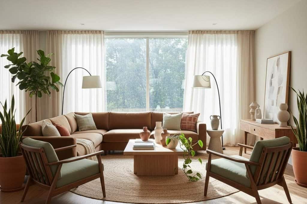
Terracotta, Ivory, and Muted Sage
Add to Favorites
Terracotta and sage create an earthy contrast because one is warm and reddish while the other is cool and green. Ivory helps connect them without adding unnecessary visual complexity.
This combination suits relaxed interiors with natural wood, woven textures, and soft furnishings.
Use terracotta for an accent chair, sage for cushions or a secondary seat, and ivory for the sofa or larger upholstery pieces. Pale oak furniture can complete the arrangement.
The proportions matter. If both terracotta and sage are used on large furniture pieces, keep the remaining colors relatively simple.
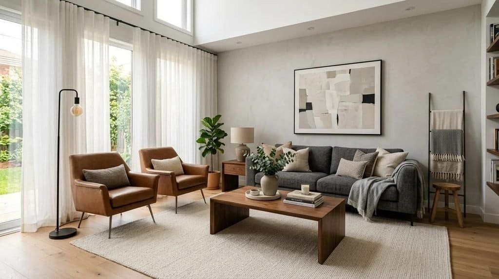
Charcoal, Warm Beige, and Caramel
Add to Favorites
This palette offers a more contemporary look for homeowners who prefer stronger contrast.
Charcoal gives the furniture definition, warm beige softens the darker color, and caramel adds a warm accent that prevents the room from feeling too cool.
Consider a charcoal sofa, beige armchairs, and a caramel leather ottoman. Walnut furniture and cream textiles can connect the different shades.
This combination works particularly well in modern interiors with simple furniture shapes and restrained decoration. In a smaller room, use charcoal selectively and allow beige and other lighter shades to occupy more of the visible space.
How to Combine Furniture Colors Without Creating Visual Clutter
Even attractive colors can compete when too many appear in equal proportions. The easiest way to avoid this problem is to decide which color should dominate before selecting individual furniture pieces.
A practical starting point is the following:
| Color role | Suggested proportion | Examples |
| Dominant color | Around 60% | Main sofa, large furniture pieces, major upholstery |
| Supporting color | Around 30% | Accent chairs, secondary furniture, rugs and curtains |
| Accent color | Around 10% | Cushions, ottomans, lampshades and decorative details |
These proportions are a flexible styling guide, not a strict rule. The important point is to establish a visual hierarchy rather than giving every color equal attention.
Keep the room connected by repeating at least one shade in different places. A green accent chair, for instance, might relate to green cushions or artwork elsewhere in the room.
Pay attention to material finishes, too. A brown leather chair, a walnut coffee table, and a caramel fabric sofa may belong to the same warm color family, but their different textures make the arrangement feel more layered.
Before buying new furniture, build a small palette around your existing pieces. Photograph the room in natural light, collect upholstery and wood samples, and compare the colors together. This simple step can help you avoid expensive mismatches and create a more intentional result.
How to Choose Furniture Colors for Every Room
The best furniture color depends not only on current trends but also on the room’s purpose, size, lighting, and existing finishes. A shade that looks beautiful on a living room sofa may feel too intense for a small bedroom, while a pale neutral that works well in a guest room may not be the most practical choice for a busy family space.
Furniture color trends 2027 provide plenty of options, from warm neutrals and earthy greens to rich reds and nuanced blues. The key is to adapt these colors to how you actually use each room.
Living Room: Build the Palette Around the Sofa
The sofa is often the largest upholstered item in a living room, so its color has a significant influence on the rest of the space.
For a versatile foundation, consider warm taupe, oatmeal, chocolate brown, or muted olive. These shades can work with a variety of coffee tables, rugs, curtains, and accent chairs.
If you prefer a more expressive look, consider a burgundy sofa, deep navy sectional, or terracotta accent chair. Let one strong color lead the design instead of introducing several competing statement pieces.
For example, a chocolate brown sofa can be paired with a cream rug, a walnut coffee table, and sage green cushions. Alternatively, a dusty blue sofa can work with pale oak furniture and warm beige curtains.
Think about practical use before choosing upholstery. Families with children or pets may prefer durable, easy-clean fabrics in mid-tone shades rather than delicate, very pale materials. Texture, pattern, and fabric construction can also affect how visible everyday marks become.
Bedroom: Choose Colors That Support a Restful Atmosphere
Bedrooms often benefit from furniture colors that feel calm and comfortable. Soft neutrals, muted greens, dusty blues, and warm wood tones are useful starting points.
An upholstered bed in oatmeal or mushroom can provide a flexible base for changing bedding colors. Sage green bedside tables can add a subtle accent, while a walnut dresser introduces depth.
For a richer look, consider a chocolate brown bed frame or a burgundy upholstered headboard against warm white walls. Balance the darker furniture with light bedding and soft lighting.
A coordinated bedroom palette might include:
- An ivory or oatmeal upholstered bed.
- Natural oak or walnut bedside tables.
- Muted sage or dusty blue accessories.
- Cream bedding with a subtle textured finish.
- A warm neutral rug to soften the floor.
If you prefer colorful furniture, introduce the strongest shade through one item, such as an upholstered headboard or bedroom bench. This keeps the room visually balanced while still allowing your personality to come through.
Dining Room: Use Chairs to Introduce Color
Dining furniture offers an excellent opportunity to experiment with color, particularly if you already own a wooden dining table.
A natural oak or walnut table can serve as a neutral anchor for upholstered chairs in olive green, burgundy, dusty blue, or muted terracotta.
This approach can be more flexible than buying a dining set in which every component has the same finish. The chairs create contrast, while the table keeps the overall arrangement grounded.
For a contemporary dining room, try walnut furniture with olive green chairs and cream walls. If you prefer something more dramatic, burgundy chairs can add depth to a dining area with warm neutral finishes.
Consider the amount of space around the table, too. In a small dining room, lighter chair upholstery may help preserve an open appearance, while darker colors can define the dining zone in a larger open-plan interior.
Home Office: Balance Visual Interest With Practicality
Home office furniture should support concentration while fitting comfortably into the surrounding home.
Warm wood, muted green, soft blue, and understated neutrals are useful options for desks, storage cabinets, and upholstered office chairs.
A walnut desk paired with a sage green chair creates a warm, grounded combination. A pale oak desk with a dusty blue chair offers a lighter, more contemporary appearance.
If your office shares space with a living room or bedroom, choose furniture colors that connect with the rest of the interior. Matching the desk finish to nearby wood furniture or repeating an accent color can help the workspace feel integrated rather than separate.
Avoid choosing a strong color solely because it is trending. Consider how the furniture looks during long periods of use, how it photographs during video calls, and whether it works with the room’s lighting.
Small Spaces: Use Light Colors Strategically
Small rooms don’t need to be entirely white or beige. The goal is to choose furniture colors that suit the available light and create a balanced visual arrangement.
Light upholstery can help maintain an airy appearance, but darker furniture can also work when used selectively.
For example, a small living room might feature an oatmeal sofa, a walnut coffee table, and one olive green accent chair. The sofa keeps the main seating area light, while the darker pieces introduce definition.
Helpful strategies include:
- Choose furniture with slimmer profiles when floor space is limited.
- Use light or mid-tone upholstery on the largest furniture pieces.
- Introduce darker colors through smaller chairs, side tables, or ottomans.
- Repeat wood finishes to create visual continuity.
- Avoid adding too many competing accent colors in one compact space.
Furniture layout matters just as much as color. Even a light-colored sofa can make a small room feel crowded if it blocks pathways or overwhelms the available floor area.
Open-Plan Homes: Create Connection Without Matching Everything
Open-plan living spaces can be challenging because the furniture in the living, dining, and kitchen areas is visible at the same time.
Rather than using the same color everywhere, create a shared palette with subtle variations.
For example, a living room might feature a taupe sofa and olive green accent chair, while the dining area uses natural oak furniture and muted green upholstery. A kitchen with warm neutral cabinetry can reinforce the palette without copying the living room exactly.
Repeat one or two colors across the zones, and let other materials provide variety. Walnut furniture, cream textiles, and muted green accents can connect separate areas while allowing each one to serve a different purpose.
A useful rule for every room: Choose furniture colors based on how you want the space to feel, then consider durability, lighting, and existing materials before committing. The most successful use of 2027 furniture color trends is not about copying a complete look; it’s about adapting the colors to your own home and making them work together naturally.
Painted Furniture vs. Natural Wood: Which Color Direction Should You Choose?
One of the most important decisions when choosing furniture colors for 2027 is whether to embrace painted finishes or let the natural beauty of wood take center stage. Both approaches can create stylish interiors, but they offer different advantages in terms of appearance, flexibility, maintenance, and long-term appeal.
Painted furniture introduces color directly into a room, making it easier to experiment with sage green, warm taupe, dusty blue, or burgundy. Natural wood, on the other hand, provides texture, grain, and warmth that can complement a wide range of upholstery colors.
The right choice depends on your decorating style, existing furniture, and how much visual impact you want to create.
Painted Furniture Brings Color and Personality
Painted furniture is an effective way to introduce trending shades without purchasing entirely new furniture sets. A painted sideboard, bedside table, dining chair, or chest of drawers can transform the appearance of a room while preserving the original furniture structure.
For 2027-inspired interiors, consider these options:
- Sage green cabinets and sideboards: Suitable for relaxed, nature-inspired spaces.
- Warm taupe bedside tables: Ideal for bedrooms with layered neutral colors.
- Deep blue accent furniture: Adds contrast to contemporary rooms.
- Terracotta occasional tables: Introduces warmth into neutral interiors.
- Burgundy statement pieces: Creates a distinctive focal point in a living room or dining area.
Painted furniture is particularly useful when your existing pieces are structurally sound but no longer match your preferred color palette.
For example, an old wooden bedside table can be refreshed with a muted sage finish to complement cream bedding and pale oak flooring. A dated sideboard can take on a more contemporary appearance with warm taupe paint and updated hardware.
Before repainting, check whether the furniture is solid wood, veneer, laminate, or another material. Each surface requires suitable preparation and paint products. Cleaning, sanding where appropriate, priming, and applying a compatible protective finish can help produce a more durable result.
Natural Wood Tones Provide Lasting Warmth
Natural wood remains an appealing choice because it contributes both color and texture. Rather than relying on a single flat shade, wood introduces grain patterns and subtle tonal variations that make furniture visually interesting.
Several wood tones work particularly well with the furniture colors anticipated for 2027.
Natural oak pairs beautifully with oatmeal, ivory, sage green, and dusty blue. Its relatively light appearance is useful in bright, relaxed interiors.
Walnut complements chocolate brown, burgundy, olive green, and warm taupe. Its deeper color creates a more substantial, sophisticated look.
Honey-toned wood adds warmth to cream, caramel, terracotta, and muted green palettes. It can help a contemporary room feel less stark.
Smoked or darker wood finishes provide contrast against light upholstery and can anchor larger spaces with a more dramatic aesthetic.
When selecting wood furniture, remember that the finish affects its appearance. A clear finish may highlight the wood’s natural undertones, while a tinted stain can make it appear warmer, darker, or cooler.
How to Combine Painted Furniture With Natural Wood
You don’t have to choose one direction exclusively. In fact, mixing painted furniture with natural wood can create a more layered interior than using the same finish throughout.
The secret is to give each material a clear role.
Consider a bedroom with pale oak bedside tables, a sage green dresser, and an oatmeal upholstered bed. The wood provides natural warmth, the painted dresser introduces color, and the neutral bed creates visual balance.
A dining room could feature a walnut table with muted blue chairs. In a living room, a cream sofa can sit alongside a terracotta-painted side table and a natural oak coffee table.
For a cohesive result:
- Limit the number of prominent wood finishes unless you’re intentionally creating an eclectic look.
- Repeat the painted furniture color in smaller accessories or artwork.
- Consider undertones when pairing different woods.
- Use neutral upholstery to connect contrasting finishes.
- Avoid matching every wood item perfectly if doing so makes the room feel overly uniform.
Which option should you choose? Painted furniture is ideal for introducing personality or refreshing existing pieces, while natural wood offers texture and flexibility. Combining the two can give you the best of both worlds.
For more inspiration, explore our related guide to wood furniture color trends and discover how different finishes can shape the atmosphere of a room.
How to Bring 2027 Furniture Color Trends Into Your Home on Any Budget
Refreshing your home with furniture color trends 2027 doesn’t necessarily require an expensive renovation or a completely new furniture set. A carefully chosen accent chair, a painted side table, or a simple upholstery update can change the appearance of a room considerably.
The most effective approach is to identify which pieces need attention, decide where color will have the greatest impact, and spend your budget accordingly.
Start Small With Affordable Color Updates
If your current furniture is still functional, begin by changing the elements around it rather than replacing large pieces.
Small updates allow you to experiment with new shades before making a major commitment.
Affordable ideas include:
- Replacing cushion covers with olive green, terracotta, burgundy, or dusty blue.
- Adding a colorful ottoman or upholstered footstool.
- Painting a suitable side table or bedside cabinet.
- Updating old dining chairs with new upholstery.
- Refreshing a wooden stool or occasional table with a compatible stain or paint.
- Shopping for secondhand furniture that can be refinished or reupholstered.
For example, a neutral living room can take on a warmer look with caramel cushions, a rust-colored throw, and a secondhand walnut side table. These smaller changes can help you explore an earthy palette without buying a new sofa.
Start with one or two updates and evaluate the result before adding more colors. This makes it easier to maintain a coherent design and avoid unnecessary spending.
Invest in Timeless Colors for Expensive Furniture
Large furniture pieces are usually the most visible and costly items in a room. Sofas, beds, dining tables, and large storage units should therefore be chosen with more consideration than smaller decorative pieces.
If you expect to keep a sofa for many years, a versatile color such as warm taupe, oatmeal, chocolate brown, or muted olive may offer greater flexibility than a highly distinctive shade.
That doesn’t mean you should avoid bold colors. A burgundy sofa or deep blue armchair can be a worthwhile investment if you genuinely love the color and know how to work it into your home.
The important distinction is between choosing a color because it suits your lifestyle and choosing it simply because it appears in current trend imagery.
Before purchasing expensive furniture, ask yourself:
- Will this color work with my existing flooring and wall finishes?
- Can I change the surrounding accessories without replacing the furniture?
- Does the upholstery suit my household’s cleaning and maintenance needs?
- Will I still enjoy the color if another shade becomes more fashionable?
- Does the piece fit the room’s proportions and everyday function?
Answering these questions can help you make a more practical decision while still enjoying current design inspiration.
Give Existing Furniture a Second Life
Replacing furniture isn’t always the most economical way to update a room. If the frames, drawers, or structural components are in good condition, refinishing or reupholstering may be a better option.
A dated wooden dresser can be refreshed with warm taupe paint and new handles. A solid wood dining table may benefit from refinishing to reveal a more natural tone. An older armchair could become a statement piece with olive, rust, or dusty blue upholstery.
Before starting a project, compare the total cost of materials, labor, and any repairs with the price of a replacement piece.
Reupholstery can be worthwhile for furniture with a strong frame or sentimental value, but it isn’t automatically cheaper than buying new. Likewise, painting isn’t suitable for every surface or furniture finish.
Choose the approach that makes sense for the condition of the piece and the quality of the final result you want.
Mix Secondhand Finds With Contemporary Furniture
Secondhand furniture is another way to explore distinctive colors without paying premium prices for new statement pieces.
Vintage wooden chairs, compact cabinets, side tables, and upholstered furniture can introduce character that mass-produced items may lack. Some pieces can be used as they are, while others may benefit from refinishing or reupholstery.
Imagine a contemporary living room with an oatmeal sofa, a vintage walnut side table, and a secondhand armchair reupholstered in muted terracotta. The combination feels individual because the furniture varies in age, material, and texture while sharing a coordinated color palette.
When shopping secondhand, inspect the condition carefully. Check for structural damage, unstable joints, worn upholstery, persistent odors, and signs of pests. Factor any necessary repairs into the purchase price.
Common Mistakes to Avoid When Updating Furniture Colors
Even a relatively small decorating project can become expensive if the colors don’t work together or the furniture doesn’t suit the room.
Watch out for these common mistakes:
Buying furniture based only on showroom lighting. Artificial lighting can change how upholstery and wood finishes appear. View samples in your home at different times of day.
Choosing too many statement colors. Several saturated shades competing for attention can make a room feel disjointed. Give one color the leading role and use the others selectively.
Ignoring undertones. A cool gray-beige sofa may clash with strongly yellow-toned wood, even if both seem neutral. Compare the colors side by side before purchasing.
Following trends without considering everyday use. Pale upholstery may be attractive, but it may not suit a household that needs easy-clean materials. Dark furniture may look dramatic, but it can show dust or pet hair depending on the finish.
Replacing furniture that only needs a refresh. New upholstery, updated hardware, or a carefully chosen paint finish may achieve the desired result at a lower cost.
The best budget strategy is to combine long-lasting furniture with affordable, changeable accents. That approach lets you enjoy emerging furniture color trends in 2027 without committing every part of your home to one particular look.
Furniture Color Trends 2027: Styling Ideas Worth Saving
Sometimes, choosing a furniture color is easier when you can picture the entire room rather than considering individual shades in isolation.
The following decorating ideas translate the leading furniture colors for 2027 into practical schemes. Each one uses a different balance of color, material, and texture, so you can choose the approach that best suits your home.
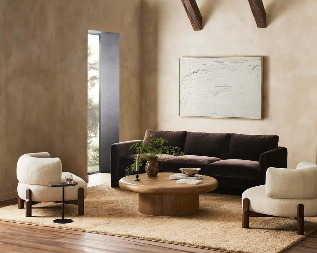
Warm Minimalism With Chocolate Brown and Oatmeal
Add to Favorites
Warm minimalism combines simple furniture silhouettes with natural materials and a restrained color palette. Chocolate brown and oatmeal are particularly effective for this look.
Start with a chocolate brown sofa or a medium-brown wooden furniture piece. Add oatmeal upholstery, a pale rug, and natural oak tables to keep the room balanced.
Rather than filling the space with decorative objects, focus on a few materials with different textures. Linen, wool, wood grain, and matte ceramics provide interest without creating visual clutter.
This scheme suits contemporary apartments, open-plan homes, and living rooms where you want a calm atmosphere with more warmth than a traditional black-and-white palette.
Try this combination: Chocolate brown sofa, oatmeal armchair, natural oak coffee table, ivory rug, and a small olive green accent.
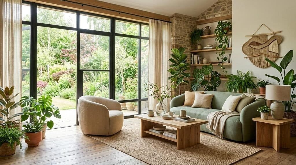
Nature-Inspired Interiors With Sage, Olive, and Oak
Add to Favorites
Nature-inspired interiors use greens, warm neutrals, and wood finishes to create a relaxed connection with the outdoors.
Sage green works well on larger upholstered pieces if you prefer a softer appearance. Olive is a stronger choice for accent chairs or dining furniture when you want more depth.
Pale oak furniture and cream textiles help the green tones feel light and cohesive. Plants can reinforce the natural theme, although you don’t need an abundance of greenery to make the palette work.
The most successful versions of this style avoid using too many unrelated natural colors. Choose one primary green, one supporting neutral, and one or two complementary materials.
Try this combination: Sage sofa, olive accent chair, pale oak coffee table, cream cushions, and a textured beige rug.
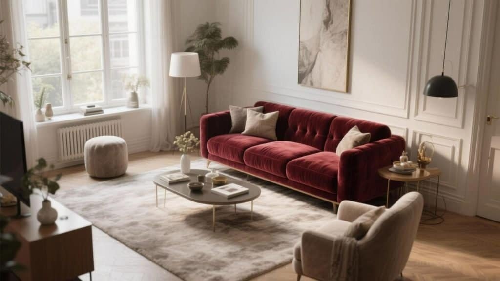
Sophisticated Spaces With Burgundy and Walnut
Add to Favorites
Burgundy and walnut create a richer interior that feels distinctive without relying on bright colors or elaborate decoration.
A burgundy sofa or accent chair can establish the room’s focal point, while walnut furniture reinforces the depth of the palette. Cream walls, a warm neutral rug, and understated metallic details prevent the combination from becoming too dark.
This look works especially well in larger living rooms, reading corners, and spaces where the furniture can stand out against a relatively simple background.
For smaller rooms, use burgundy on one chair or ottoman and introduce walnut through a side table or compact cabinet. The same palette can work on a smaller scale when the darker colors are carefully distributed.
Try this combination: Burgundy armchair, walnut side table, oatmeal sofa, cream rug, and warm brass lighting.
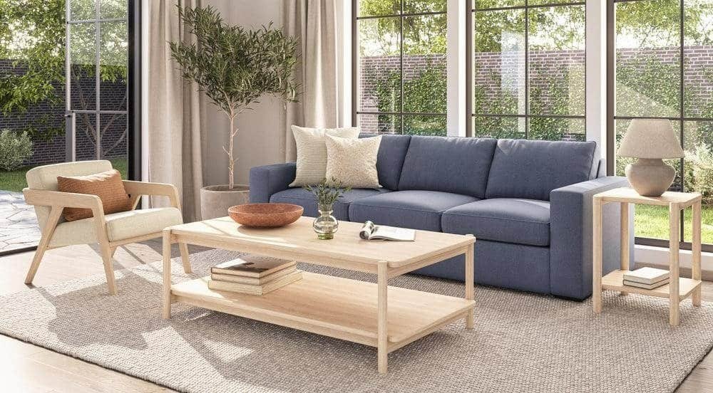
Relaxed Contemporary Rooms With Dusty Blue and Warm Neutrals
Add to Favorites
Dusty blue and warm neutrals offer a lighter alternative to deep earth tones. The blue introduces color, while beige, ivory, and natural wood maintain a relaxed atmosphere.
This palette is suitable for living rooms, guest bedrooms, and multifunctional spaces where you want the furniture to feel fresh but not overly bold.
Choose a dusty blue sofa or armchair, then add warm beige upholstery, an oak table, and cream textiles. Small accents in caramel or muted green can provide additional depth without disrupting the overall balance.
This style is also adaptable. You can change the cushions, artwork, or rug later without needing to replace the main furniture.
Try this combination: Dusty blue sofa, beige accent chair, oak coffee table, ivory rug, and caramel cushions.
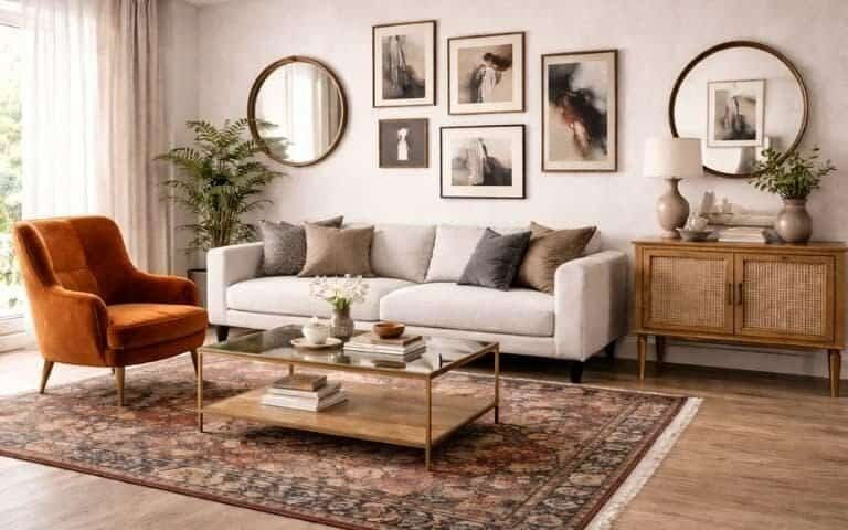
Eclectic Interiors With Terracotta, Muted Green, and Vintage Wood
Add to Favorites
For homeowners who prefer a more expressive look, terracotta, muted green, and vintage wood offer an inviting combination.
Terracotta provides warmth, green introduces contrast, and vintage wood gives the room character. The result can feel collected and personal rather than overly coordinated.
Start with a neutral sofa or another simple foundational piece. Add a terracotta accent chair, a sage green cabinet, and one or two vintage wooden furniture items.
Patterns can also work well in this style, especially when they repeat colors already present in the furniture. A rug featuring muted green, rust, and cream, for example, can connect the different pieces.
The main challenge is avoiding visual clutter. Varying furniture styles can create interest, but the room still needs a clear color direction.
Try this combination: Cream sofa, terracotta chair, sage green sideboard, vintage walnut table, and a muted patterned rug.
How to Adapt These Furniture Color Ideas to Your Own Home
You don’t need to copy any scheme exactly. Use the examples as starting points and adjust the proportions to suit your room.
If you already own a neutral sofa, you may only need an accent chair or a few accessories to introduce a new color. If your furniture is mostly dark wood, lighter upholstery can help balance it. If the room has pale flooring and white walls, deeper furniture colors can add definition.
Before making purchases, collect a few reference images and identify the colors that appear repeatedly. Then compare those shades with your existing furniture, flooring, curtains, and wall finishes.
For additional inspiration, explore our related guide to home decor color trends 2027 for ideas on connecting furniture colors with the wider interior palette.
Frequently Asked Questions About Furniture Color Trends 2027
What are the biggest furniture color trends for 2027?
Key colors to explore for 2027 include chocolate brown, warm taupe, oatmeal, sage green, olive green, burgundy, dusty blue, and muted terracotta. These shades offer a balance of versatile neutrals, nature-inspired colors, and expressive accents.
What is the most timeless furniture color for 2027?
Warm neutrals such as oatmeal, ivory, taupe, and medium brown are versatile choices because they can work with many wall colors, wood finishes, and decorative styles. Natural wood furniture is also adaptable, particularly when paired with changeable upholstery and accessories.
Are brown sofas still a good choice in 2027?
Brown sofas are worth considering if you want a warm, versatile foundation for your living room. Chocolate, caramel, and chestnut can all work with cream, olive green, terracotta, and dusty blue. Choose the depth of brown according to your room’s lighting and existing finishes.
What furniture colors make a small room look bigger?
Light and mid-tone colors such as ivory, oatmeal, warm beige, and soft sage can help a small room maintain an open appearance. However, furniture size, layout, and natural light matter just as much. A carefully placed dark accent chair can add depth without overwhelming the room.
Is green furniture going out of style in 2027?
Green remains a useful color direction to explore, particularly muted shades such as sage, olive, and moss. These colors complement wood and warm neutrals, making them adaptable to different decorating styles. Choose a shade that suits your home rather than relying entirely on predictions about trends.
What colors go best with brown furniture?
Brown furniture pairs well with ivory, cream, oatmeal, olive green, muted blue, terracotta, and burgundy. Lighter colors create contrast, while related brown tones build a warmer, layered look. The best combination depends on the brown’s undertone and the amount of natural light in the room.
Should I choose neutral or colorful furniture in 2027?
Choose neutral furniture if you want flexibility and plan to update your accessories regularly. Colorful furniture is ideal when you want a distinctive focal point or have a strong preference for a particular shade. You can also combine both approaches by choosing a neutral sofa and adding a colorful accent chair.
How can I update my furniture colors without buying new furniture?
Consider painting suitable wooden furniture, replacing cushion covers, reupholstering chairs, changing hardware, or adding colorful accessories. Refinishing an existing piece can be more economical than replacing it, provided the furniture is structurally sound and the materials are suitable for the intended treatment.
What furniture colors work best with natural wood?
Natural oak pairs well with ivory, oatmeal, sage, and dusty blue. Walnut complements chocolate brown, olive green, burgundy, and warm taupe. Honey-toned wood works particularly well with cream, caramel, terracotta, and muted green. Always compare the undertones of the wood and upholstery before making a final choice.
How do I choose a furniture color that won’t look dated quickly?
Choose colors you genuinely enjoy and consider how they work with your existing interior. Versatile neutrals and natural wood provide flexibility, while trend-forward shades can be introduced through smaller pieces. If you love a bold color, you can still make it a long-term choice by building a balanced palette around it.
Bring the Best Furniture Color Trends of 2027 Into Your Home
Furniture color trends 2027 offer plenty of ways to create a home that feels warmer, more personal, and visually balanced. From chocolate brown and natural wood to sage green, burgundy, dusty blue, and terracotta, the most useful colors are those that work with your space rather than simply following a trend.
Start by looking at the furniture you already own. Identify the pieces worth keeping, decide where a new color would have the greatest impact, and build a small palette around your existing flooring, wall finishes, and materials.
You don’t need to change everything at once. A single olive green chair, a warm taupe sofa, or a refinished wooden sideboard can be enough to give a room a fresh direction.
Choose one furniture color that inspires you, experiment with a complementary shade, and create a palette that feels right for your home. Save your favorite combinations, compare samples in your own lighting, and make your next furniture update a thoughtful investment in a space you’ll enjoy for years to come.
