
Modern house color trends 2027 are moving beyond safe neutrals and into a more expressive, nature-connected direction. Homeowners and designers are rethinking how color shapes mood, functionality, and even long-term value.
This guide breaks down the most important color directions for 2027, shows how to use them in real homes, and helps you avoid common mistakes. Whether you’re repainting a single room or planning a full redesign, you’ll find practical ideas, combinations, and expert insights you can actually use.
In This Article
Why Color Trends Matter in Modern Homes (More Than Just Aesthetic)
Color choices are no longer just about “what looks good.” In modern homes, color plays a functional role—affecting how a space feels, how large it appears, and how well it adapts to daily life.
The Psychology Behind Color in Modern Living
Colors influence how we experience a space more than furniture or layout. Warm tones can make a room feel inviting, while cooler shades create a sense of calm and focus.
Key effects to consider:
- Warm tones (beige, clay, terracotta): Cozy and welcoming
- Cool tones (blue, sage, grey): Relaxing and clean
- Dark shades (charcoal, navy): Dramatic and intimate
- Light neutrals: Open, airy, and versatile
A living room painted in a soft earthy neutral feels completely different from one in stark white—even with identical furniture.
From Decoration to Intentional Design
Modern design in 2027 leans toward intentional color use. Instead of choosing colors last, homeowners now start with a palette and build everything around it—materials, textures, and lighting included.
This shift means:
- Color defines the identity of the home
- Spaces feel more cohesive and curated
- Design decisions become more strategic
Micro-Trends vs. Timeless Palettes
Not every trend is worth following. Some colors surge in popularity quickly and fade just as fast.
A smart approach:
- Use timeless base colors (warm neutrals, soft greys) for walls
- Add trend-driven accents through décor or feature walls
This balance keeps your home current without requiring constant updates.
Modern House Color Trends 2027: The Big Picture
The overall direction of modern house color trends 2027 reflects a deeper shift in how people live. Homes are becoming more personal, more calming, and more connected to nature.
Nature-Inspired Palettes Take Center Stage
Expect to see colors pulled directly from natural environments:
- Earth tones like clay, sand, and stone
- Botanical greens and muted plant shades
- Ocean-inspired blues with a softened edge
These colors create spaces that feel grounded and restorative—especially important in a fast-paced, digital world.
Technology Meets Warmth
Sleek, modern homes used to lean heavily on cool tones like white and grey. In 2027, that’s changing.
New palettes blend:
- Soft neutrals + subtle tech-inspired accents
- Warm whites instead of stark whites
- Matte finishes instead of glossy surfaces
The result is a home that feels modern without feeling cold.
Minimalism Gets More Expressive
Minimalism isn’t disappearing—it’s evolving. Instead of plain, monochrome spaces, 2027 introduces layered minimalism.
Think:
- One dominant color used in multiple shades
- Carefully chosen contrast instead of bold clutter
- Texture and tone doing more work than patterns
This approach keeps spaces clean while adding depth and personality.
Earthy Neutrals 2.0: Warm, Grounded, and Far From Boring
Neutral colors remain a foundation of modern house color trends 2027—but they’re warmer, richer, and far more dynamic than before.
The Evolution of Neutrals
Cold greys are gradually being replaced by warmer, earth-based tones that feel more inviting and livable.
Popular choices include:
- Sand beige
- Warm taupe
- Soft clay
- Mushroom tones
These shades work beautifully across walls, ceilings, and even cabinetry.
Why Cool Greys Are Fading Out
Cool grey once dominated modern interiors, but it often creates spaces that feel sterile or flat.
Homeowners are now prioritizing:
- Comfort over stark minimalism
- Warmth over sharp contrast
- Depth over simplicity
That’s why warmer neutrals are taking over—they make spaces feel lived-in, not showroom-like.
How to Use Earthy Neutrals Effectively
Earthy tones are versatile, but the magic lies in how you layer them.
Practical ideas:
- Pair warm beige walls with darker wood furniture
- Use tone-on-tone layering for a subtle, elegant look
- Add texture (linen, stone, wood) to avoid flatness
A well-executed neutral palette doesn’t look plain—it feels sophisticated and timeless.
Best Combinations for Modern Homes
| Base Color | Complementary Accent | Ideal Space |
| Warm beige | Olive green | Living room |
| Soft taupe | Matte black | Kitchen |
| Clay | Cream or off-white | Bedroom |
| Sand | Natural wood tones | Open-plan areas |
These combinations reflect how modern house color trends 2027 prioritize harmony over contrast.
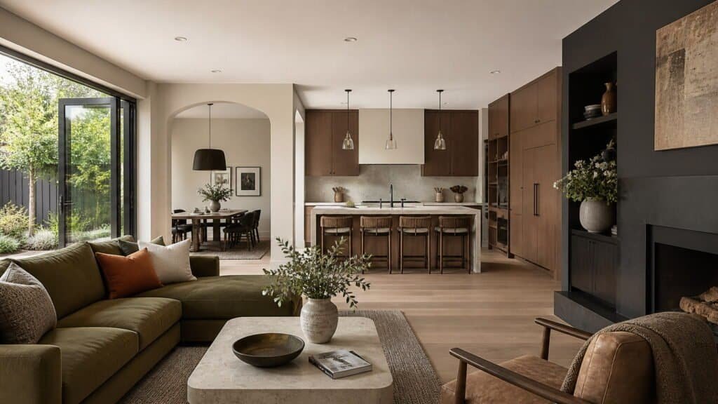
Deep Greens & Organic Hues: Bringing the Outside In
Green has firmly established itself as one of the defining tones in modern house color trends 2027. It’s no longer just an accent—it’s becoming a core color choice for both interiors and exteriors.
Why Green Feels So Right in 2027
As homes evolve into spaces for rest, work, and recharge, green offers a sense of balance that few colors can match. It naturally connects interiors to the outdoors, even in urban environments.
Popular shades include:
- Forest green for depth and richness
- Olive for warmth and versatility
- Moss and sage for softer, calming effects
Each variation brings a slightly different mood, making green highly adaptable.
Pairing Green with Natural Materials
Green works best when combined with textures found in nature. This creates a cohesive, grounded aesthetic that feels intentional rather than decorative.
Strong pairings:
- Wood finishes (oak, walnut) for warmth
- Stone surfaces for an organic, tactile feel
- Linen and cotton textiles for softness
A moss green wall paired with light wood flooring instantly creates a calming, spa-like environment.
Where Green Works Best in Modern Homes
Green isn’t limited to one type of space—it adapts beautifully across the home.
Best uses:
- Living rooms for a relaxed, welcoming vibe
- Bedrooms for calm and restfulness
- Kitchens for a fresh, modern-natural feel
- Exterior facades for bold yet timeless appeal
Used thoughtfully, green can act as both a neutral and a statement color.
Moody & Dark Palettes: The Rise of Dramatic Interiors
While lighter palettes remain popular, modern house color trends 2027 are embracing deep, moody tones that add sophistication and depth.
The Appeal of Dark Colors in Modern Design
Dark colors create an atmosphere that feels intimate, refined, and intentionally designed. Rather than shrinking a space, they can actually make it feel more curated and layered.
Trending shades:
- Charcoal grey
- Deep navy
- Espresso brown
- Near-black tones with warm undertones
These colors bring a sense of luxury without relying on ornate details.
How to Use Dark Colors Without Overwhelming a Space
The key to using moody tones is balance. When applied correctly, they enhance a room rather than overpower it.
Practical strategies:
- Use dark colors on feature walls instead of all walls
- Combine with lighter ceilings to maintain openness
- Add reflective surfaces (glass, metal) to bounce light
A navy accent wall behind a bed, paired with soft neutral bedding, creates contrast without heaviness.
Lighting: The Secret to Making Dark Palettes Work
Lighting becomes essential when working with darker tones. Without it, even the best color choice can fall flat.
Effective lighting techniques:
- Layered lighting (ambient + task + accent)
- Warm light bulbs to soften the look
- Wall sconces or LED strips to highlight textures
Well-lit dark interiors feel intentional—not dim or closed-in.
Soft Pastels, Reimagined for 2027
Pastels are making a comeback, but not in the way you might expect. Modern house color trends 2027 transform traditional “light” colors into something far more refined.
From Playful to Sophisticated
Forget overly bright or sugary pastels. The new approach leans toward muted, dusty versions that feel elegant and modern.
Updated pastel tones:
- Dusty blue instead of sky blue
- Muted lilac instead of lavender
- Soft sage instead of mint green
- Warm blush instead of pink
These shades bring subtle color without overwhelming the space.
Where Pastels Shine in Modern Interiors
Pastels work best when used to soften a space or introduce gentle contrast.
Ideal applications:
- Bedrooms for a calming atmosphere
- Bathrooms for a clean, spa-like feel
- Kitchens to add warmth without heaviness
A muted lilac wall paired with neutral furniture creates a look that feels fresh yet understated.
How to Style Pastels Without Looking Outdated
The biggest risk with pastels is making a space feel dated. The difference lies in how they’re combined and styled.
Modern styling tips:
- Pair pastels with matte black or dark accents for contrast
- Use minimal décor to keep the look clean
- Combine with natural textures to avoid a “synthetic” feel
When done right, pastels in 2027 feel modern, balanced, and quietly expressive.
Bold Accent Colors That Actually Work in Modern Homes
Bold color is making a confident return in modern house color trends 2027—but with more control and intention. Instead of overwhelming spaces, these colors are used to create focus, contrast, and personality.
Statement Shades Leading the Way
Accent colors are becoming richer and more grounded, rather than neon or overly bright.
Trending bold tones:
- Terracotta and burnt orange
- Cobalt and deep teal
- Mustard yellow
- Rust red
These hues bring energy without disrupting the overall harmony of a space.
Where to Use Bold Colors Without Regret
The success of bold accents depends heavily on placement. Strategic use allows you to experiment without long-term commitment.
Smart applications:
- Accent walls to anchor a room
- Upholstered furniture (sofas, chairs)
- Kitchen islands or lower cabinets
- Artwork and décor pieces
A terracotta accent wall behind a neutral sofa instantly adds warmth and depth.
How to Keep Bold Colors Balanced
Too much contrast can feel chaotic. The goal is to let bold tones stand out without competing.
Balance techniques:
- Keep surrounding colors neutral
- Limit bold tones to one or two per space
- Repeat the accent color subtly (pillows, rugs, décor)
This approach creates cohesion while still making a visual impact.
Modern House Exterior Color Trends 2027
Exterior colors are becoming just as important as interiors in modern house color trends 2027. The focus is on clean contrasts, natural tones, and architectural emphasis.
Trending Exterior Color Combinations
Modern homes are embracing palettes that highlight structure rather than hide it.
Popular combinations:
- Dark charcoal + warm wood accents
- Soft white + black trims
- Earthy beige + olive green details
- Monochromatic greys with layered shades
These combinations create a polished, contemporary look that feels timeless.
Designing with Contrast and Depth
Flat exteriors are being replaced by layered designs that use color to add dimension.
Key ideas:
- Highlight architectural features with contrasting trims
- Use darker shades for lower sections to ground the home
- Incorporate texture (stone, wood panels) alongside color
A well-designed exterior feels dynamic even with a limited palette.
Regional Influences on Exterior Colors
Climate and surroundings play a big role in color selection—especially in tropical or urban environments.
Examples:
- Tropical regions: lighter tones to reflect heat, paired with natural greens
- Urban settings: darker, more dramatic palettes for a sleek look
Choosing colors that respond to the environment ensures both beauty and practicality.
The Role of Natural Light in Choosing 2027 Color Palettes
Even the best color can fall flat if lighting isn’t considered. Modern house color trends 2027 place strong emphasis on how natural light interacts with color throughout the day.
How Light Changes Color Perception
A color doesn’t stay constant—it shifts depending on light direction and intensity.
Key differences:
- North-facing rooms: cooler, softer light (colors appear muted)
- South-facing rooms: warmer, brighter light (colors appear richer)
- East-facing: bright mornings, softer afternoons
- West-facing: warmer tones in the evening
A beige wall can look warm and inviting in one room, but dull in another.
Practical Tips for Testing Colors
Choosing paint from a sample card is risky. Testing in real conditions makes a significant difference.
Best practices:
- Paint large sample patches on multiple walls
- Observe the color at different times of day
- Compare under both natural and artificial lighting
This simple step prevents costly mistakes and ensures confidence in your final choice.
Artificial Lighting Still Matters
Natural light isn’t the only factor. Artificial lighting can dramatically shift how colors appear at night.
Important considerations:
- Warm bulbs enhance earthy tones
- Cool bulbs highlight blues and greys
- Layered lighting improves depth and balance
A well-lit room supports the color palette rather than working against it.
Color Pairing Secrets Designers Are Using in 2027
The real difference between an average home and a stunning one often comes down to how colors are combined, not just which colors are chosen.
Tonal Layering: The Subtle Luxury Trend
Instead of high contrast, many designers are using variations of the same color to create depth.
Examples:
- Light beige walls + medium taupe furniture + dark brown accents
- Soft green walls + deeper green cabinetry
This creates a cohesive, sophisticated look without visual noise.
Balancing Warm and Cool Tones
A space that leans too warm or too cool can feel off-balance. The solution is thoughtful contrast.
Simple formula:
- Warm base + cool accents, or
- Cool base + warm textures
For example, a warm neutral room paired with cool metal finishes creates visual harmony.
Unexpected Combinations That Work
2027 encourages a bit of creativity—especially with combinations that feel fresh but still grounded.
Trending pairings:
- Olive green + blush pink
- Navy blue + warm beige
- Terracotta + soft grey
- Charcoal + muted gold
These combinations feel modern because they balance contrast with restraint.
Sustainable & Eco-Friendly Color Choices (Growing Demand)
Sustainability is no longer a niche concern—it’s shaping modern house color trends 2027 in a very real way. Homeowners are paying attention not just to how colors look, but how they’re made and how they impact health.
The Rise of Low-VOC and Natural Paints
Traditional paints often contain volatile organic compounds (VOCs) that release harmful chemicals into the air. In 2027, more people are switching to safer alternatives.
What to look for:
- Low-VOC or zero-VOC paints
- Natural pigments derived from minerals or plants
- Water-based formulas with fewer toxins
These options improve indoor air quality while still delivering rich, modern colors.
How Sustainability Influences Color Preferences
Eco-conscious design naturally leans toward colors found in nature. That’s one reason earthy tones, greens, and muted shades are dominating.
Sustainability-driven color traits:
- Soft, non-synthetic tones
- Colors that age well over time
- Palettes that reduce the need for frequent repainting
A timeless, nature-inspired palette is both stylish and environmentally responsible.
Finishes That Matter Just as Much as Color
The finish you choose can impact both aesthetics and sustainability.
Popular choices in 2027:
- Matte and eggshell finishes for a soft, modern look
- Limewash and clay-based paints for texture and depth
- Durable coatings that reduce maintenance
A sustainable approach isn’t just about color—it’s about longevity and impact.
Room-by-Room Guide to Applying Modern House Color Trends 2027
Applying modern house color trends 2027 successfully means adapting them to each space’s function. A one-size-fits-all palette rarely works.
Living Room: Comfort Meets Sophistication
The living room sets the tone for the entire home.
Best approaches:
- Warm neutrals as a base
- Green or earthy accents for depth
- Layered textures to enhance the palette
The goal is a space that feels inviting yet refined.
Kitchen: Clean, Warm, and Functional
Kitchens are shifting away from stark white toward warmer, more livable tones.
Trending ideas:
- Soft taupe or beige cabinetry
- Dark lower cabinets with lighter upper sections
- Subtle color contrasts instead of sharp ones
This creates a kitchen that feels modern but not clinical.
Bedroom: Calm, Restful, and Personal
Bedrooms benefit from colors that promote relaxation.
Ideal palettes:
- Muted pastels (sage, dusty blue, blush)
- Warm neutrals with soft contrast
- Minimal color variation for a serene feel
A well-chosen palette can noticeably improve how restful the space feels.
Bathroom: Spa-Inspired Simplicity
Bathrooms in 2027 are designed to feel like personal retreats.
Effective combinations:
- Soft whites + natural stone tones
- Pale greens or blues for freshness
- Matte finishes for a modern touch
Clean, calming colors turn everyday routines into a more relaxing experience.
Common Color Mistakes to Avoid in Modern Homes
Even the best trends can go wrong without thoughtful execution. Avoiding these mistakes will help your home look intentional rather than experimental.
Overusing Trendy Colors
Trends are exciting, but too much can quickly feel overwhelming.
Better approach:
- Use trends in accents, not entire spaces
- Keep foundational colors timeless
Ignoring Undertones
Every color has an undertone that affects how it pairs with others.
Common issues:
- Mixing warm and cool tones unintentionally
- Choosing paint that clashes with flooring or furniture
Always compare samples side by side before committing.
Disconnect Between Interior and Exterior
A modern home should feel cohesive from outside to inside.
What to avoid:
- Completely different color directions
- Clashing tones between façade and interior palette
Consistency creates a more polished overall impression.
Visual Inspiration: Real-Life Modern House Color Ideas for 2027
Seeing trends in action makes them easier to apply. These ideas reflect how modern house color trends 2027 come together in real spaces.
Minimalist Homes with Layered Neutrals
- Soft beige walls with deeper taupe furniture
- Natural wood accents for warmth
- Subtle contrast through textiles
This look feels calm, clean, and timeless.
Bold Contemporary Homes with Contrast
- Dark exterior with light interior palette
- Statement accent walls in living areas
- Sharp but controlled color transitions
Perfect for homeowners who want a modern edge.
Nature-Inspired Interiors with Organic Tones
- Green walls paired with stone textures
- Earthy palettes throughout the home
- Indoor plants reinforcing the color story
These homes feel connected to the outdoors and highly livable.
Bringing It All Together: Choosing a Palette That Lasts Beyond 2027
Trends come and go, but a well-chosen color palette can last for years. The key is blending what’s current with what feels right for your space.
How to Balance Trendy and Timeless
A smart strategy ensures your home won’t feel outdated too quickly.
- Use neutral foundations for walls and large surfaces
- Introduce trends through décor, furniture, or accents
- Focus on colors that complement your lifestyle and lighting
Creating Flow Throughout the Home
Consistency matters more than exact matching.
Tips for cohesion:
- Repeat key tones in different rooms
- Use gradual transitions between spaces
- Stick to a unified undertone (warm or cool)
This creates a seamless experience as you move through the home.
Trusting Your Personal Style
Trends should guide—not dictate—your decisions.
A home feels its best when:
- Colors reflect your personality
- Spaces feel comfortable and functional
- Choices are made with intention, not pressure
For deeper insight into how color affects perception and mood, you can explore this helpful resource from Verywell Mind: https://www.verywellmind.com/color-psychology-2795824
FAQ: Modern House Color Trends 2027
What are the most popular modern house color trends for 2027?
Earthy neutrals, deep greens, warm tones, muted pastels, and dark moody shades are leading the way, with a strong focus on natural and calming palettes.
Are grey tones still in style for modern homes?
Cool greys are fading, but warmer greys and greige tones remain popular as versatile base colors.
How do I choose the right color palette for my home?
Start with lighting conditions, choose a neutral base, and layer in accent colors that match your style and the function of each room.
What exterior color trends are popular in 2027?
Dark exteriors with wood accents, soft whites with black trims, and earthy natural palettes are trending for a modern look.
Can I mix multiple color trends in one home?
Yes, but maintain consistency through undertones and balance bold colors with neutrals to avoid a chaotic look.
Ready to refresh your space? Start by testing a few trending shades in your home and see how they interact with your lighting and materials—small changes can completely transform how your home feels.
