
Home textiles color palettes 2027 are redefining how we experience comfort, mood, and style at home. From calming nature-inspired tones to bold, cocooning hues, this year’s palettes go far beyond simple decoration—they shape how a space feels.
In this guide, you’ll explore the key color directions, learn how to combine them across textiles like curtains, cushions, and bedding, and discover practical ways to apply these trends in real homes without costly mistakes.
In This Article
The Color Shift: Why Home Textiles in 2027 Look Different
Color trends don’t change randomly. The home textiles color palettes 2027 are driven by deeper lifestyle shifts that are reshaping interiors globally.
A Move Toward Emotional Comfort
Modern homes are no longer just functional—they’re emotional spaces. People want interiors that:
- Reduce stress
- Feel warm and personal
- Support relaxation and mental clarity
Textiles play a major role here. Unlike furniture, they’re soft, flexible, and easy to update—making them the perfect medium for color expression.
Sustainability Is Changing Color Itself
Eco-conscious production is influencing not just materials but how colors look. Expect:
- Slightly muted, imperfect tones from natural dyes
- Earth-derived hues instead of synthetic brights
- A preference for long-lasting, timeless palettes
This creates a more grounded, authentic aesthetic across fabrics.
Digital Fatigue Is Softening Palettes
After years of screen-heavy living, harsh and overly bright colors are losing appeal. In their place:
- Soft, diffused tones
- Dusty pastels
- Gentle contrasts
Textiles now act as visual relief from digital overstimulation.
Home Textiles Color Palettes 2027: The Defining Mood Spectrum
Rather than one dominant trend, home textiles color palettes 2027 are built around distinct emotional directions. Choosing the right palette depends on the mood you want to create.
The Four Core Palette Directions
Calm & Restorative
- Soft greens, misty blues, warm neutrals
- Ideal for bedrooms and quiet zones
Bold & Expressive
- Deep reds, saturated blues, high-contrast accents
- Works well in living rooms or statement spaces
Nostalgic & Warm
- Caramel, terracotta, vintage-inspired tones
- Creates a cozy, lived-in atmosphere
Futuristic & Soft-Tech
- Muted lilac, cool gray, hazy aqua
- Perfect for modern, minimalist interiors
Why Mood Matters More Than Matching
Strict color matching is fading out. Instead, designers focus on:
- Emotional harmony
- Layered tones within the same mood family
- Subtle contrast rather than exact coordination
This approach makes spaces feel more natural and less staged.
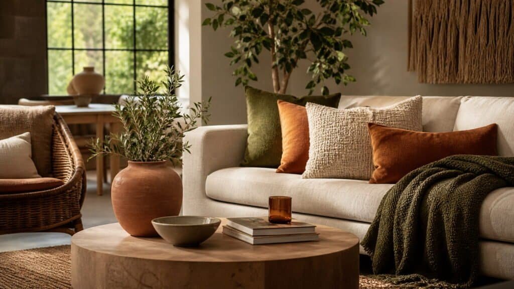
Nature Reimagined: Organic & Earth-Led Textile Colors
One of the strongest influences in home textiles color palettes 2027 is a deeper connection to nature—but interpreted in a more refined, modern way.
Key Earth-Inspired Colors to Use
Expect to see these tones across fabrics:
- Clay and terracotta for warmth
- Olive and moss green for grounding
- Sand and mineral beige for softness
- Muted stone gray as a balancing neutral
These colors work especially well in:
- Linen curtains
- Woven throws
- Cotton bedding
- Textured rugs
How to Combine Earth Tones Without Looking Flat
A common mistake is using too many similar tones. Instead, aim for contrast within nature:
- Pair warm clay with cooler olive
- Mix light sand with deeper brown accents
- Add subtle pattern (like stripes or organic prints)
Practical Example: A Balanced Earth Palette
| Textile Item | Color Choice | Effect |
| Curtains | Soft sand | Keeps the space light |
| Sofa cushions | Terracotta + olive | Adds warmth and depth |
| Throw blanket | Textured beige | Creates softness |
| Rug | Mixed earthy tones | Grounds the room |
The result feels cohesive but not monotonous—exactly what defines 2027 styling.
Why Earth Tones Are Replacing Cool Grays
Cool gray dominated interiors for years. In 2027, it feels:
- Too sterile
- Emotionally flat
- Less connected to nature
Earth-based palettes offer something more human—warmth, texture, and depth.
Soft Digital Pastels: The New “Calm Tech” Palette
Technology isn’t disappearing from our homes—it’s becoming quieter. That shift shows up clearly in home textiles color palettes 2027 through soft digital pastels that feel modern without being overwhelming.
What Defines This Palette
Think of colors that look like they’ve been gently “blurred”:
- Dusty lilac instead of bright purple
- Misty blue rather than sharp sky tones
- Faded peach with a warm undertone
- Muted aqua that feels almost gray
These shades work beautifully in spaces where you want mental clarity without visual noise.
Where Soft-Tech Colors Work Best
Certain rooms benefit more from this palette:
- Bedrooms → promotes calm and better sleep
- Home offices → reduces eye strain and distraction
- Reading corners → creates a soft, cocoon-like feel
How to Layer Digital Pastels Without Looking Washed Out
Pastels can easily feel flat if not handled carefully. Use these techniques:
- Combine two pastels + one grounding neutral (like warm gray or taupe)
- Add texture (quilted bedding, boucle cushions, linen drapes)
- Introduce a slightly deeper tone for contrast
Quick Styling Idea
- Bedding: misty blue
- Cushions: lilac + soft gray
- Throw: pale peach
- Curtains: sheer white
The result feels airy, modern, and quietly sophisticated—perfect for 2027 interiors.
Saturated Comfort: Deep, Cocooning Textile Tones
On the opposite end of the spectrum, home textiles color palettes 2027 also embrace rich, enveloping colors that make spaces feel intimate and grounded.
The Rise of “Comfort Saturation”
These tones are bold—but not loud. They’re designed to:
- Create a sense of security
- Add visual depth
- Make large spaces feel more inviting
Key colors include:
- Burgundy and wine red
- Ink blue and midnight navy
- Forest green
- Espresso and chocolate brown
Best Applications for Deep Tones
These colors shine when used in tactile, cozy elements:
- Velvet cushions
- Heavy drapes
- Thick knit throws
- Layered bedding
They’re especially effective in:
- Living rooms
- Bedrooms
- Media rooms
Balancing Dark Colors Without Overwhelming the Space
Deep tones can feel heavy if overused. Keep them balanced:
- Pair with lighter neutrals (cream, sand, soft beige)
- Use metal or wood accents to reflect light
- Limit dark tones to 60% or less of the textile palette
Example: Cozy Living Room Setup
| Element | Color | Purpose |
| Sofa cushions | Burgundy | Adds richness |
| Throw blanket | Deep green | Enhances depth |
| Rug | Neutral beige | Lightens the base |
| Curtains | Soft cream | Keeps space open |
The contrast creates a layered, high-end feel without making the room feel smaller.
Unexpected Neutrals: Beyond Beige and White
Neutrals are evolving in home textiles color palettes 2027. Instead of playing it safe, they now carry subtle personality and warmth.
The New Neutral Spectrum
Forget flat, one-dimensional tones. The new neutrals include:
- Warm taupe with pink undertones
- Greige with depth and variation
- Creamy yellow neutrals
- Soft caramel and latte tones
These shades feel richer and more inviting than traditional white or gray.
Why Neutrals Are Getting More Expressive
Homes are becoming more layered and lived-in. Plain neutrals often feel:
- Too stark
- Too cold
- Too predictable
Updated neutrals solve this by adding:
- Warmth
- Subtle color shifts
- Better compatibility with both bold and soft palettes
Layering Neutrals Like a Designer
Creating depth with neutrals requires variation, not repetition:
- Mix light, medium, and dark tones within the same color family
- Combine different textures (linen, wool, cotton, boucle)
- Add patterned neutrals (subtle stripes or tonal prints)
Neutral Palette Example You Can Use
- Curtains: warm off-white
- Sofa throw: caramel tone
- Cushions: taupe + greige mix
- Rug: cream with soft pattern
This approach feels elevated and modern—proof that neutrals in 2027 are anything but boring.
High-Contrast Accents: Small Pops That Transform Spaces
Not every color needs to dominate. In home textiles color palettes 2027, high-contrast accents are used strategically to energize a room without overwhelming it.
The Power of Controlled Contrast
A few well-placed bold tones can:
- Break visual monotony
- Highlight focal areas
- Add personality instantly
Popular accent colors include:
- Cobalt blue
- Citrus yellow
- Coral red
- Electric teal
Where to Add These Pops
Instead of spreading bold colors everywhere, concentrate them in small, impactful elements:
- Cushion covers
- Decorative trims or piping
- Throws layered over neutral furniture
- Statement rugs with accent threads
How to Get the Balance Right
Too much contrast can feel chaotic. Keep it refined:
- Stick to one or two accent colors
- Place them where the eye naturally lands (sofa, bed, entry seating)
- Anchor them with a calm base palette
Quick Tip
A neutral room instantly comes alive with just 2–3 vibrant cushions. This is one of the easiest and most budget-friendly updates for 2027.
Pattern Meets Palette: How Prints Reinvent Color in 2027
Color doesn’t exist in isolation—patterns are redefining how we experience it. In home textiles color palettes 2027, prints are softer, more expressive, and deeply tied to craftsmanship.
The Patterns Defining 2027
Expect to see:
- Blurred florals that feel almost watercolor-like
- Abstract geometrics with imperfect edges
- Handcrafted motifs inspired by weaving and embroidery traditions
These patterns introduce color in a more dynamic, layered way.
Mixing Patterns Without Clashing
Combining prints can elevate your space when done thoughtfully:
- Use a shared color thread across all patterns
- Mix different scales (large print + small print)
- Keep at least one element solid to ground the look
Color Repetition: The Secret to Cohesion
A simple designer trick:
- Repeat one color across multiple textiles
Example:
- Blue in the rug
- Blue accents in cushions
- Subtle blue detail in curtains
This creates flow without needing everything to match perfectly.
How to Build a Cohesive Home Textiles Color Palette (Step-by-Step)
Creating a balanced palette doesn’t require professional training—it just needs a clear system. This step-by-step approach works for any home.
Step 1: Start With a Base Color
Choose a dominant tone that sets the mood:
- Neutral (calm, versatile)
- Earthy (warm, grounded)
- Deep (dramatic, cozy)
This color will appear in larger textile pieces like rugs or curtains.
Step 2: Add Supporting Colors
Introduce 1–2 secondary tones that complement your base:
- Slightly lighter or darker variations
- Colors within the same mood family
These work well for bedding, throws, and medium-sized textiles.
Step 3: Use the 60-30-10 Rule (Adapted for Textiles)
- 60% → Base color (rug, curtains)
- 30% → Secondary tones (bedding, large cushions)
- 10% → Accent colors (decorative pillows, trims)
This keeps the palette balanced and visually pleasing.
Step 4: Layer Texture for Depth
Even a simple palette looks rich when textures vary:
- Linen for softness
- Wool for warmth
- Velvet for depth
Texture prevents colors from feeling flat.
Step 5: Test Before Committing
Always preview combinations:
- Place fabrics together in natural light
- Check how colors shift during the day
- Adjust tones if something feels off
Room-by-Room Color Palette Ideas for Home Textiles 2027
Each room benefits from a slightly different approach. The goal is consistency without repetition.
Living Room: Layered Neutrals + Bold Accents
- Base: warm beige or taupe
- Add: textured neutrals
- Accent: cobalt or coral cushions
Creates a balanced, welcoming environment with personality.
Bedroom: Calming Gradients and Soft Harmony
- Base: misty blue or soft green
- Add: tonal layers (lighter and darker shades)
- Accent: minimal, subtle contrast
Encourages rest and relaxation.
Dining Area: Warm and Inviting Hues
- Base: caramel or terracotta
- Add: earthy tones
- Accent: muted gold or deep red
Enhances warmth and sociability.
Outdoor Textiles: Sun-Washed and Durable Colors
- Base: sandy neutrals
- Add: faded blues and greens
- Accent: brighter tones for energy
Choose fabrics that age beautifully under sunlight.
Sustainable Dyes & Materials Shaping Textile Colors
Color in 2027 isn’t just about aesthetics—it’s about how it’s made. Home textiles color palettes 2027 are heavily influenced by eco-conscious dyes and materials, which subtly change how colors appear and age.
Why Sustainable Dyeing Matters
Traditional dyeing processes often involve:
- High water consumption
- Chemical-heavy pigments
- Environmental pollution
New methods focus on:
- Plant-based dyes (indigo, madder root, turmeric)
- Low-impact pigments
- Closed-loop water systems
These practices result in colors that feel softer, more natural, and slightly varied—never overly perfect.
The Beauty of “Imperfect” Color
Uniform color is no longer the goal. Instead, designers embrace:
- Slight tonal variations
- Washed or sun-faded effects
- Organic inconsistencies
This gives textiles a more authentic, handcrafted look.
Materials That Enhance Color Depth
Certain fabrics naturally elevate these palettes:
- Linen → airy, muted tones
- Organic cotton → soft, even color absorption
- Wool → rich, saturated hues
- Recycled blends → subtle texture variations
Choosing the right material is just as important as choosing the color itself.
Common Mistakes When Choosing Textile Color Palettes
Even the best color trends can fall flat without proper execution. Avoid these common pitfalls when working with home textiles color palettes 2027.
Overmatching Everything
Matching every textile perfectly creates a flat, staged look.
Better approach:
- Mix tones within the same color family
- Introduce subtle contrast
- Let each piece have slight variation
Ignoring Lighting Conditions
Colors don’t look the same throughout the day.
- Natural daylight → reveals true tones
- Warm lighting → enhances reds and yellows
- Cool lighting → emphasizes blues and grays
Always test textiles in your actual space before finalizing.
Following Trends Without Context
A trending palette might not suit your home’s architecture or furniture.
Ask yourself:
- Does this palette match my existing pieces?
- Will I still like it in a year?
- Does it support the mood I want?
Forgetting Texture
Color alone isn’t enough. Without texture, even the best palette feels dull.
- Combine smooth + textured fabrics
- Add woven or patterned elements
- Layer different materials for depth
Styling Ideas: Bringing 2027 Textile Color Trends Into Your Home
Updating your home doesn’t require a full redesign. Small textile changes can completely transform a space.
Easy Swaps With Big Impact
Start with quick, affordable updates:
- Replace cushion covers
- Add a new throw blanket
- Switch out curtains
- Layer a new rug over an existing one
These changes instantly reflect home textiles color palettes 2027.
Mix Old and New Thoughtfully
You don’t need to discard existing textiles.
- Pair older neutral pieces with trend-forward accents
- Refresh vintage items with modern color combinations
- Re-dye or reupholster when possible
This creates a layered, personal look.
Budget-Friendly Refresh Strategy
- Focus on high-visibility areas (sofa, bed)
- Choose multi-use textiles (reversible throws, neutral rugs)
- Rotate textiles seasonally for variety
Smart updates keep your home current without overspending.
Home Textiles Color Palettes 2027: What Will Last Beyond the Trend Cycle
Trends evolve, but some choices remain relevant for years. The key is knowing what to invest in.
Timeless vs. Trend-Driven Colors
| Category | Examples | Longevity |
| Timeless | Warm neutrals, soft earth tones | Long-term |
| Semi-trend | Muted pastels, deep greens | Medium-term |
| Trend-driven | High-contrast brights | Short-term |
How to Future-Proof Your Palette
- Use timeless colors as your base
- Introduce trends through small accents
- Avoid committing to bold colors in large, expensive pieces
Where to Invest vs. Save
Invest in:
- Rugs
- Curtains
- Upholstery
Save on:
- Cushions
- Throws
- Decorative textiles
This strategy keeps your home adaptable as trends shift.
Visual Inspiration: Palette Combinations You Can Copy Right Now
Sometimes the easiest way to start is with ready-made palettes. These combinations reflect the essence of home textiles color palettes 2027.
Desert Calm
- Sand
- Clay
- Olive
Best for: Living rooms and warm, grounded spaces
Digital Serenity
- Misty blue
- Dusty lilac
- Soft gray
Best for: Bedrooms and calming zones
Modern Heritage
- Burgundy
- Caramel
- Cream
Best for: Cozy, elegant interiors
Forest Retreat
- Deep green
- Warm taupe
- Muted beige
Best for: Relaxing, nature-inspired homes
Sunwashed Coastal
- Faded blue
- Sandy beige
- Soft white
Best for: Light, airy environments
Designing Emotion Through Textile Color in 2027
Home textiles color palettes 2027 aren’t just about what looks good—they’re about how your space feels every day. The right combination of tones, textures, and materials can turn any room into a place that supports relaxation, creativity, or connection.
Color becomes more powerful when it’s intentional. Thoughtful layering, subtle contrast, and a clear mood direction will always outperform blindly following trends.
If you’re ready to refresh your space, start small. Swap a few textiles, experiment with one new palette, and observe how it changes the atmosphere.
For deeper insight into how color influences mood and behavior, this guide from the American Psychological Association is worth exploring: https://www.apa.org/monitor/2015/03/cover-color-psychology
Frequently Asked Questions
What are the top home textiles color palettes 2027?
The most popular palettes include earthy tones (clay, olive, sand), soft digital pastels (lilac, misty blue), and deep cocooning hues like burgundy and forest green.
How do I choose the right textile color palette for my home?
Start with a base color that matches your desired mood, then layer complementary tones and add small accents for contrast.
Are neutral palettes still relevant in 2027?
Yes, but they’ve evolved into warmer, more expressive tones like taupe, caramel, and creamy beige.
Can I mix different color palettes in one home?
Yes, as long as there’s a consistent mood or repeating color elements to create flow between spaces.
What’s the easiest way to update my home with 2027 textile trends?
Swap cushions, throws, or curtains. These small changes can instantly reflect new color trends without a full redesign.
Ready to transform your space? Start experimenting with one of these palettes today and see how quickly the right textiles can redefine your home’s atmosphere.
