
Color trends 2028 are shaping up to be more than just aesthetic choices—they reflect how people want to feel in their spaces. From calming, nature-inspired palettes to bold digital hues, this year’s colors are deeply connected to lifestyle shifts, emotional well-being, and evolving design habits.
If you’re planning a refresh—whether it’s a full interior makeover or a few simple updates—this guide will help you understand what’s trending, why it matters, and how to use it effectively. Expect practical ideas, real-world examples, and expert insights you can actually apply.
In This Article
Why Color Trends 2028 Feel Different This Time
Color trends have always evolved, but 2028 marks a noticeable shift in how and why colors are chosen. It’s no longer just about what looks good—it’s about what feels right and lasts longer.
From fast trends to lasting palettes
Design is moving away from short-lived fads. Instead, homeowners and designers are prioritizing timeless tones with emotional depth. This means colors that don’t just follow trends—but still feel relevant years later.
- Warm neutrals replacing stark whites
- Muted tones over overly bright palettes
- Layered color schemes instead of single-tone spaces
The influence of sustainability and conscious living
Eco-awareness is directly impacting color choices. Natural pigments, earthy hues, and materials-inspired tones are gaining traction because they feel more grounded and authentic.
You’ll notice colors inspired by:
- Clay, sand, and stone
- Forest landscapes and ocean depths
- Raw, untreated materials
These tones create a sense of connection to nature, which many people are actively seeking.
Digital life is reshaping color perception
Spending more time in digital environments has changed how we respond to color. Screens favor contrast and vibrancy, and that influence is bleeding into real-world design.
As a result, color trends 2028 blend calming natural shades with striking digital accents, creating a balance between comfort and stimulation.
The Defining Color Trends 2028 You’ll See Everywhere
Rather than one dominant palette, color trends 2028 are defined by a mix of contrasting directions. This creates more freedom—and more opportunities to personalize your space.
Key palettes shaping 2028
Here’s a snapshot of the most influential color directions:
| Trend Direction | Key Colors | Mood/Effect |
| Warm Earth Tones | Terracotta, sand, ochre | Cozy, grounded |
| Digital Brights | Electric blue, neon green, violet | Energetic, futuristic |
| Modern Naturals | Moss green, slate, deep blue | Calm, restorative |
| Muted Pastels | Dusty pink, soft lavender | Soft, refined |
Global influence = hybrid styles
Design inspiration is becoming more global than ever. Scandinavian minimalism, Mediterranean warmth, and Japanese simplicity are blending into hybrid color palettes.
This results in combinations like:
- Warm beige + charcoal + sage green
- Clay tones paired with soft lavender
- Deep blue contrasted with pale wood
These mixes feel fresh without being overwhelming.
A quick look at standout shades
Some colors are already gaining traction across interiors and design platforms:
- Clay beige – the new neutral replacing gray
- Deep ocean blue – bold yet calming
- Digital violet – futuristic and expressive
- Soft olive green – versatile and natural
These shades work well alone, but they really shine when layered thoughtfully.
Warm Minimalism: The Evolution of Neutrals
Minimalism isn’t disappearing—it’s evolving. The cold, stark look of previous years is being replaced by something softer, warmer, and far more livable.
Why cool grays are fading out
Cool gray interiors once dominated modern design, but they often feel sterile or impersonal. In 2028, people are leaning toward spaces that feel inviting and human.
That’s where warm minimalism comes in.
The new neutral palette
Expect to see neutrals with subtle warmth and depth:
- Sand beige instead of flat white
- Muted terracotta as a grounding accent
- Creamy taupe for softness and flexibility
These colors adapt easily to different lighting conditions, making them practical for everyday living.
How to apply warm minimalism in real spaces
You don’t need a full redesign to embrace this trend. Small changes can make a big impact:
- Swap cool-toned decor for warmer alternatives
- Add textured materials like linen, wood, or clay
- Layer similar tones instead of using stark contrasts
Pro tip: Combine 2–3 warm neutrals in varying shades to create depth without clutter.
Warm minimalism proves that simplicity doesn’t have to feel cold—it can be comfortable, elegant, and deeply personal.
Digital Drenched Hues: The Rise of Hyper-Saturated Colors
If warm minimalism brings comfort, digital drenched hues bring energy. One of the most striking color trends 2028 is the rise of bold, high-saturation colors inspired by screens, gaming, and virtual environments.
Why bold is back—this time with purpose
Bright colors aren’t new, but in 2028 they’re used more intentionally. Instead of overwhelming a space, they act as strategic accents that add personality and contrast.
Expect to see:
- Electric blues that feel almost luminous
- Neon greens with a futuristic edge
- Deep violets influenced by AI-generated visuals
These colors reflect a world where digital and physical experiences are blending.
Where hyper-saturated colors work best
Using these hues successfully is all about placement. A little goes a long way.
- Accent walls in living rooms or creative spaces
- Statement furniture pieces like sofas or chairs
- Decor elements such as artwork, lighting, or rugs
Pairing them with neutral backgrounds helps maintain balance while still making an impact.
How to avoid visual overload
Bold colors can easily become too much if not handled carefully. The key is restraint and contrast.
- Stick to one dominant bold color per room
- Balance with soft neutrals or natural textures
- Use lighting to control how intense the color appears
When done right, digital hues feel exciting—not chaotic.
Nature Reimagined: Biophilic Color Trends 2028
Nature-inspired palettes are evolving beyond basic greens and browns. Color trends 2028 take biophilic design further by introducing richer, more layered tones that mimic real landscapes.
The new wave of nature-inspired colors
Instead of flat greens, designers are using complex, multi-dimensional shades:
- Forest green with deep undertones
- Ocean blue that shifts with light
- Mineral grays inspired by stone and slate
These colors feel immersive, almost like bringing the outdoors inside.
Why biophilic colors matter more than ever
Modern life is increasingly fast-paced and screen-heavy. Natural colors help counter that by creating a sense of calm and restoration.
Benefits include:
- Reduced visual stress
- A more grounded atmosphere
- Improved emotional comfort in living spaces
It’s not just about aesthetics—it’s about how a space supports well-being.
Layering natural tones for depth
The key to making this trend work is layering. Real nature isn’t flat, and your color palette shouldn’t be either.
Try combinations like:
- Moss green + warm wood + soft beige
- Deep blue + stone gray + off-white
- Olive green + clay + muted gold
These layered palettes feel organic and sophisticated at the same time.
Unexpected Pastels: Soft Colors With a Modern Edge
Pastels are making a comeback—but not in the way you might expect. In color trends 2028, they’re softer, dustier, and far more refined than the sugary tones of the past.
Meet the new generation of pastels
Forget overly bright baby colors. Today’s pastels have a muted, almost smoky quality:
- Dusty lilac instead of bright purple
- Chalky peach instead of coral
- Faded mint instead of icy green
These tones feel grown-up and versatile.
Why pastels are trending again
There’s a growing desire for spaces that feel light, calm, and emotionally balanced. Soft colors naturally support that goal.
They’re especially effective in:
- Bedrooms for relaxation
- Bathrooms for a spa-like feel
- Small spaces where lighter tones create openness
How to style pastels without looking outdated
The secret is contrast. Pairing soft colors with deeper or richer tones keeps the look modern.
- Combine pastel walls with dark wood or black accents
- Add metallic finishes like brass or bronze
- Mix in textured fabrics to avoid a flat appearance
Used thoughtfully, pastels can feel fresh, elegant, and surprisingly contemporary—a perfect counterbalance to the bolder trends of 2028.
Color Trends 2028 in Interior Design: Room-by-Room Ideas
Trends only matter if you can actually use them. The beauty of color trends 2028 is their flexibility—whether you prefer subtle updates or bold transformations, there’s a way to apply them in every room.
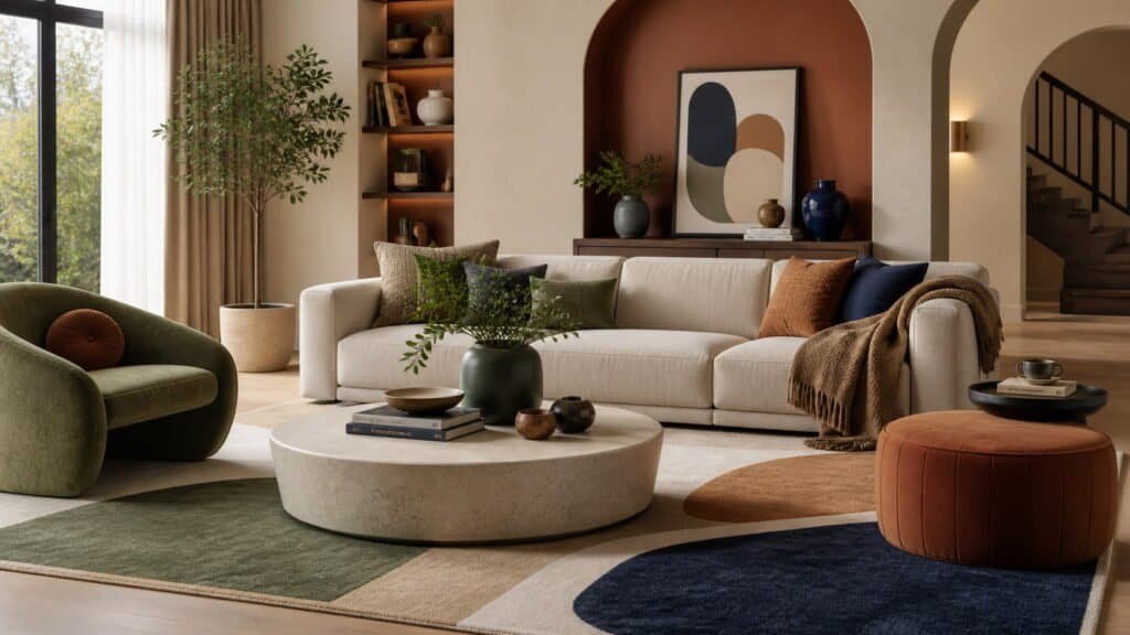
Living room: balance comfort with personality
Living rooms are becoming more layered and expressive. A neutral base with thoughtful color accents works best.
- Walls in warm beige or soft taupe
- Accents in deep blue, olive green, or muted terracotta
- Textiles (pillows, rugs) to introduce digital hues in small doses
This approach keeps the space inviting while still feeling current.
Kitchen: earthy meets bold
Kitchens in 2028 are moving away from all-white designs. Instead, they mix grounded tones with striking elements.
- Lower cabinets in clay or forest green
- Upper cabinets in soft neutrals
- Statement backsplashes in bold or patterned colors
This contrast creates depth without making the space feel heavy.
Bedroom: calming, layered tones
Bedrooms are leaning into wellness-focused palettes. The goal is to create a space that supports rest and relaxation.
- Soft pastels like dusty lavender or muted peach
- Natural tones such as sand, cream, and light wood
- Minimal use of bold colors, reserved for subtle accents
Layering these tones creates a cocoon-like atmosphere that feels both modern and soothing.
The Psychology Behind 2028’s Most Popular Colors
Color is no longer just decorative—it’s emotional. One of the biggest drivers behind color trends 2028 is how shades influence mood, behavior, and overall well-being.
The rise of “healing colors”
People are choosing colors based on how they feel, not just how they look.
- Greens promote calm and balance
- Blues encourage focus and relaxation
- Warm earth tones create comfort and security
These choices are especially important in homes where people work, relax, and recharge.
Color as emotional storytelling
A well-designed palette tells a story. Instead of random combinations, colors are being selected to create a specific atmosphere.
For example:
- A mix of clay, beige, and olive can feel grounding and earthy
- Deep blue paired with soft gray creates a peaceful, reflective mood
- Digital violet accents can add energy and creativity
This intentional use of color makes spaces feel more personal and meaningful.
Why balance matters more than ever
Too much of any one tone can shift the mood in the wrong direction. Balance is key.
- Pair calming colors with subtle contrast
- Avoid overly bright palettes in rest-focused areas
- Use darker tones to anchor lighter schemes
A thoughtful balance ensures your space feels harmonious, not overwhelming.
How to Use Color Trends 2028 Without Redesigning Everything
Adopting color trends 2028 doesn’t require a full renovation. Small, strategic changes can refresh your space without a big investment.
Start with easy, high-impact updates
Simple swaps can instantly modernize a room:
- Throw pillows and blankets in trending shades
- New curtains or rugs to introduce color layers
- Artwork that reflects current palettes
These updates are affordable and easy to change later.
Accent walls vs. subtle layering
Two popular approaches stand out:
- Accent walls for bold statements using digital hues
- Layered tones for a softer, more cohesive look
If you prefer flexibility, layering is the safer choice.
Budget-friendly ways to stay on trend
You don’t need designer pieces to achieve a stylish look.
- Repaint small areas like shelves or furniture
- Use peel-and-stick wallpaper for experimentation
- Shop second-hand decor and refresh it with paint
A little creativity goes a long way when working with color.
Color Pairing Secrets Designers Are Using in 2028
The real magic of color trends 2028 lies in how colors are combined. Pairing is what transforms a palette from average to exceptional.
High-contrast vs. tonal palettes
Designers are using two main strategies:
- High-contrast palettes (light + dark) for bold, dynamic spaces
- Tonal palettes (similar shades) for calm, cohesive environments
Both approaches work—it just depends on the mood you want to create.
Mixing warm and cool tones intentionally
Strict color rules are fading. Mixing warm and cool tones is now encouraged—but it needs to be done thoughtfully.
- Warm beige + cool gray-blue
- Olive green + soft lavender
- Terracotta + deep navy
The key is finding a common undertone that ties everything together.
Trending combinations that feel fresh
Some pairings are gaining popularity because they strike the perfect balance between modern and timeless:
- Clay + sage + cream
- Deep blue + sand + brushed gold
- Dusty pink + charcoal + walnut
These combinations feel current without risking quick burnout.
Mastering color pairing allows you to personalize trends instead of just following them—giving your space a look that truly stands out.
Visual Inspiration: Real-Life Color Trends 2028 in Action
Seeing color trends 2028 applied in real spaces makes it much easier to imagine them in your own home. The key takeaway? It’s less about copying a look and more about understanding how colors interact.
Modern living spaces that feel balanced
A common approach is combining a calm base with expressive accents.
- Neutral walls in warm beige or cream
- Furniture in earthy tones like olive or clay
- Pops of digital color through art or decor
This creates a space that feels both grounded and dynamic.
Bold yet livable kitchens
Kitchens are becoming more expressive without sacrificing functionality.
- Two-tone cabinetry (e.g., forest green + soft taupe)
- Statement islands in deep blue or muted terracotta
- Subtle metallic accents for contrast
The result is a kitchen that feels designed, not generic.
Serene bedrooms with layered tones
Bedrooms showcase how soft palettes can still feel rich.
- Layered pastels paired with warm neutrals
- Textures like linen, wood, and boucle
- Minimal but intentional color contrast
These spaces prove that calm doesn’t have to mean boring.
What’s Fading Out: Colors Losing Popularity by 2028
While new palettes are emerging, some older trends are quietly stepping aside. Understanding what’s fading helps you avoid investing in colors that may feel dated quickly.
Cool gray overload
Once a staple of modern interiors, cool gray is losing its appeal.
- Feels cold and impersonal
- Lacks the warmth people now prefer
- Often replaced by beige, taupe, or greige
Overly stark black-and-white schemes
High-contrast monochrome interiors are becoming less common.
- Can feel harsh and uninviting
- Difficult to maintain a cozy atmosphere
- Being replaced by softer, layered contrasts
Bright, flat pastels
Traditional pastel shades without depth are fading out.
- Appear overly sweet or outdated
- Lack the sophistication of newer muted tones
- Being replaced by dusty, desaturated versions
Updating these elements gradually can help your space evolve without a full redesign.
Related Trends to Watch (Internal Linking Opportunities)
Color doesn’t exist in isolation. Many color trends 2028 are directly influenced by other design elements, which opens up opportunities to explore related topics on your blog.
Material trends shaping color choices
Materials and colors now go hand in hand.
- Natural wood tones enhancing warm palettes
- Stone and marble influencing neutral selections
- Brushed metals adding subtle contrast
You can expand this into a dedicated post on material trends 2028.
Lighting and its impact on color perception
Lighting can completely change how a color looks in a space.
- Warm lighting enhances earthy tones
- Cool lighting sharpens blues and grays
- Layered lighting adds depth and dimension
This connects naturally to topics like lighting trends 2028 or home ambiance design.
Exploring these related areas helps readers build a more cohesive and informed design strategy.
Final Thoughts: Choosing the Right Color Trends 2028 for Your Style
Trends are a guide—not a rulebook. The most successful spaces in 2028 aren’t the ones that follow every trend, but the ones that adapt trends to fit personal style.
Focus on what feels right
A color might be trending, but it still needs to work for your space and lifestyle.
- Consider how a color makes you feel daily
- Test samples before committing
- Observe how colors change with lighting
Create a cohesive color story
Instead of picking random shades, think about how everything connects.
- Choose a base color, then layer supporting tones
- Repeat key colors throughout the space
- Balance bold accents with calming neutrals
This creates a home that feels intentional and well-designed.
Think long-term, not just trendy
The best approach is blending timeless elements with current influences.
- Invest in neutral foundations
- Use trendy colors in easily changeable elements
- Avoid overcommitting to bold trends
For a deeper understanding of how color influences mood and communication in design, you can explore this helpful resource from the American Psychological Association: https://www.apa.org/monitor/2015/03/cover-color-psychology
FAQ: Color Trends 2028
What are the biggest color trends for 2028?
Warm neutrals, biophilic greens and blues, digital-inspired bold hues, and muted pastels are leading the way in 2028.
How can I use color trends 2028 on a budget?
Focus on small updates like textiles, decor, paint accents, or artwork instead of full renovations.
Are gray interiors completely out of style?
Not entirely, but cool grays are being replaced by warmer tones like beige, taupe, and greige.
What colors make a room feel more relaxing?
Soft greens, muted blues, and warm neutrals tend to create the most calming environments.
How do I choose the right color palette for my home?
Start with a base neutral, add 1–2 complementary colors, and test them in your space under different lighting conditions.
Ready to refresh your space? Start small—pick one room, choose a palette from these color trends 2028, and experiment. You might be surprised how much a simple color shift can transform the way your home feels.
